Row Layouts For Your Design Freedom
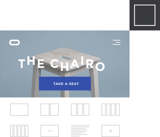
Rows and columns are the foundation of any layout. Combine blocks and sections to form the structure of your site and fill it with content.
Row and column layout
Choose between one or several columns for your rows. Use row layout to form a grid of your page. Adjust column sizes to your needs.
Row and column responsiveness
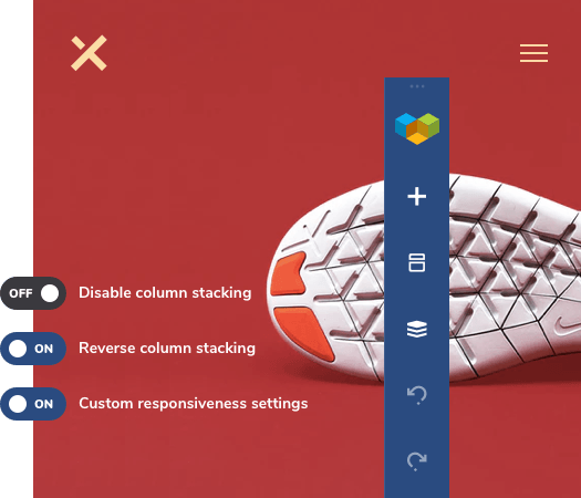
Enjoy the auto responsiveness enabled by default for all your new rows and columns. Adjust any row layout with custom responsive controls for mobile devices.
Row stretching
Build boxed or full-width sections complemented with stunning background effects. Convert any boxed row into a full-width section with one click.


Full height sections
Create beautiful full height sections to grab your visitors' attention and give your design a breath.
Column and content position
Control your column and content vertical position within a row. Create eye-catching hero sections with content placement on top, middle or bottom.
Advanced row layouts
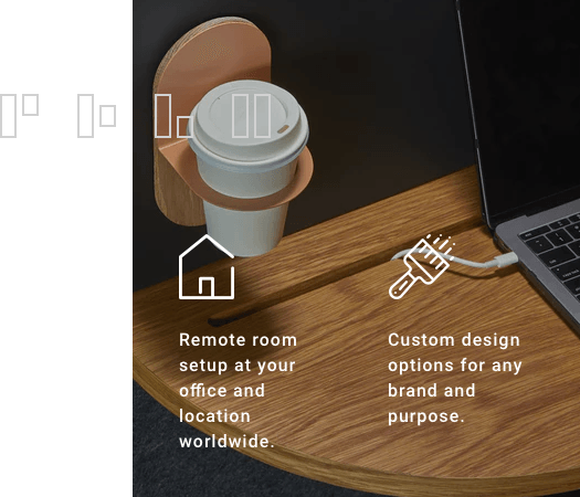
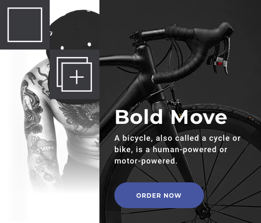
Combine multiple rows and columns to form advanced layouts. Place rows inside columns with no restrictions to achieve any layout style you want.
Powerful row design options
Achieve stunning results with the most advanced design options for rows, columns, and sections. Tinker your sections up to perfection and apply visual effects like parallax, video backgrounds, and gradients.
RTL compatible layouts
Control the order of column stacking on mobile devices. Change default left-to-right stacking to right-to-left with a single click.
Disable column stacking
Disable stacking for specific rows to adjust your layout for the mobile devices with a single click.
Drag and drop editor
Use a simple drag and drop editor to move and manage your layout and elements across the page.
Column resize
Resize columns with the help of your mouse. Resize mechanism will analyze and recognize your popular layouts and offer smart snap-to-grid options.
Equal height columns
Set all columns within a row to have equal height. The website builder will automatically analyze the height of the tallest column and adapt all the settings.
Sticky rows
Create sticky headers and interactive sections with sticky rows, columns, and sections feature available out of the box.
Shape dividers
Divide your website sections with an easy to use shape divider. Select from various divider types - apply color, gradient, image background or video to your shapes and build award-winning designs yourself.
Box shadows
Make your rows and columns stand out with box-shadow options. Control shadow color, position, blur, and more.

Lock rows
Lock rows and other elements when designing a website for your customers. Allow editing only certain content elements that won't break your beautiful site.
Fixed column width
Create pixel-perfect layouts. Set column width in pixels for added responsiveness to your layouts. Defining column width in pixels will ensure columns stay intact on different devices and screen sizes.


