Creating a form that converts visitors into leads is important for any company that uses its website for business and wants to get the most out of its marketing efforts. This is the case for B2B companies that aim to book the first meetings with potential buyers, but also for B2C companies that want to nurture their leads through email marketing.
According to Sumo, the average email sign-up rate ranges between 1.95% and 4.77%. While these percentages might seem low, email sign-up forms are still one of the most effective ways to generate leads to this day. With a healthy email sign-up rate considered to be above 2%, it's an attainable goal for any online business.
By following the industry best practices and avoiding common mistakes, you can get more users into your next stage of the funnel. This will help you apply a variety of email marketing strategies and ultimately boost your sales.
In this article, I will guide you on creating an effective email sign-up form that converts visitors to leads.
What constitutes an email signup form?
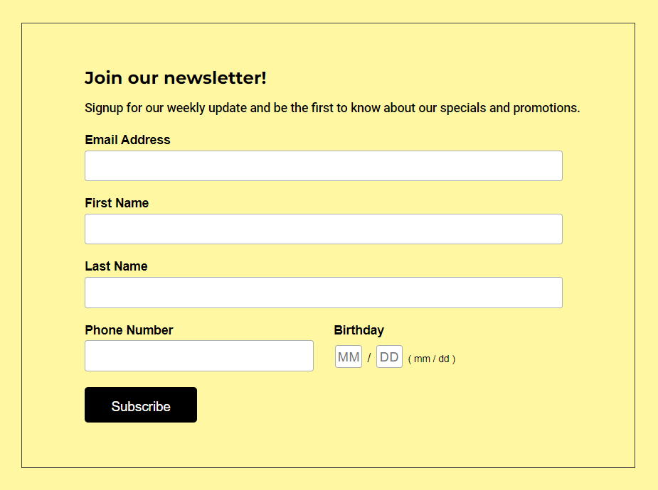
The email sign-up form is a simple way to collect visitor information for marketing purposes. The design should be simple, clear, and straightforward so that people can drop their emails without difficulty or confusion when they visit your site.
Sign-up forms can be placed as a pop-up on the website, in the sidebar for blog posts, or as the main call-to-action on a landing page. But, for a pop-up version, the form should have a clearly visible close button so visitors can close it if they are not interested.
A must-have field for the form is email - you want to collect email addresses, right? Data such as name, age, etc. can be collected based on the marketing campaign. But as we said before, the simpler a signup form is - the better conversion rates you can expect.
Note: Statistics show that popups perform significantly better than passive sign-up forms, which you can find at the bottom of most pages.
Best Practices
Following are some best practices to be followed while creating a signup form:
- A good signup form should have one or two fields and be easy enough to be filled in within seconds.
- The form headline should clearly state the benefit that the user will avail in return. It can be a weekly newsletter, offers, free e-books, etc.
- It’s best to stick to a one-column layout which makes it simple and less complicated.
- The user experience can be enhanced by giving them instant field feedback. For eg: There can be an alert about an incorrectly entered email id while they are typing it.
- The form colors must be in sync with site branding.

Note: A report by WPForms, found that marketers who use lead magnets (webinars, free materials, etc.) report 50% higher email sign-up conversion rates.
Things to avoid
Here are a few things that can be avoided to have a higher conversion rate:
- A signup form with more than two fields can result in fewer signups.
- Too many fine prints and links to terms and conditions should be avoided.
- Bad color scheme or fonts which are not clearly visible.
- Incorrect placement of field validation errors.

WordPress plugins for best email signup forms
WordPress repository has a lot of plugins that can be used for building an email signup form. We have curated a list of the following six plugins based on our experience:
- MailPoet – emails and newsletters in WordPress:
It offers a complete email marketing solution from your WordPress dashboard. You can create a marketing campaign, newsletter, and signup form. All this can be done without having to go to a third-party site. - MC4WP: Mailchimp for WordPress:
This plugin offers seamless integration with Mailchimp. Using it, you can easily add a signup form created in a marketing campaign, to your WordPress site. - Contact Form 7 and Mailchimp:
This is an add-on plugin of Contact Form 7. It works on expanding the standard form functionality. Using it, Contact Form 7 can be used as a signup form for the Mailchimp campaign. - Mailchimp addon of Gravity form:
Similar to the above one, this is an add-on to the Gravity form plugin. It makes it possible to build a signup form using the Gravity form. This form can then be integrated easily with Mailchimp. - HubSpot – CRM, Email Marketing, Live Chat, Forms & Analytics:
It offers seamless integration with HubSpot to display a signup form. Apart from this, it also allows integration with other HubSpot features. These include features such as live chat, analytics, etc. in the WordPress dashboard. - AWeber Signup Form:
It integrates with AWeber's email marketing solution. The plugin provides a shortcode and a widget. These can be used to display the signup form from the email marketing campaign.
Discover the Responsive WordPress Website Builder & Build Sign-up Forms for All Devices
Step-by-step process of adding an email signup form
According to Datanyze, Mailchimp has a market share of just over 68% when it comes to email marketing softwares. I personally prefer using it due to its user-friendly interface and easy-to-use setup.
To add a signup form to your website, you will need to follow these steps:
- Signup for email marketing software. For this example, we will use Mailchimp. Its free plan allows you to send up to 10,000 emails per month.
- Install and activate the plugin “MC4WP: Mailchimp for WordPress” on your WordPress site.
- Navigate to: MC4WP - Settings and enter the API key after generating it.

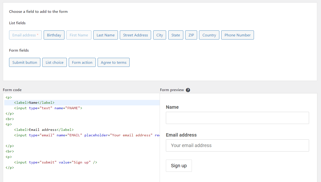
The status will display as connected once you enter the API key - You can now create a signup form under MC4WP - Forms.
- In the form, you can add desired fields such as name, email, etc.

Interface of editor in Mailchimp for WordPress plugin - Using the shortcode provided on the page, you can display the form. It also provides a widget feature that can be used to add the form to widget areas such as the sidebar.
Visual Composer integrations

The Visual Composer provides an easy way to display the form using its elements. The Mailchimp element, alongside other form integrations, can be downloaded from the Visual Composer Hub.
The above-mentioned steps can be followed to integrate Mailchimp with WordPress. The next step is to select the form that is created and available in the dropdown.
The form can also be added via Popup Builder. This ensures that the signup form can be displayed as a popup to the website visitor.
The Visual Composer also integrates with the HubSpot plugin. It uses the HubSpot form element for such integration.
The first step is to connect the site using the HubSpot plugin interface. Once done, the subscription form can be selected from the element settings.
Conclusion
Now that you are aware of how to build a sign-up form and what a good signup form can do, it is time to implement it on your website and increase the conversion rate. You can always experiment with form position on the website and see what gets you more conversions.
To recap, here are the key takeaways from this article:
- Creating a form to collect emails from potential clients is an important step in email marketing and the start of the sales process
- A good sign-up form should be located in a prominent place and should be easy to fill out within seconds
- The form headline should clearly state the benefit that the user will receive in return for signing up, such as weekly newsletters, exclusive offers, or freebies
- WordPress plugins such as Mailchimp and HubSpot make it easy to create and add a sign-up form to your website
- Visual Composer website builder offers integrations with the most popular sign-up form plugins, allows you to create pop-ups, and makes sure your forms look good on all devices
By following these tips, you can create an email sign-up form that converts visitors into leads. Plus if you are using Mailchimp or HubSpot, you can check out the Premium version of Visual Composer. It makes it easy to add create a form that is both effective and easy-to-use, all within our drag-and-drop editor.

