Sticky menus, buttons, dynamic sections with sticky rows and content - these are the components you can see on well-designed sites. The sites that have awards for their user interface and experience. The sites that have experienced team of developers and designers behind them. Can you do the same? The answer is just around (below) the corner … ????
Sticky Row Option
In the last couple month, there were many requests to have an option of adding sticky menus and sections to the WordPress for non-technical users. Yes, coding such stuff can be hard and time-consuming, so we decided to jump in.
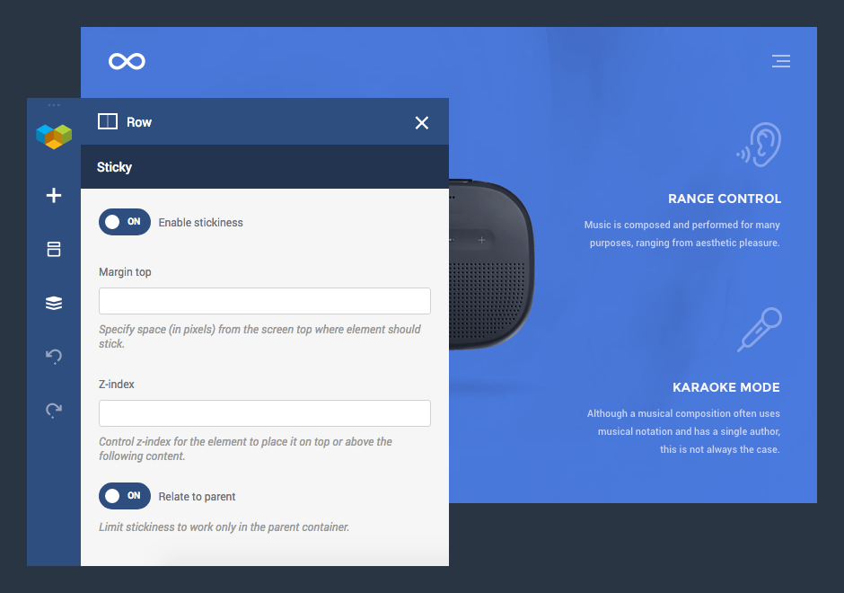
The new Visual Composer Website Builder 2.8 allows everyone to create sticky rows, columns, and sections in order to highlight important parts of your website. With a single click, you can make sure that your 'Subscribe' button never leaves the sight or that your navigation is always on top to guide your visitors.
Even more, Visual Composer sticky options allow you to control depth (z-index) and margins, apply sticky options within specific containers - all this for your imagination and various purposes.

For Sales and Marketing
Convert your website into a lead generation machine. Sticky row allows you to place sticky buttons and 'Call-to-Action' blocks anywhere on the site.
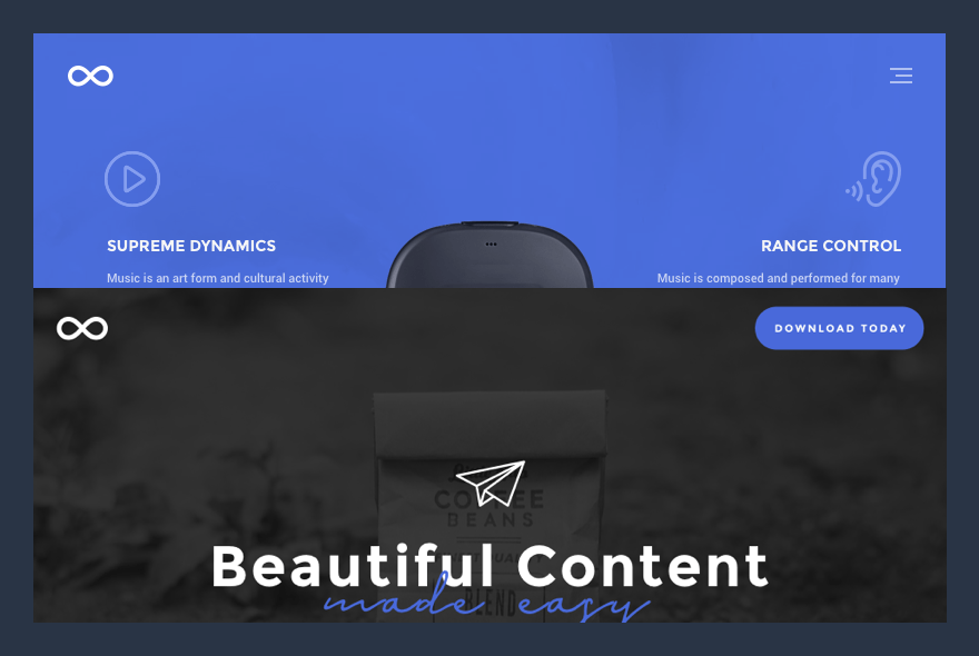
A simple 'Download' button is always there to give your visitors a hint of what to do next. You have heard it before, but a well-placed sticky button with the right message is one of the strongest tools online marketers use to generate sales and increase conversions.
And, with the margin-top control at your fingertips, you can tune up your sales pitch up to the smallest detail to find a perfect spot.

For Header and Navigation
Did you know that the sticky menu can reduce bounce rate by up to 33%? A simple navigation block that is always there for your visitors can help them get around your site at any point in time. No need to scroll up and down the page to quickly jump from section to section.
With the sticky menu, you are in charge of your visitors' flow and can lead them straight to your sales pitch.
In Visual Composer, creating a sticky menu is a piece of cake, with the Header Builder at your fingertips you can simply set any row of your navigation to be sticky. Now it will always stay at the top where it belongs and your visitors won't have to wander around in the dark.

For Features and Product Highlights
Put your products on top of everything and wrap your features around of besides. Have you seen those award-winning sites with a good looking product in the center and features literally flowing around? It is your time to create such a layout and make sure that people remember both - your product and your site.
Did you know?
You can limit a sticky option by applying it to the parent container. Place a sticky row into a section or another row so it will be released once your visitor reaches the end of the section.

For Storyboards Sections
Divide your website into dynamic sections with each next section going on top or below the previous one. With the z-index control available in the sticky options you can achieve various effects and create compelling stories.
Is it a website, or online presentation, sticky sections allows you to create a beautiful transition between your content blocks.
Now you see that there are so many things you can do with the sticky rows, columns, and sections to make your website and your business better. You can sell more, help your visitors, or simply make your website even more beautiful.
On the side: Control Preview
For a pro Visual Composer users, there is something more in the box of the release 2.8. We know how easy for you is to get along with the website builder. You, probably, known all the elements and templates by your heart.
While beginners are excited to instantly seeing element and template preview images and descriptions without even adding them, you are more likely to skip it. This is why we are introducing a tiny option that allows you to control element and template preview. As requested by WPTuts, you can now find a toggle to enable/disable preview image right in the Visual Composer Frontend editor Settings window.
As you can see, we do appreciate your feedback and there is no better proof for that as this release which is purely based on your requests. So, if you want to see more awesome features that can help you out - simply leave a note below and we will make sure to take it into account.
