Do you want to build your own website but haven't decided about the tool yet? We are excited to showcase website design examples created with Visual Composer Website Builder.
This month we have featured design examples for portfolio, products, and business websites with various layouts and effects, like parallax and full-height sections.
#madeinvc
Element
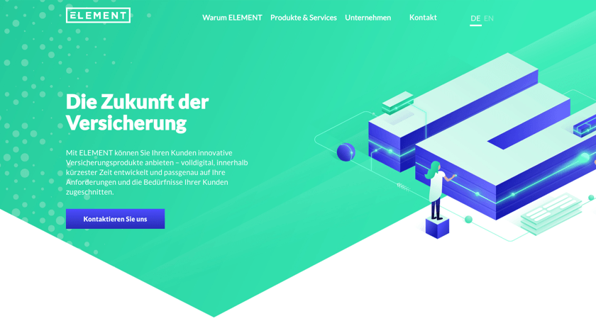
Element offers an innovative way for digital insurance products. Moreover, Element is the largest digital insurance provider with the white label solution that allows everyone to create their own insurance products.
We know that innovative products require modern ways to build and manage their websites and Visual Composer Website Builder is all about that. It allows using default and custom elements in combination with the shape divider and background illustrations to give Element an outstanding website.
Bleeding Bulb
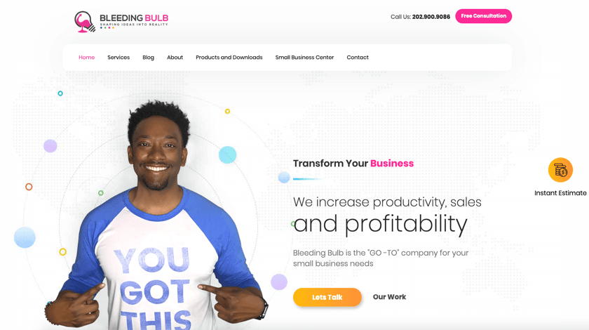
Bleeding Bulb is a top-notch agency that provides digital strategy, web design, app design, and other digital services.
Their website is a good example of an agency-grade portfolio that features services, portfolios, case studies, blog and other company relevant information.
The layout is organized in easy-to-read sections and call-to-action blocks to catch potential leads.
In addition, Bleeding Bulb takes advantage of the Visual Composer API to develop custom elements.
Chasing
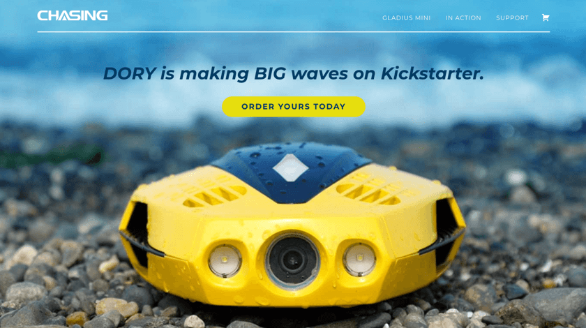
Tired of flying drones? Chasing is the world's 1st intelligent underwater drone that allows you to film 4K videos and take photos from 330-foot depths.
Chasing is a perfect website example of a product landing page powered by full-height sections and background videos. These essential effects of Design Options help to create a mood and deliver product branding.
Tucks Wine
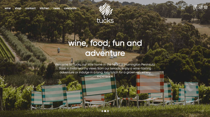
Tucks is an Australian winery located in Mornington Peninsula. The place where you can enjoy wine tasting, lazy lunch, and Instagram-worthy views from the terrace. What can be better than that?
The Tucks website is also a thing to enjoy. It has unique shapes formed from the idea of the logo and large typography. The use of large typography is getting more and more trendy and helps to quickly adjust your website for mobile devices.
Hansagard Camping
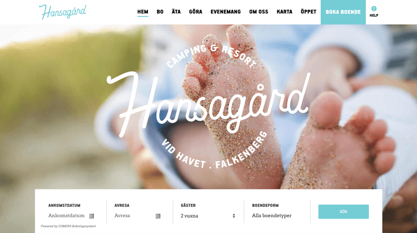
Hansagard camping and resort in Falkenberg is a perfect place to spend your vacation or weekend by the sea. From the camping place and up to cottages, Hansagard is a place to enjoy great food, events, and nature vibes.
Their website is a good example that advanced booking sites can rely on WordPress and website builders like Visual Composer.
Bagel Palace NY
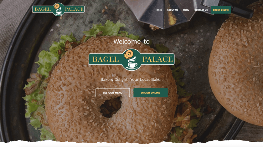
Bagel Palace is a bagel shop (no way, right?) in New York to enjoy awesome bagels with your family.
As we know, no Visual Composer showcase is complete without some food. We love bagels and we love how Bagel Palace uses Visual Composer to set up a custom-made website.
If you are in New York, make sure to visit them and say hi 😊
Afterwords
In this showcase, we've seen beautiful website examples made with Visual Composer.
Do you have a WordPress site build with our editor? Want to get featured on our site of the month showcases? Shoot us a message and let's inspire the web together.
Want to create your first WordPress website? We are here to help you out.

Amazing study and outstanding example, thanks for sharing
Hi, I’m using visual composer aswell for creating my gluten free recipe blog (in swedish).
I’m really pleased with it, thanks.
https://lagaglutenfritt.se
Hi Malin, thanks for sharing your website. Actually, we have people on our team who will find your recipes very valuable – thanks for that 🙂