A wedding is perhaps the most memorable event of one’s life, worth all the effort you and your loved one put into it. What better way to creatively announce and commemorate your union than with your very own wedding website?
Now, it might sound quite odd at first, but having a website prepped for your big day has many practical benefits.
For one, it will serve to keep everyone updated and you’ll be stress-free, at least for the organizing part.
Instead of having to answer endless messages from your guests who ask you wedding-related questions, with a wedding website they can get all their information from one single place, easily accessible to all guests no matter their location.
And two, it’s a great way to introduce you and your beloved to family members on both sides, letting you tell your story and share how you met for the benefit of your inquisitive aunts and uncles; nieces and nephews.
This article created by our team at Visual Composer will include a few wedding website examples where you can gather your information from, as well as share some tips that will help you put together your own site.
Read on to learn more.
Composing Your Website Sections – Tips
A wedding website is pretty different from a regular website in terms of how it is separated into sections. These are the essentials you should be aware of:
A Short Welcome Message
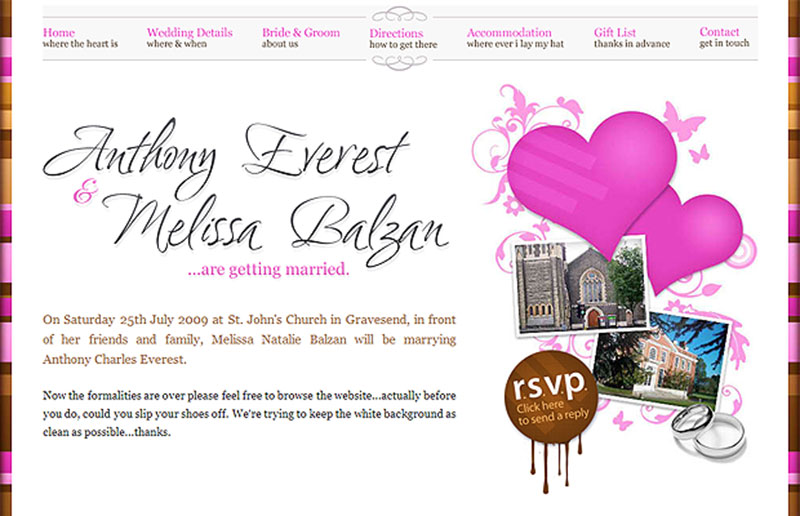
The welcome message is the most important part of your website. You should think of something unique, yet short, that can make people daydream about you and your loved one’s big day. Think of it as the text you would normally place on your wedding invitations.
The whole purpose of the welcome message on your wedding website is to build excitement. You can take a look at the wedding website examples later in this article to see how other couples incorporate their welcome message in the site’s design.
The “About Us” Page
Next, you’ll have to tweak the About Us page. When visiting normal websites, the About Us page is basically mandatory. The same goes for your wedding website, but – instead of the classic About Us page – you will include an Our Story page. This page is meant to narrate your love story and guide your guests through your shared ‘memory lane’.
Some of your guests might not know the complete story of how you two met or other aspects of your relationship that are worth sharing, so this is a nice way to bond with all of your guests, regardless of how much you’ve communicated with them in the past years.
Bridal Party Bio
This is a section that you will only see on wedding websites, as well as the one that we will present next. The bridal party bio refers to introducing each person that plays a huge role in your wedding.
It’s a great way to break the ice for the other guests and let them know who is going to be roaming around during your wedding.
Wedding Registry
Another section that is unique to wedding websites, the registry is optional. You can either make it public or keep it for the big day. Here you can include a brief thank-you message in advance for all the people who are going to bring gifts to your wedding.
Either way, it’s important to take into consideration that you’ll have to be sincere from the very beginning. Don’t try to make the big day seem something it isn’t through the virtual world. The site should accurately reflect how your wedding day will look.
Other Tips to Keep in Mind
Maintain the Theme
Once you’ve decided to use a specific theme, you’ll have to stick with it all the way. If you’re not a natural or a tech-savvy person, this might get tricky.
The good news is that you can use plugins like Visual Composer that lets you edit pages of your website with a drag-and-drop interface.
With easy-to-use tools like Visual Composer, there’s simply no excuse not to have fun with the layout and design of your wedding day theme, and it will be quicker to pull off than you expect.
Maintaining the theme gives your website unity and gives guests an idea of how your wedding itself will be themed.
Make the Website Entirely Public
If you’ve decided to create a public wedding website, you shouldn’t include details about events where not all the guests are invited. Keep those to yourself and publish the general information only.
As you may notice on other wedding website examples, no couples have included invite-only events on their page. It will make some guests feel excluded, and no bride or groom wants that.
Include Location Information
Most questions about a wedding are related to the venue, so you’d do well to include very clear information about your wedding’s location.
Include a map, a detailed description, some transportation ideas, and even accommodation ideas if you know that people from other cities or countries will attend your wedding.
Don’t forget to include your contact details as well.
Make the Timeline Visible
Create a timeline and use it to keep guests posted about how you’re organizing the wedding. Once you’ve set up the dress code, let the guests know by updating your site and sending them the link. The same goes for transportation details or anything that all your guests need to know before the big event.
Now that you know the basics of building a wedding website, it’s time to take a look at some of the best wedding website examples. You will be inspired by these for sure!
Wedding Website Examples for Inspiration
Amelia & Steve
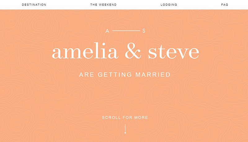
This is one of the best wedding websites out there. It is simple and clear, it’s not crowded with all sorts of elements and it respects its purpose – informing people about Amelia and Steve’s wedding.
The website is beautifully designed to fit the theme of the actual wedding, the information details included are relevant and concise, while the schedule of the celebration is very easy to access.
Ankush & Richa
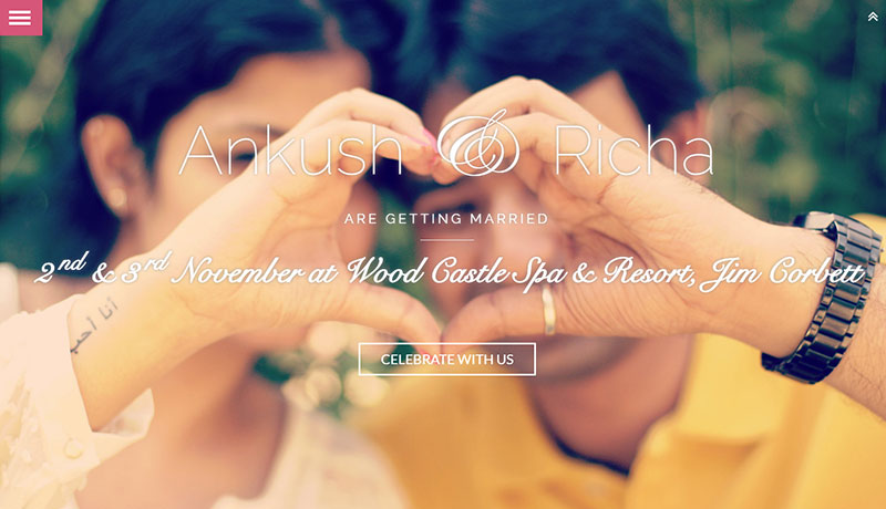
This is a single-page website that’s highly responsive and looks great at the same time. This wedding website is specific for an Indian couple – it is colorful, it is exotic, and it replaces the classic wedding invitation that borders on “cliche”.
The website has a unique detail to it that might also help other couples: separate buttons that redirect users to a different version of the website based on where the guests come from: e.g. either the groom or bride’s family.
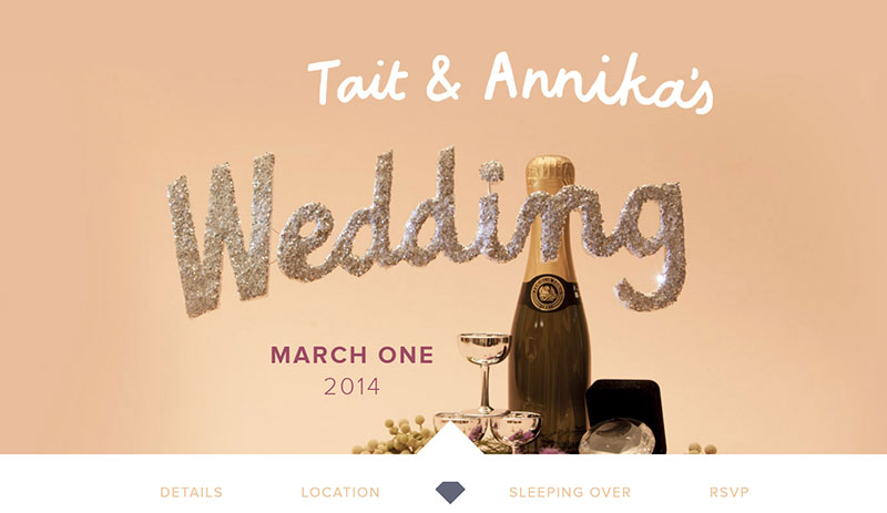
Tait & Annika
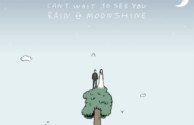
Tait and Annika’s website has certainly earned its place on this list. Out of these wedding website examples, this one impresses the most through its simple yet effective style. The whole website is built in a cartoonish manner and has humoristic elements designed to elicit smiles.
If you want to stand out from the crowd and make people remember your wedding, this is definitely an example to follow.
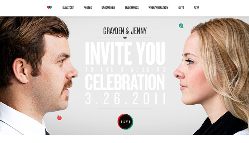
Jenny and Grayden
Jenny and Grayden had the most unique idea. Their wedding website is a funny one, as it includes bobblehead photos. Doesn’t it sound entertaining? Well, their introduction page is just as humorous and memorable, so they totally nailed the theme.
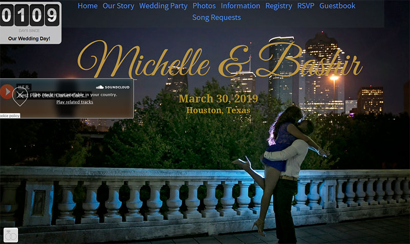
Michelle and Bashir
Passionate about music? Then you will love Michelle and Bashir’s wedding website. Guests can request songs that they want to be played at their wedding. Through a simple Soundcloud widget, they can create a complex playlist that will meet the preferences of all their guests.
A modern-day solution to an age-old problem!
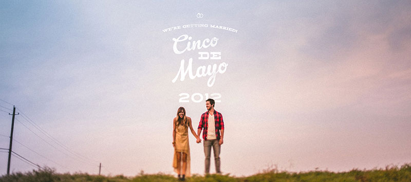
The Pittmans
Finally, the Pittmans chose a very simple website. They preferred to emphasize the idea of love, happiness and – ultimately – marriage. Everything about their wedding website is clean, clear, and simply beautiful.
They also included a short film regarding the moment when Courtney said “yes”.
Ending thoughts on these wedding website examples
The wedding website examples included here are all emotional and beautiful, so you will find at least one spark of inspiration among them. But don’t stop at copying some of their ideas, feel free to be creative and come up with your own.
Take your time to understand what makes you as a couple unique and integrate that into your wedding website. It will touch your guests and that’s the exact result you want to obtain!
If you enjoyed reading this article about wedding website examples, you should read these as well:

Just finished my website (www.soulseeker.ro) with visual composer. I love it!