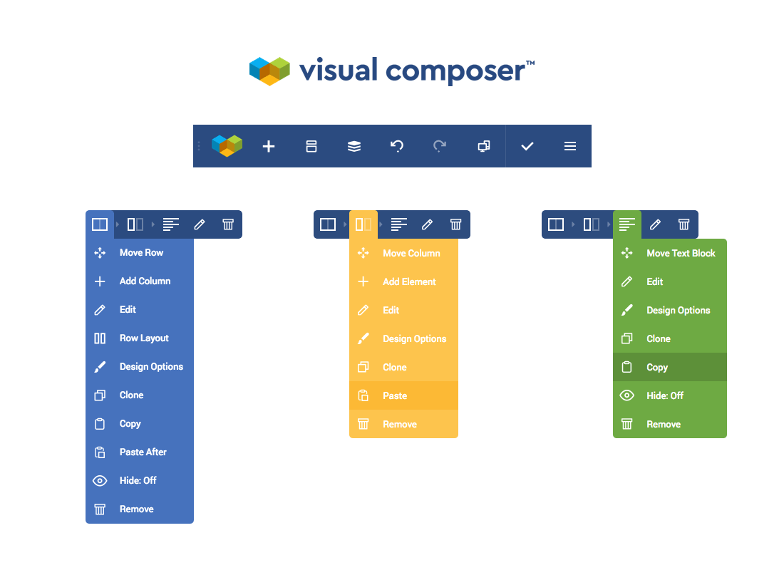
We are thrilled to share exciting news - Visual Composer has a new look.
As we continue our evolution into a robust WordPress website builder, we want Visual Composer brand to represent our vision and go hand in hand with the product development.

Since the release in 2011, Visual Composer has experienced a vast amount of changes that have been reflected throughout the brand. The public API and first ever WordPress frontend editor is just a few of them.

With the launch of the new website builder, Visual Composer brand requires a fresh look to represent the new era of design, development, and management of your WordPress site. These three cornerstones that lie at the heart of every successful website.
It also represents the core values of the Visual Composer team. Just like you, we work, learn, and have fun together to build our culture and make a common commitment. Like independent elements, we apply our unique skills and expertise to achieve common goals.

I'm excited to see how the new brand marks a new chapter of our company on its ongoing mission to unleash your potential of creating websites.
Thank you for being a part of our changes!

I think it’s great that you guys a focusing so much on the design aspect (and brand identity). I would say this is the biggest issue with WordPress add ons. Browsing through them the function is often there but the UI/UX isn’t. And as we all know. Looks are everything! (the things behind that is just suposed to work). As a user of your VC Premium I’m hoping that you continue to add more well designed functions. I would even pay for some of these add ons above the premium fee just to get the combination of looks and function. Right now there are som interesting add ons like Envira Gallery where the functions is good but the looks are terrible. I’ve been browsing their demo gallery and the UI/UX looks like something from 10 years ago. This isn’t OK 2019 when UI/UX is the most important thing. I might have a really nice designed website in VC but if add a gallery from Envira the whole first impression is in trouble. I’ts like buying a new car and adding crappy looking rims. Not OK. So if you have any say over these partners I would recommend you to highlight this.
/Cheers!
Hey there and thanks for the appreciation. Indeed, UX is a huge thing and we have significant plans to work towards that direction in the next upcoming months. As for Envira, will let them know about it 🙂