In its essence, a website can be reduced to a couple of big areas that first catch your eye. I'd say it's the text and the images. Those are the things that get attention and gives the first impression.
So the text is pretty important, right? In this guide, we'll look into typography that in the shortest possible explanation is the way your text will look. What will be the font? How to find the right one? What is the distance between the letters going to be? What are some good practices and what does the research say about this topic?
These are just some of the questions I'll answer in this guideline. Here's a quick walkthrough of the exact topics that'll be covered:
Table of Contents
Later, you can apply all this knowledge to change fonts in WordPress and make your site visually appealing.
Why does typography matter?
Typography has a great effect on your website in many different ways. It affects user experience, your brand identity as well as the overall look.
Let's take a closer look at some important aspects that typography can influence.
Branding
Typography is a big part of your branding. It's another way you can establish a specific style that in combination with other content elements, like a logo, the structure of your site, colors, can create a unique experience that will differentiate your website from others.
Set the mood
This is especially true for typefaces and fonts. There are fonts that just feel quirky and fun, while others feel serious and important. 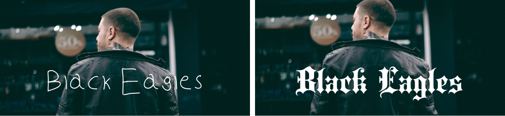
Allow scanning
With the number of websites we visit, it's clear that we don't read them all word by word. We scan the content. There's some research done, showing the patterns in which we view website most commonly. The main thing it shows is that it's important to use some sort of hierarchy. By using different fonts, we're in control of what we want the visitors to see, what is most important.
Typography terminology
Before going deep into the world of typography, it is important to know its language. In order for us to be on the same page, here is a handy list of terms that are important to know when thinking of the typography of a website.
Typography
We've touched on this already, but by definition, typography is the art and technique of arranging type to make written language readable and visually appealing. It refers to anything from the size of the letters, to the way letters are displayed on a page.
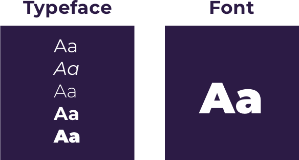
Typeface
A typeface is a term that is commonly used interchangeably with font, but that's not correct. A typeface is a group of characters that have the same design. Some popular typefaces are Arial, Georgia, and Helvetica.
Font
Fonts, on the other hand, are a part of the typeface, it's a specific style. If Arial is a typeface than Arial Bold is a font. The font consists of one specific point size, weight, width and other styling elements, like the italic style for example.
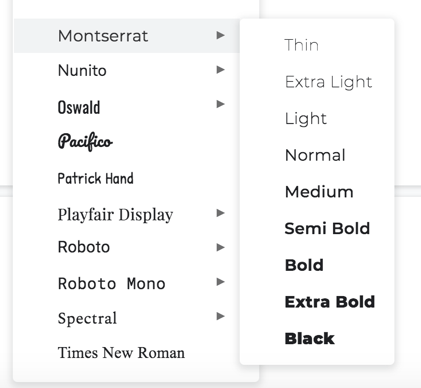
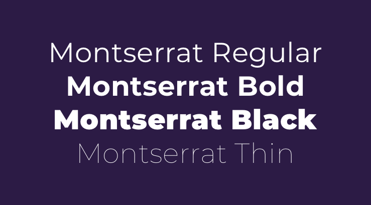
Font family
Font family is just the obvious - a group of fonts that are designed to use together. A good example would be the Montserrat font family - it consists of several weights, styles and more.
The richest and most popular font family library across the web is a Google Fonts library which consists of more than 800 free licensed font families. In Visual Composer, you have an option to add all Google Fonts to your website.
Weight
The weight of a font is the thickness of the strokes of the character. The weights are usually the following - thin, normal, bold, black and others depending on the font.
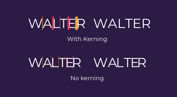
Kerning
Kerning is the horizontal space between two characters. This allows setting different sized spaces between letters in one word if needed. Depending on the word and font, it is a good practice to adjust the kerning manually, but usually, the kerning is set to the best looking version by default.
Tracking
Also referred to as letter spacing. Tracking adjusts spaces for the whole block of text while keening adjusts the space between two specific characters.
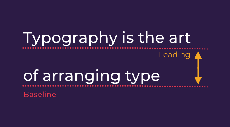
Leading
Leading is the space between the baselines (the bottom of the letters, like the line where they all are on).
Point (pt)
This is the most common way to represent the size of a font. It is the vertical distance of a font from the top to the very bottom of a letter. But it's the size of the whole font not a single letter. To give you a more detailed look - one point equals to 1/72 of an inch.

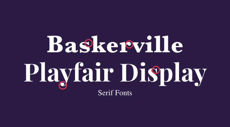
Serif
Serif is a styling element of characters that refers to the small embellishment finishing a stroke of a character.
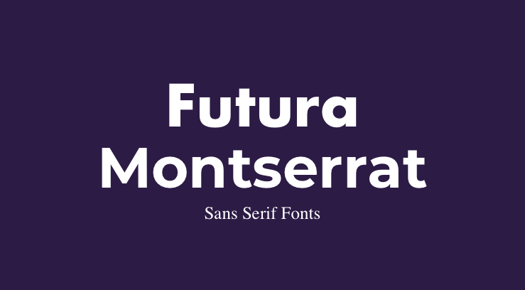
Sans serif
“Sans” in French means “without”, so sans serif would be a typeface without the ornaments.
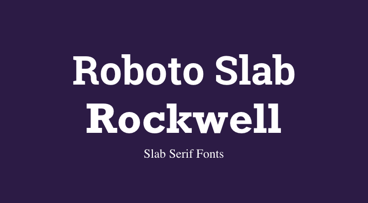
Slab Serif
This refers to a specific type of serif. Slab Serif is thick and block-like. Here are some examples.
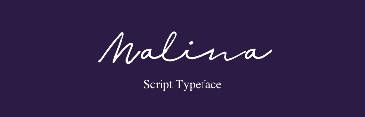
Script typeface
Script typefaces are meant to look like handwriting.
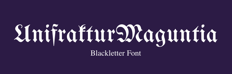
Blackletter
Blackletter typeface is also known as Gothic script, Gothic minuscule, Textura and sometimes as Old English. You can recognize this style by the varying thin and thick strokes, ornamental look, swirls and serifs.
Once you know and can identify these terms, you won't be able to look at text the same anymore. Or at least, you'll know what exactly is it that you are looking for. No more “big pretty letters”.
How to choose the right font
Let's say you have a copy of your page down. You probably have noticed that most websites will have more than one font in use. So at this point, you'll have some decisions to make.
What font shows is a feeling - what we feel when we see this font - what's the purpose and what's the mood. We want to sell a serious product or kids toys. So before choosing anything, let's look into fonts are perceived. This will be a big help when searching among the massive amount of typefaces and fonts available.
Font Psychology
There are a lot of fonts. A lot. No discussion there. One way to categorize them is from a psychological perspective or how people perceive them. It is common that we associate the font with the product or the message that we want to send to our site. I think that Nick Kolenda has put this in the best words:
“When an advertisement’s message, image, and typeface posit the same connotation, the ad should bring an intended response from the audience. This means that a consonant matching between typeface and its connotative meaning to message and image can influence individuals’ responses and attitudes.”
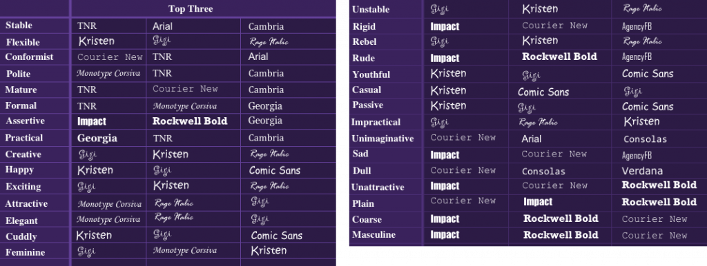
There's a study that had people pair up fonts with personality traits like stable, flexible, casual, feminine, rude, etc. There were some interesting findings. While “Arial” was perceived as stable, it was also seen as “unimaginative”.
But this study was conducted more than 10 years ago. So for a more recent font and character test, there was an analysis made by Venngage looking at fonts used in Netflix show posters and how they reflect what the show is about or what message it wants to send. They categorized the fonts into six types and described their characteristics:
- Serif - traditional, respectable
- Sans Serif - minimalistic, straight forward
- Decorative - quirky, fun
- Headline - bold, dramatic
- Handwritten - personal, fancy
- Modern - efficient, forward-thinking
The most used was serif fonts, so they were used in shows that need to evoke nostalgia, authority, and stability with the traditional and respectable tone of the serif fonts.
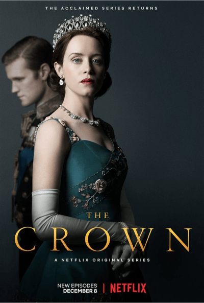
As an example, the show The Crown is a period drama and that's what the font choice suggests. This study can really give you an insight into how much the fonts we use influence. Let's dig even deeper into the feelings that specific types of fonts can evoke in your visitors, so you can send the right message across. Although there is a lot of research out there and you could analyze every single little thing, I'll show you the general idea of how fonts are perceived. There's a great infographic by Crazy Egg. It illustrates what feelings, emotions and associations font types evoke.
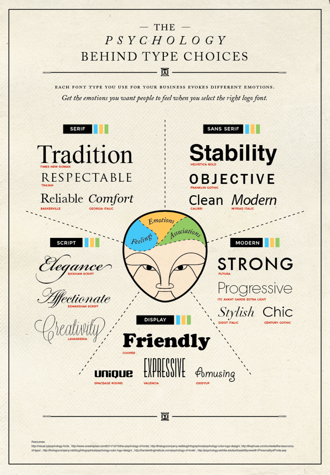
It is really similar to the previous studies. Each font type has a different feeling associated with it. So by choosing a font type, you automatically set the mood of the site and let the visitors know how you want them to feel and perceive your brand. Other facts:
- Round vs Angular
Round fonts are effective if you want to convey softness, comfort, femininity, beauty and it's also shown to be effective for domains related to sweet foods. Angular fonts are effective for formal and official texts, convey masculinity and durability, and are effective for bitter, salty, or sour food-related domains.
- Slanted vs Straight
Slanted fonts convey movement and speed while straight fonts send the message of stability and durability.
- Lowercase vs Uppercase
Lowercase is effective for a brand that promotes compassion, altruism, self-expression. As this study suggests, they are the “caregiver” brands (L’Oréal, Nivea, Starbucks, and Volvo). The same study shows that capital letters are effective for “hero” brands (BMW, Diesel, Nike, and Sony), that convey discipline and focus.
- Condensed vs Extended
Condensed letters give a feeling of efficiency, as they are precise and economical in space, as you can pack more information. They can also feel cramped and restrictive. Wide typefaces, on the other hand, give a relaxed feeling and are seen in a positive light.
Headings
It is common to have at least 2 fonts. So, what types of texts should have different fonts? Usually, you'll have to choose a different font for the headings and body. Let's dive deeper into the headings and their importance, so you know what to accentuate and what can take a step back. You can recognize headings by the tags H1; H2; H3 and so on. Usually, as the number of the heading gets bigger, the font gets smaller. You'll need to know this when working with WordPress, or actually with most editors where you write text.
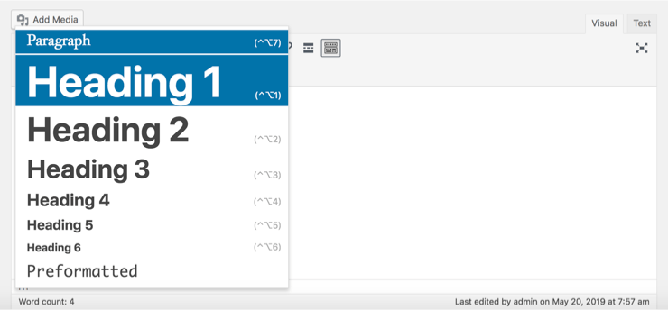
You might think - I can just increase the size and change the font manually, why is this necessary? And it's simple. In short, heading tags are crucial for SEO, they inform search engines what your page is about. As well as give your readers are structured and easy-to-read page. This is what each heading is usually used for:
- H1 is most commonly used for page titles. There should be only one H1 heading per page
- H2 and H3 will usually be sections of the page, that indicate different topics
- H4-H* will be lower in the section hierarchy
- Paragraph is the text that goes under the headings (just so everything's crystal clear)
Once that's out of the way, there are some bigger aspects to figure out.
Typeface
Typeface might be the biggest decision of the bunch as there are so many to choose from. But know you can start by narrowing the lost down by choosing a font based on the font psychology. Another factor could be the number of font styles. If a typeface has a good amount of font styles, you'll have some flexibility. When that is done, you can start looking around. You should think of three things at this stage:
- Will I use a free font? If so, already mentioned Google Fonts are a good option as there are around 800 typefaces to choose from
- Will I pay for a font? If so, you can choose a font that's not so commonly used and are more original. Fonts.com is a great look at as it has a huge library
- Will I use a custom font? If so, you can create your own typeface that no one else has. This is great for brand recognition as your font will be associated with your brand only. As of Netflix, for example, who created its own Netflix Sans font. You can use a platform like FontStruct where you can build and share your own fonts
Now you can start to look for specific typefaces and just try them out. There are some tools that let you easily pair up fonts and see how they look together.
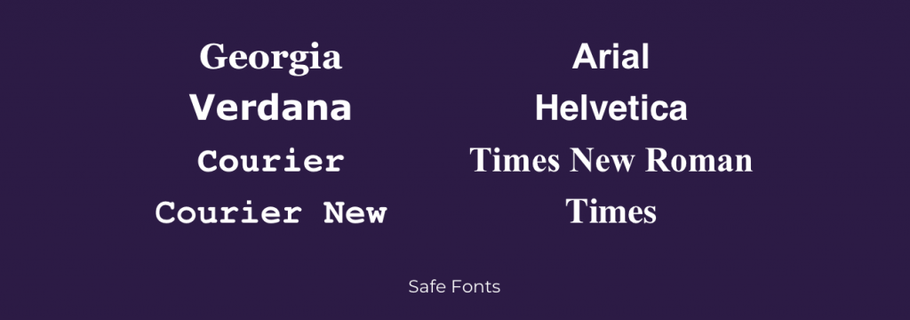
Safe Fonts
Another thing to keep in mind is that each device comes with pre-installed font selection. Therefore it's possible that your fonts will not be available for some devices and then all your hard work goes to waste. Here's a list of some fonts that are considered to be safe (Arial; Helvetica; Times New Roman; Times; Georgia; Verdana; Courier):
Font Pairing
It is not uncommon that there will be more than one font in use on a page. But it might be a hassle to find the ones that match. They have to be similar enough to look good together, but not so different that they look like a part of separate designs. A good rule is not to go over 3 typefaces. These are the things you can think about when combining fonts:
- Try to find some similarities in the fonts. Look for a common feature, that might bring them together
- Assign roles to each font, so that they are consistent throughout the layout. One can be for the headers, second for body text. This will create a nice hierarchy
- Pair decorative fonts with more neutral fonts. If you choose two extravagant fonts, the readability of your page might be significantly worse. Reserve the decorative fonts for headers and titles, and use something simple for the body
- Try fonts by the same author. It's common that they have created multiple fonts in a similar style
- You can use multiple fonts from one typeface and that can save you a lot of valuable time. Bold font for headers, light or regular for the body
If that doesn't help, but you are determined to use more than one font, there are tools and resources that can help. Like fontpair.co, for example, shows some popular Google font pairings. You can also search for a specific font and it will show some pairing to choose from.
How to choose a font size
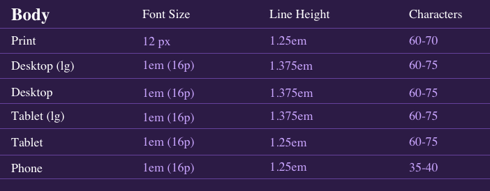
As much as building a website can be based all on your creativeness, there are some things that work, so obviously are used very often. We tend to notice the font size only if it's too small or too big. If not - we certainly do notice if something's off. It all comes down to readability - we want to ensure that the visitor won't have a hard time reading through the page. When we want to tell people about our service or product, we want to tell as much as possible, so it's likely that we make the font size smaller, just to make everything fit. But this might get the opposite of what we want to achieve. So the general thing to consider is to go bigger. This is especially important for mobile devices. A smaller screen needs extra attention to readability. A font size might look good on a huge desktop, but it will be way too small for a tiny mobile screen. Typecast has created this great cheat sheet of body, header, and blockquote font sizes, line heights, and characters for most devices. These are general recommendations for maximum readability.
This illustrates the importance of varying sizes for devices. Always make sure to test out your font sizes. There's a good test to try when choosing a font size for a longer text. Take a book and hold it in a comfortable reading level and line that up with your screen. The font size should match up with the letters in the book.
Typography and mobile devices
There's no way of denying that we're on our phones all the time - reading, chatting, browsing, scrolling, and everything in between. So at this point, it's a necessity to make your website responsive. This might seem like an annoying thing to think about. You've already created a website and now you have to look at it from another angle and adjust it for a whole new set of screens. Take full control over your site typography and responsiveness!
Discover Complete Freedom
Have full control over your website typography with a Visual Composer free version.
"*" indicates required fields
By entering your email, you agree to our Terms of Service and Privacy Policy.
It always comes down to what kind of website you are creating. 8 in 10 Americans shop online and 51% of them have bought something using a cellphone. And it is predicted that in five years the number of smartphone users will grow by one billion. So there's no escape. People will use their mobile devices.
The data speaks for itself, we have to think about responsiveness. And when it comes to typography, there are many factors to think about - size, color, even the amount of text, the font, etc.
What to take into consideration:
- Size plays a big role here. Remember we talked about going bigger with the font size before. This is the time when it's important to get it “just right” not go too big and definitely not too small. Let me demonstrate. Here are three mobile views on the same website.
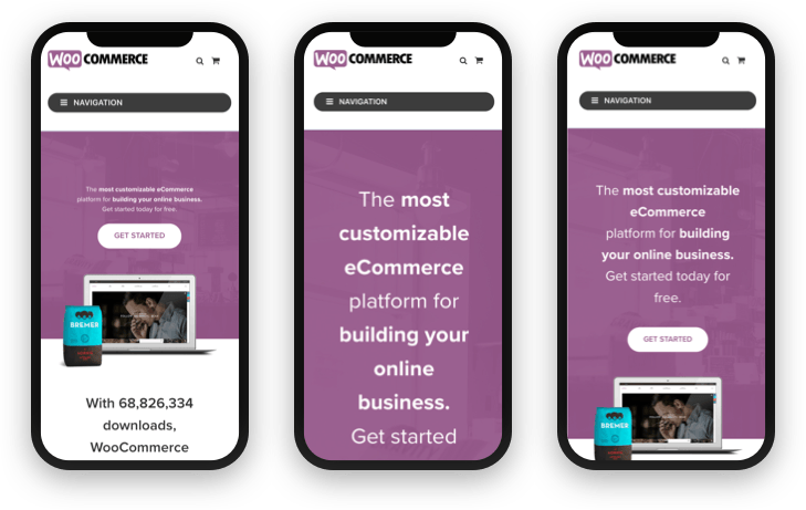
The size of the text for the first phone is 12px, 40px for the second, and 26px for the third.
It's clear that the third one fits just right, the first screen shows just the hero section, it's not missing any words and not adding anything too much. While the first one would be difficult to read.
- Color contrast is an element to keep in mind at all times, but it's especially important on mobile devices as we tend to be in difficult lighting with a mobile device a lot more. There are people working outside with their laptops, but mostly it's our phone screens that we can't keep our eyes off.
So a good contrast is crucial to be able to see what's on the page. There are tools like Contrast Checker by WebAIM that lets you know if the contrast between your foreground color and your background color is big enough.
- Line length in another thing to keep in mind. The line length on a desktop will be bigger than that of a mobile screen. The common recommendation is 30-40 characters per line or just below 50 characters.
Tracking is one way to control the line length without adding extra characters. - Fewer levels of hierarchy are recommended for mobile devices to make the design less complex and easier to look at a small screen.
Smaller screens, shorter sessions, the environment the visitor is in when looking at your page - all are things to consider.
More types of fonts
Because of the abundance of fonts available, let's take a look at some of the most popular font types and specific fonts you can try. Note: Make sure to check the licensing for these fonts. If it's free, it doesn't always mean you can use them commercially.
Hipster fonts
As overused and silly the term hipster seems now, it still has some meaning attached to it. Hipster fonts are mostly free-flowing, creative but simple, trendy yet have a vintage kind of feel, modern and folk. This broad selection of adjectives is what I look for in a hipster font. Not to stereotype, but you might see these fonts on craft beers and their websites as well as some trendy bicycle sites.


Christmas Fonts
When Christmas comes around, you might need to find an appropriate font to share your holiday cheer. It can be a special holiday landing page, a Christmas card or anything else holiday related. Here are some fun holiday fonts.


Tattoo fonts
Ink your site with these cool tattoo style fonts. They are usually great for titles and headers. Because of their decorative nature, maybe skip these for the body text, as a little goes a long way here.


Lettering fonts
Calligraphy is a delicate art form and can look beautiful on a website. So here are some calligraphy fonts that can bring elegance to your design.


Cursive fonts
These are also known as script fonts and very popular. They resemble handwriting, so they bring personal and familiar feel to the page.


Kids fonts
If you're making a website for kids, you will need the right amount of fun, quirkiness, and lightness in the design. So here are some really cool fonts you can use for children's websites.


Fancy fonts
If the feeling you want your visitors to feel when they visit your website is - Wow, this feels so sophisticated, expensive, exclusive and … fancy! Or it's a special occasion that you're creating a website for. These are the fonts that might help achieve that.


This should help or at least give you some inspiration for what is the font that you want to use.
Conclusion
Typography has a big impact on your site and there's no doubt about it. And if you know what you're doing (by this point you should be some sort of a master), it is also a way you can influence how a visitor will feel when on your site and what they're going to do. So in short, make sure to take typography seriously and apply the best practices.
Discover Complete Freedom
Have full control over your website typography with a Visual Composer free version.
"*" indicates required fields
By entering your email, you agree to our Terms of Service and Privacy Policy.

It was fab, thanks a lot for sharing.
just an fyi – typeface and font are muddled up on your diagram