Visual Composer Website Builder is a powerful drag-and-drop website builder for WordPress with tons of features and customization options that help design and create a website easily and effortlessly. Visual Composer features premium templates, elements, and extensions to help you create a professional website.
Visual Composer Website Builder has an API that allows anyone to develop custom elements for their site. This option opens up a lot of possibilities, so here are the main benefits of creating custom elements:
- You are in charge of the element fully - from the design to the functionality;
- You can create unique designs and work on custom projects;
- API allows creating add-ons and in return earning some money;
- You can integrate Visual Composer into your themes and include your custom elements.
We’re going to cover step-by-step instructions that will help you to create your own custom element.
This article contains:
- Getting started
- Knowledge - skills, and technologies;
- Dev Environment - environment you need to have in order to build elements;
- Requirements - server requirements in order to set up a dev environment;
- Code Editor - code editor suggestions;
- Terminal - superficial mention of a terminal;
- Install example plugin - walkthrough example plugin installation;
- Edit example plugin - walkthrough example plugin editing.
- Development
- Element - explanation of what is a Visual Composer element;
- File Structure - example and explanation of the file structure;
- Code - code examples with explanations;
- Building an element - example of how to build an element for preview;
- Testing an element - an example of how to test an element.
Getting started
There are a few things you’ll need to take into account before start creating your first custom element.
Knowledge
In order to start developing an element, you should be familiar with the following technologies and skills.
- WordPress;
- HTML (JSX);
- CSS;
- JavaScript (ReactJS);
- PHP;
- Webpack;
- Yarn;
- Terminal.
Dev Environment
Since you’ll be developing an element for the Visual Composer plugin, you’ll need a local server with the latest WordPress installation on it and a Free or Premium version of the Visual Composer Website Builder plugin installed.
Requirements
To start developing custom Visual Composer elements following technical requirements should be met:
- Node 8.0 or higher (recommended latest) installed;
- PHP 5.4 or higher (recommended latest) installed.
For more information, visit Visual Composer Server requirements.
Code Editor
For the ease of editing, we recommend that you use special code editing tools, however, you can use any code editor or IDE that you find useful. Here is the list of some of the popular free code editors:
Terminal
Since we’ll be running terminal commands to build our element, you should be familiar with working with the terminal. MAC OS and Linux have built-in terminals. If you’re using Windows we recommend using the ConEmy console emulator. Also, some code editors and IDEs have built-in terminals.
Install example plugin
To make it easier for you, we’ve created an example plugin, that you can install and play around with. Follow the steps to install it and check if it works:
- Download, install, and activate the example plugin like you would any other WordPress plugin;
- Create a page with Visual Composer;
- Once in the editor, open Add Element panel and you should see a Text Test element appear;
- Hover over this element and you should see an Add-on tag on the preview image;
- Try adding the Text Test element to a page.
Edit example plugin files
Now that you’ve installed the plugin and checked that it works, you can make changes to it to get acquainted with the code and the element file structure.
- Locate example plugin folder in your WordPress installation under wp-content/plugins/;
- Open it in the code editor;
- You’ll see an elements folder inside the plugin folder;
- The elements folder contains three example elements;
- Each element has a specific structure;
- In order to see an element or to see the changes made to an element you have to build it;
- Run yarn install and yarn build commands inside the element folder to build an element;
- Use the yarn watch command to watch changes made to an element.
Once you’ve made the changes to an element and built it, refresh the editor page and try adding the element again.
Development
"To get started, you need to understand how the Visual Composer Website Builder Editor works. The Editor is WYSIWYG module based editor which has inner and public API to manage elements and components. The editor works with elements as React components. These components must be built with Webpack and enqueued via API hooks (WordPress actions)."
For this example, we’re going to create the Banner Element, that you can find in Visual Composer Hub.
Element
“The Visual Composer element is an independent component of the system which represents HTML based block with the ability to output media and dynamic content. Visual Composer offers a wide range of pre-defined content elements which can be downloaded from the Visual Composer Hub. Visual Composer API allows extending the list with your own elements – these elements will not be available in the Hub but will be instantly displayed in the ‘Add Element’ window.”
The Banner Element will allow a user to add images with links and display a random image every time the page loads. This element will include and have the ability to:
- Add images;
- Add links to images;
- Set image size;
- Set image alignment;
- Add custom class name and id;
- Design options.
File Structure
To create custom element we’re going to use element boilerplate as a base for our element.
There are certain files required to build element:
- manifest.json – describes element data, preview, thumbnail, description, category, and PHP files;
- package.json – npm install/update files for required node modules;
- Directory {tag}*:
- cssMixins directory – cssMixin.pcss: a POST CSS file that holds mixin for custom generated style;
- public directory – may contain custom CSS, JS, and images for public view
- index.js – the main file, build with Webpack;
- component.js – ReactJs component contains Visual Composer Editor component. This component is used only in the editor;
- settings.json – describes element attributes;
- *.php files – required PHP files (must be described in ../manifest.json);
- editor.css – CSS files which will be used only in the editor;
- style.css – CSS files which will be used on the frontend to display content.
Just like for the example plugin we need to create our plugin's new folder under the wp-content/plugins/ folder, let’s name it banner-element.
Inside the banner-element folder, we need to create an index.php file of our plugin. Next, we need to create an elements folder which will store plugins elements. Then we download the element boilerplate zip file and extract it to the elements folder. Rename vcwb-element-boilerplate to bannerElement.
NOTE: folder name bannerElement will act as a tag name for our element and will be used throughout the code.
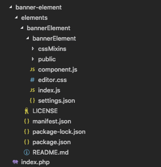
In the end, the structure will look like this:
Code
index.php file
First, let’s edit the index.php file.
We add a comment describing our plugin. Next a generic code to prevent the access to the index.php file. Then we’ll use the following hook for API calls. This is the code from the example plugin. Now we need to change the element name in the $elementsToRegister array, so the complete code will look as follows:
<?php
/**
 Plugin Name: Banner Element
 Plugin URI: https://visualcomposer.com
 Description: Add image banners to your page that will load randomly - only one banner will be loaded at the time.
 Version: 1.0
 Author: Visual Composer
 Author URI: https://visualcomposer.com
 */

 // don't load directly
 if (!defined('ABSPATH')) {
   die('-1');
 }
 add_action(
 /**
  * @param $api \VisualComposer\Modules\Api\Factory
  */
    'vcv:api',
    function ($api) {
      $elementsToRegister = [
        'bannerElement',
      ];
      $pluginBaseUrl = rtrim(plugins_url(basename(__DIR__)), '\\/');
      /** @var \VisualComposer\Modules\Elements\ApiController $elementsApi */
      $elementsApi = $api->elements;
      foreach ($elementsToRegister as $tag) {
        $manifestPath = __DIR__ . '/elements/' . $tag . '/manifest.json';
        $elementBaseUrl = $pluginBaseUrl . '/elements/' . $tag;
        $elementsApi->add($manifestPath, $elementBaseUrl);
      }
    }
);
Once this is done, a new plugin should appear in the plugins page in WordPress dashboard.

Next, we need to edit folder and files in the element boilerplate. We’ve already renamed the vcwb-element-boilerplate folder and the same name nested folder to bannerElement. So the structure looks like:

Inside bannerElement folder there’s another bannerElement folder which contains element files and folders. Let’s manage those.
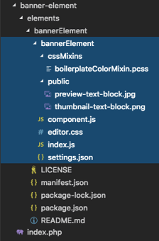
For this element we won’t use any cssMixins, so we can delete the cssMixins folder. The public folder will contain styles, scripts, and images, so let’s change the default images. We’ll need new preview and thumbnail images for our element.
Thumbnail:

Preview:

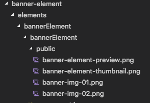
Also, we’ll need a couple of default images to go.


So now the public folder will look like this.
manifest.json file
The manifest.json file describes element data, preview and thumbnail images, element category and PHP files. We need to specify element tag - bannerElement, which is the first property of the elements object. Element name will be - “Banner Element” and it goes under “name” property, and the description will be - “Add image banners to your page that will load randomly - only one banner will be loaded at the time.” and it goes under “metaDescription” property. The category will be “Misc”. You can find more about categories in the official API docs. In the end, the manifest.json file will look like this:
{
 "elements": {
   "bannerElement": {
     "settings": {
       "name": "Banner Element",
       "metaThumbnailUrl": "[publicPath]/banner-element-thumbnail.png",
       "metaPreviewUrl": "[publicPath]/banner-element-preview.png",
       "metaDescription": "Add image banners to your page that will load randomly - only one banner will be loaded at the time."
     }
   }
 },
 "categories": {
   "Misc": {
     "elements": [
       "bannerElement"
     ]
   }
 }
}
settings.json file
Now let’s get to visualizing our element. First, we need to specify what kind of settings element will have. For this, we’ll edit the settings.json file. In settings.json file data stored in an object, each object property is an attribute. You can get acquainted with all the possible attributes and attribute options in the API docs.
It’s a good practice to start with a tag attribute so that when you open a file you recognize the element right away. Next, we’ll specify the relatedTo attribute, which defines the relationship to drag and drop groups, we’ll set it equal to General. Note that they’re both protected attributes, so it means they are not accessible within an element.
"tag": {
  "access": "protected",
  "type": "string",
  "value": "bannerElement"
},
"relatedTo": {
  "type": "group",
  "access": "protected",
  "value": [
    "General"
  ]
},
The following attribute names speak for themselves:
- images will use attachimage type attribute with label, description, multiple, and url options;
- size will use string type attribute with label, description options;
- alignment will use buttonGroup type attribute with label, values options;
- customClass will use string type attribute with label, description options;
- metaCustomID will use string type attribute with label, description options;
- designOptions will use string type attribute with label option;
Then, we specify the order of the attributes in the Edit Form panel of the element in the editFormTab1 attribute. Specify the order of sections (in this case section are represented by editFormTab1 and designOptions attributes) in the Edit Form panel of the element in the metaEditFormTabs attribute. Note that these two attributes are also protected.
"editFormTab1": {
   "type": "group",
   "access": "protected",
   "value": [
     "images",
     "size",
     "alignment",
     "metaCustomId",
     "customClass"
   ],
   "options": {
     "label": "General"
   }
 },
 "metaEditFormTabs": {
   "type": "group",
   "access": "protected",
   "value": [
     "editFormTab1",
     "designOptions"
   ]
 },
Lastly, we need to specify the path to our custom JS file that will be loaded only on View Page (public page). The metaPublicJs attribute will handle this. Note this attribute is also protected.
"metaPublicJs": {
  "access": "protected",
  "type": "string",
  "value": {
    "libraries": [
      {
        "libPaths": [
          "public/dist/bannerElement.min.js"
        ]
      }
    ]
  }
}
So, in the end, our settings.json file will look like this:
{
 "tag": {
   "access": "protected",
   "type": "string",
   "value": "bannerElement"
 },
 "relatedTo": {
   "type": "group",
   "access": "protected",
   "value": [
     "General"
   ]
 },
 "images": {
   "type": "attachimage",
   "access": "public",
   "value": [
     "banner-img-01.png",
     "banner-img-02.png"
   ],
   "options": {
     "label": "Images",
     "description": "Only one image will be loaded at the time.",
     "multiple": true,
     "url": true
   }
 },
 "size": {
   "type": "string",
   "access": "public",
   "value": "full",
   "options": {
     "label": "Size",
     "description": "Enter image size (Example: 'thumbnail', 'medium', 'large', 'full' or other sizes defined by theme). Alternatively enter size in pixels (Example: 200x100 (Width x Height))."
   }
 },
 "alignment": {
   "type": "buttonGroup",
   "access": "public",
   "value": "left",
   "options": {
     "label": "Alignment",
     "values": [
       {
         "label": "Left",
         "value": "left",
         "icon": "vcv-ui-icon-attribute-alignment-left"
       },
       {
         "label": "Center",
         "value": "center",
         "icon": "vcv-ui-icon-attribute-alignment-center"
       },
       {
         "label": "Right",
         "value": "right",
         "icon": "vcv-ui-icon-attribute-alignment-right"
       }
     ]
   }
 },
 "customClass": {
   "type": "string",
   "access": "public",
   "value": "",
   "options": {
     "label": "Extra class name",
     "description": "Add an extra class name to the element and refer to it from Custom CSS option."
   }
 },
 "metaCustomId": {
   "type": "customId",
   "access": "public",
   "value": "",
   "options": {
     "label": "Element ID",
     "description": "Apply unique Id to element to link directly to it by using #your_id (for element id use lowercase input only)."
   }
 },
 "designOptions": {
   "type": "designOptions",
   "access": "public",
   "value": {},
   "options": {
     "label": "Design Options"
   }
 },
 "editFormTab1": {
   "type": "group",
   "access": "protected",
   "value": [
     "images",
     "size",
     "alignment",
     "metaCustomId",
     "customClass"
   ],
   "options": {
     "label": "General"
   }
 },
 "metaEditFormTabs": {
   "type": "group",
   "access": "protected",
   "value": [
     "editFormTab1",
     "designOptions"
   ]
 },
 "metaPublicJs": {
   "access": "protected",
   "type": "string",
   "value": {
     "libraries": [
       {
         "libPaths": [
           "public/dist/bannerElement.min.js"
         ]
       }
     ]
   }
 }
}
Note: The order of the attributes doesn’t matter, we just showed you how we do it.
index.js file
This is the main JS file where we include settings.json, component.js file and CSS files. We start off by importing vcCake library, for now, all you need to know about it is that it will handle communication between the modules in the Visual Composer system with the help of services and storages. Right after that, we import our element BannerElement component class.
import vcCake from 'vc-cake'
import BannerElement from './component'
Then we define vcvAddElement which will add our element to the system.
const vcvAddElement = vcCake.getService('cook').addAnd pass several arguments to it, like settings.json, imported element component, and CSS files.
For CSS there are three available properties css, editorCss, and cssMixins.
- css property specifies the main CSS file with element styles;
- editorCss property specifies the CSS file which will be loaded only in the editor;
- cssMixins property can specify one or multiple POST CSS files which will be used by the system to generate element styles.
For our element, we will only need css and editorCss properties.
So in the end, we get:
import vcCake from 'vc-cake'
import BannerElement from './component'

const vcvAddElement = vcCake.getService('cook').add

vcvAddElement(
 require('./settings.json'),
 // Component callback
 (component) => {
   component.add(BannerElement)
 },
 // css settings // css for element
 {
   'css': require('raw-loader!./styles.css'),
   'editorCss': require('raw-loader!./editor.css')
 }
)
component.js file
This file is the React component and contains element class. Every JS code we write here will run only in the editor.
We will be using ES6 syntax to write code, it will be transpiled by Babel. We recommend using code style tools to keep your code properly formatted and avoid bugs. For our projects, we use the Standard tool.
Here we also import vcCake library in the beginning along with React library.
import React from 'react'
import vcCake from 'vc-cake'
Define two vcCake services: vcvApi and renderProcessor.
const vcvAPI = vcCake.getService('api')
const renderProcessor = vcCake.getService('renderProcessor')
You’ll be using vcvAPI for element component all of the time, while renderProcessor is quite a unique service and is used in just a few elements. As the name states, it is used to render HTML, asynchronously. We will use it to render images in the editor since we need to have the ability to frequently change image sizes.
Then we create our BannerElement class by extending vcvAPI.elementComponent. It will contain a lot of custom code, mostly related to rendering images in the editor.
export default class BannerElement extends vcvAPI.elementComponent {
  ...
}
The render is the React class method where you’ll be writing most of your code for the most part. If you’re not familiar with React, this method will return a markup for the element. Here we can get the values of the element attributes, make decisions based on conditions, define classes for CSS and write markup in JSX.
The first thing we do is destruct this.props object to get the id, atts and editor variables.
- id is the unique ID of the element and is used to recognize the element by the system;
- atts is the attributes of the element, the ones that are set in settings.json file;
- editor object holds data attributes necessary for the editor (for drag and drop).
const { id, atts, editor } = this.propsWe also destruct the atts prop to get the attribute values.
const { images, size, alignment, metaCustomId, customClass } = attsDefine variables for classes and custom props (like custom element ID).
let containerClasses = 'vce-banner-element-container vce'
let bannerClasses = 'vce-banner-element'
let linkClasses = 'vce-banner-element-link'
let imageClasses = 'vce-banner-element-image'
let bannerProps = {}
let customImageProps = {}
Based on the value of the attributes we add classes and props.
if (alignment) {
  containerClasses += ` vce-banner-element--align-${alignment}`
}

if (typeof customClass === 'string' && customClass) {
  containerClasses += ` ${customClass}`
}

if (metaCustomId) {
  bannerProps.id = metaCustomId
}
We then map our images into an array of elements and store in the variable. We define CustomTag variable and set it equal to span tag to further check whether an image has a URL selected if so, we change it to an anchor tag.
imgSrc variable is equal to an element built-in method getImageUrl that returns a string with a path to an image.
All of our images will be rendered, this needs to be done because the size of the image can be calculated once it is in the DOM. For this, we will use a helper element with a class of vcvhelper. Since only one image needs to be displayed we will hide the rest images with CSS.
let Images = images.map((image, index) => {
  let CustomTag = 'span'
  let customProps = {}
  const imageProperty = `image-${index}`
  const imgSrc = this.getImageUrl(image)
  customImageProps[ 'data-img-src' ] = imgSrc
  customImageProps[ 'alt' ] = image && image.alt ? image.alt : ''
  customImageProps[ 'title' ] = image && image.title ? image.title : ''

  if (image && typeof image === 'object' && image.constructor === Object && image.link) {
    let { url, title, targetBlank, relNofollow } = image.link
    CustomTag = 'a'
    customProps = {
      'href': url,
      'title': title,
      'target': targetBlank ? '_blank' : undefined,
      'rel': relNofollow ? 'nofollow' : undefined
    }
  }

  customProps.key = `customProps:${id}-${imgSrc}-${size}`

  const shortcodeOptions = {
    props: customImageProps,
    classes: imageClasses,
    isDefaultImage: !(image && image.id),
    src: imgSrc
  }

  return (
    <CustomTag className={linkClasses} {...customProps} key={`vce-banner-element-image-${index}-${id}`}>
      <span
        className={`${imageClasses} vcvhelper`}
        {...customImageProps}
        data-vcvs-html={this.getImageShortcode(shortcodeOptions, imageProperty)}
      >
        <canvas data-image-property={imageProperty} />
      </span>
    </CustomTag>
  )
})
It’s important to understand that the editor property (that we assigned to a variable) should be set on the element's outermost container. We do it by using the spread operator.
It is recommended to set the id attribute with the id property on the outermost container as well, however, that is not always mandatory. For this element, we will set it on the main container.
To get the Design Options we use another element build-in method this.applyDO(‘all’). It accepts a string argument that may contain different data. We will store it in a variable and use the string ‘all’ argument to get all of the Design Options attributes.
const doAll = this.applyDO('all')We then use the spread operator to assign them to a div tag with bannerClasses.
In the end, the whole completed component will look as follows:
import React from 'react'
import vcCake from 'vc-cake'
import { isEqual } from 'lodash'

const vcvAPI = vcCake.getService('api')
const renderProcessor = vcCake.getService('renderProcessor')

export default class BannerElement extends vcvAPI.elementComponent {
  promise = null
  canvases = {}

  static drawImageProp (ctx, img, x, y, w, h, offsetX, offsetY) {
    if (arguments.length === 2) {
      x = y = 0
      w = ctx.canvas.width
      h = ctx.canvas.height
    }

    // default offset is center
    offsetX = typeof offsetX === 'number' ? offsetX : 0.5
    offsetY = typeof offsetY === 'number' ? offsetY : 0.5

    // keep bounds [0.0, 1.0]
    if (offsetX < 0) {
      offsetX = 0
    }
    if (offsetY < 0) {
      offsetY = 0
    }
    if (offsetX > 1) {
      offsetX = 1
    }
    if (offsetY > 1) {
      offsetY = 1
    }

    let iw = img.width
    let ih = img.height
    let r = Math.min(w / iw, h / ih)
    let nw = iw * r // new prop. width
    let nh = ih * r // new prop. height
    let cx
    let cy
    let cw
    let ch
    let ar = 1

    // decide which gap to fill
    if (Math.round(nw) < w) {
      ar = w / nw
    }
    if (Math.round(nh) < h) {
      ar = h / nh
    }

    nw *= ar
    nh *= ar

    // calc source rectangle
    cw = iw / (nw / w)
    ch = ih / (nh / h)

    cx = (iw - cw) * offsetX
    cy = (ih - ch) * offsetY

    // make sure source rectangle is valid
    if (cx < 0) {
      cx = 0
    }
    if (cy < 0) {
      cy = 0
    }
    if (cw > iw) {
      cw = iw
    }
    if (ch > ih) {
      ch = ih
    }

    // make canvas high quality
    ctx.imageSmoothingQuality = 'high'

    // fill image in dest. rectangle
    ctx.drawImage(img, cx, cy, cw, ch, x, y, w, h)
  }

  static images = {}

  constructor (props) {
    super(props)

    this.state = {
      imgElements: null
    }

    this.setImage = this.setImage.bind(this)
    this.setImageState = this.setImageState.bind(this)
    this.setError = this.setError.bind(this)
  }

  componentDidMount () {
    this.promise = new window.Promise((resolve, reject) => {
      this.resolve = resolve
      this.setImage(this.props)
    })
    renderProcessor.add(this.promise)
  }

  componentWillUnmount () {
    const images = Object.keys(BannerElement.images)
    images.forEach((image) => {
      BannerElement.images[image] && BannerElement.images[image].removeEventListener('load', this.setImageState)
      BannerElement.images[image] && BannerElement.images[image].removeEventListener('error', this.setError)
    })
  }

  componentDidUpdate (prevProps) {
    if (!isEqual(prevProps.atts, this.props.atts)) {
      this.setImage(this.props)
    }
  }

  parseSize (size, naturalWidth, naturalHeight) {
    let crop = true
    if (typeof size === 'string') {
      size = size.replace(/\s/g, '').replace(/px/g, '').toLowerCase().split('x')
    } else if (typeof size === 'object') {
      crop = size.crop
      size = [ size.width, size.height ]
    }

    naturalWidth = parseInt(naturalWidth)
    naturalHeight = parseInt(naturalHeight)

    const cropHorizontal = parseInt(size[ 0 ]) < naturalWidth
    const cropVertical = parseInt(size[ 1 ]) < naturalHeight

    if (crop) {
      size[ 0 ] = parseInt(size[ 0 ]) < naturalWidth ? parseInt(size[ 0 ]) : naturalWidth
      size[ 1 ] = parseInt(size[ 1 ]) < naturalHeight ? parseInt(size[ 1 ]) : naturalHeight
    } else {
      size[ 0 ] = cropHorizontal ? parseInt(size[ 0 ]) : naturalWidth
      size[ 1 ] = cropVertical ? parseInt(size[ 1 ]) : naturalHeight

      if (cropHorizontal && !cropVertical) {
        const prop = size[ 0 ] / naturalWidth
        size[ 1 ] = parseInt(naturalHeight * prop)
      }

      if (cropVertical && !cropHorizontal) {
        const prop = size[ 1 ] / naturalHeight
        size[ 0 ] = parseInt(naturalWidth * prop)
      }

      if (cropVertical && cropHorizontal) {
        if (naturalHeight < naturalWidth) {
          const prop = size[ 0 ] / naturalWidth
          size[ 1 ] = parseInt(naturalHeight * prop)
        } else {
          const prop = size[ 1 ] / naturalHeight
          size[ 0 ] = parseInt(naturalWidth * prop)
        }
      }
    }

    size = {
      width: size[ 0 ],
      height: size[ 1 ]
    }

    return size
  }

  checkRelatedSize (size) {
    let relatedSize = null
    if (window.vcvImageSizes && window.vcvImageSizes[ size ]) {
      relatedSize = window.vcvImageSizes[ size ]
    }
    return relatedSize
  }

  getSizes (atts, img) {
    let { size } = atts
    size = size.replace(/\s/g, '').replace(/px/g, '').toLowerCase()

    let parsedSize = ''

    if (size.match(/\d+(x)\d+/)) {
      parsedSize = this.parseSize(size, img.width, img.height)
    } else {
      parsedSize = this.checkRelatedSize(size)

      if (parsedSize) {
        parsedSize = this.parseSize(parsedSize, img.width, img.height)
      } else {
        parsedSize = this.parseSize({ width: img.width, height: img.height }, img.width, img.height)
      }
    }

    return {
      width: parsedSize.width,
      height: parsedSize.height
    }
  }

  setImage (props) {
    const { images } = props.atts
    let newState = {}
    images.forEach((image, index) => {
      const imgSrc = this.getImageUrl(image)
      const imageProperty = `image-${index}`

      BannerElement.images[imageProperty] && BannerElement.images[imageProperty].removeEventListener('load', this.setImageState)
      BannerElement.images[imageProperty] && BannerElement.images[imageProperty].removeEventListener('error', this.setError)

      BannerElement.images[imageProperty] = new window.Image()

      BannerElement.images[imageProperty].addEventListener('load', this.setImageState.bind(this, index))
      BannerElement.images[imageProperty].addEventListener('error', this.setError)

      if (imgSrc) {
        BannerElement.images[imageProperty].src = imgSrc
      } else {
        this.setError()
      }

      if (!imgSrc) {
        newState[imageProperty] = {
          imgIndex: null,
          imgElement: null,
          parsedWidth: null,
          parsedHeight: null,
          naturalWidth: null,
          naturalHeight: null
        }
      }
    })
    this.setState({ imgElements: newState })
  }

  setImageState (index, e) {
    let { imgElements } = this.state
    const img = e.currentTarget
    const sizes = this.getSizes(this.props.atts, img)
    const imageProperty = `image-${index}`

    imgElements[imageProperty] = {
      imgIndex: index,
      imgElement: e.currentTarget,
      parsedWidth: sizes.width,
      parsedHeight: sizes.height,
      naturalWidth: img.width,
      naturalHeight: img.height
    }
    this.setState({
      imgElements: imgElements
    }, () => {
      this.resolve && this.resolve(true)
    })
  }

  setError () {
    this.resolve && this.resolve(false)
  }

  resizeImage () {
    const { images } = this.props.atts
    for (let i = 0; i < images.length; i++) {
      const imageProperty = `image-${i}`
      if (!this.canvases.hasOwnProperty(imageProperty) || !this.state.imgElements[imageProperty]) {
        continue
      }
      const { imgElement, parsedWidth, parsedHeight, naturalWidth, naturalHeight } = this.state.imgElements[imageProperty]
      const ctx = this.canvases[imageProperty].getContext('2d')
      if (!imgElement) {
        ctx.clearRect(0, 0, parsedWidth, parsedHeight)
        continue
      }
      this.canvases[imageProperty].width = parsedWidth
      this.canvases[imageProperty].height = parsedHeight
      this.canvases[imageProperty].naturalWidth = naturalWidth
      this.canvases[imageProperty].naturalHeight = naturalHeight

      BannerElement.drawImageProp(ctx, imgElement, 0, 0, parsedWidth, parsedHeight, 0.5, 0.5)
    }
  }

  getImageShortcode (options, imageProperty) {
    const { props, classes, isDefaultImage, src } = options
    const image = this.state.imgElements && this.state.imgElements[imageProperty]
    const width = image && image.parsedWidth ? image.parsedWidth : 0
    const height = image && image.parsedHeight ? image.parsedHeight : 0
    let shortcode = `[vcvSingleImage class="${classes}" style="position: absolute; visibility: hidden; left: 0; z-index: -1;" data-width="${width}" data-height="${height}" src="${src}" data-img-src="${props[ 'data-img-src' ]}" alt="${props.alt}" title="${props.title}"`

    if (isDefaultImage) {
      shortcode += ' data-default-image="true"'
    }

    shortcode += ']'

    return shortcode
  }

  render () {
    let { id, atts, editor } = this.props
    let { images, size, alignment, metaCustomId, customClass } = atts
    let containerClasses = 'vce-banner-element-container vce'
    let bannerClasses = 'vce-banner-element'
    let linkClasses = 'vce-banner-element-link'
    let imageClasses = 'vce-banner-element-image'
    let bannerProps = {}
    let customImageProps = {}

    if (alignment) {
      containerClasses += ` vce-banner-element--align-${alignment}`
    }

    if (typeof customClass === 'string' && customClass) {
      containerClasses += ` ${customClass}`
    }

    if (metaCustomId) {
      bannerProps.id = metaCustomId
    }

    let Images = images.map((image, index) => {
      let CustomTag = 'span'
      let customProps = {}
      const imageProperty = `image-${index}`
      const imgSrc = this.getImageUrl(image)
      customImageProps[ 'data-img-src' ] = imgSrc
      customImageProps[ 'alt' ] = image && image.alt ? image.alt : ''
      customImageProps[ 'title' ] = image && image.title ? image.title : ''

      if (image && typeof image === 'object' && image.constructor === Object && image.link) {
        let { url, title, targetBlank, relNofollow } = image.link
        CustomTag = 'a'
        customProps = {
          'href': url,
          'title': title,
          'target': targetBlank ? '_blank' : undefined,
          'rel': relNofollow ? 'nofollow' : undefined
        }
      }

      customProps.key = `customProps:${id}-${imgSrc}-${size}`

      const shortcodeOptions = {
        props: customImageProps,
        classes: imageClasses,
        isDefaultImage: !(image && image.id),
        src: imgSrc
      }

      return (
        <CustomTag className={linkClasses} {...customProps} ref='imageContainer' key={`vce-banner-element-image-${index}-${id}`}>
          <span className={`${imageClasses} vcvhelper`}
            {...customImageProps}
            data-vcvs-html={this.getImageShortcode(shortcodeOptions, imageProperty)}>
            <canvas ref={(canvas) => { this.canvases[imageProperty] = canvas }} />
          </span>
        </CustomTag>
      )
    })

    const doAll = this.applyDO('all')
    this.resizeImage()

    return <div className={containerClasses} id={'el-' + id} {...editor}>
      <div className={bannerClasses} {...bannerProps} {...doAll}>
        {Images}
      </div>
    </div>
  }
}
editor.css file
Since this file is used only in the editor we’ll use it to set some styles specifically for the editor view.
First, we need to set the min-height property and set it to 1em, to make the element visible for hover in case no images are selected.
.vce-banner-element {
 min-height: 1em;
}
Also, we need to style in editor images which are basically inside canvases.
.vce-banner-element canvas {
 max-width: 100%;
 vertical-align: top;
}

.vce-banner-element .vcvhelper {
 display: inline-block;
 vertical-align: top;
}
And in the end in the editor, we will show only the first image. In the View Page the image will be displayed randomly by script.
.vce-banner-element-link {
 position: absolute;
 visibility: hidden;
}

.vce-banner-element-link:first-child {
 position: relative;
 visibility: visible;
}
styles.css file
Here we’re just going to set general styles, nothing fancy. Since the code is very simple and the volume is minimal we’re not going to use any preprocessors for this, only pure CSS.
Note: If you’re willing to use any preprocessor, you should create a separate folder for that in the bannerElement/bannerElement/public/ folder e.g.: bannerElement/bannerElement/public/sass.
And then compile the main preprocessor file to the styles.css file.
For the anchor tag, we’re going to reset some styles, because some of the WordPress themes often custom style links.
a.vce-banner-element-link {
 color: transparent;
 border-bottom: 0;
 text-decoration: none;
 box-shadow: none;
}
The complete code looks like this:
.vce-banner-element {
 position: relative;
 display: inline-block;
}

a.vce-banner-element-link,
span.vce-banner-element-link {
 color: transparent;
 border-bottom: 0;
 text-decoration: none;
 box-shadow: none;
}

a.vce-banner-element-link:hover,
a.vce-banner-element-link:focus {
 text-decoration: none;
 box-shadow: none;
 border-bottom: 0;
}

.vce-banner-element-link {
 display: inline-block;
 vertical-align: top;
 line-height: 1;
 max-width: 100%;
}

.vce-single-image-wrapper img {
 vertical-align: top;
 max-width: 100%;
}

.vce-banner-element--align-center {
 text-align: center;
}

.vce-banner-element--align-right {
 text-align: right;
}

.vce-banner-element--align-left {
 text-align: left;
}
webpack.config.js file (in the public folder)
In a public folder, we’ll create a webpack.config.js file.
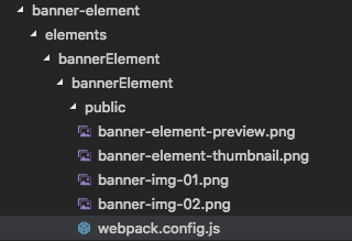
It is a very simple config file used to list input and output JS file for public use. Here we’re going to write the name and the path of our public JS file, for webpack to minimize. The code is as follows:
module.exports = {
 entry: {
   'bannerElement': [ './js/bannerElement.js' ]
 },
 output: {
   filename: '[name].min.js'
 }
}
js folder and bannerElement.js file (in public folder)
Inside the public folder, we’ll create a js folder with bannerElement.js file.
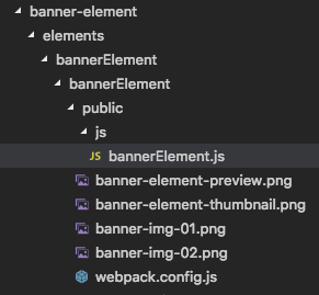
This file will contain a small script for View page, which will randomly pick and display an image.
Note: This script will also run in the editor.
We’ll start with a self-invoking document.ready() function.
(function ($) {
  ...
})(window.jQuery)
Then we’ll subscribe to a special event, which happens when the page loads.
(function ($) {
  window.vcv.on('ready', function () {
    ...
  })
})(window.jQuery)
The code that is run on the event does following:
- selects all banner elements;
- checks if it is not the editor by checking for .vcvhelper class which is editor specific only;
- checks if there’s more than one image (why execute if more than one image, duh);
- hides all images by setting inline style;
- picks a random image and removes its style attribute.
The end code looks as follows:
(function ($) {
 window.vcv.on('ready', function () {
   var banners = $('.vce-banner-element')
   if (banners.length) {
     banners.each(function () {
       var banner = $(this)
       var images = banner.find('.vce-banner-element-image')
       if (images.hasClass('vcvhelper')) {
         return
       }
       if (images.length > 1) {
         images.css({
           'position': 'absolute',
           'visibility': 'hidden'
         })
         var randomIndex = Math.floor((Math.random() * images.length))
         var randomImage = $(images[ randomIndex ])
         randomImage.removeAttr('style')
       }
     })
   }
 })
})(window.jQuery)
Building an element
Whether you’re creating a new element or editing existing, every time you make a change in files, you need to build an element.
In the terminal, we’ll enter into our element’s folder.
cd banner-element/elements/bannerElement
Run yarn install command. Once npm is installed we’re able to build our element using yarn build. You can notice the change in folder structure:
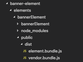
Also, we can run yarn watch command to watch for file changes and automatically build an element. All available webpack commands for building an element can be found in API.
Once this is done we also need to build our public JS file bannerElement.js.
Again, in the terminal, we need to enter the public folder inside the bannerElement folder.
cd banner-element/elements/bannerElement/bannerElement/public
Once there run the following command:
../../node_modules/.bin/webpack --config=webpack.config.js -p
It will create a minified version of the original bannerElement.js file.
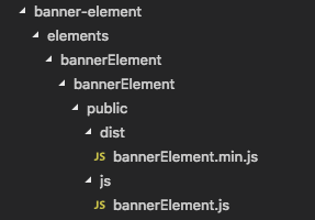
Note: Everytime you make changes to a JS file in the public folder don’t forget to build it. Or use a command to constantly watch changes to a file and build it:
../../node_modules/.bin/webpack --config=webpack.config.js -p --watch
Testing an element
After we’ve made all the changes and have built our element, now’s the time to test it. Let's activate our plugin in the Plugins page of the WordPress admin dashboard.

Once activated, we open a page with Visual Composer. Click on the Add Element button in the navbar and see if we can spot our element, ah there it is.
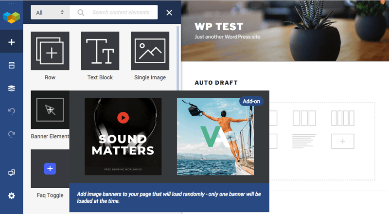
Click on it to see if it adds to a page.
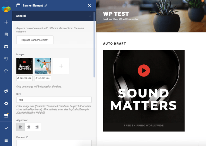
Success! Now we can add custom images, links, set size and alignment. Save and view the page to make sure it works.
Create Your Own Custom Elements
As you can see, Visual Composer gives you the power to be responsible for all aspects of the element. And now, that you've been through this guide, just follow the steps and you'll be creating your own elements and addons in no time.
Visit our API documentation to get more information that will help you along the way!

Hello, the component.js code block preview seems to be corrupt or incomplete at this point. Would you mind updating the article or providing a link to the bannerElement repo? Following this article to see if VisualComposer is a good fit for our company and if I can get this to work we will likely use the tool.
Thanks!
Hi Brandan! Thanks for reaching out. Please contact us via our Slack channel or, if you are using Premium version of the plugin, log into your account to submit a ticket so our tech team can have a look 🙂
Hi Brandan! Thanks for your comment. I just updated this article please try to use new component.js code.
2020 calling. This seems to have changed. I just installed and activated the “vcwb-demo-element-example-plugin-master” plugin. Nothing appears in the wpbakery front end (the wordpress page -> backend editor). I also tried building the cssVariablesButton element with yarn inside the ccVariablesButton folder, per the instructions on Github. Nada.
Hi, this tutorial is about Visual Composer Website Builder. I guess you wrote about WPBakery Page Builder. These are two different plugins with different API. If you want to learn more about WPBakery Page Builder API check this link https://kb.wpbakery.com/docs/inner-api/. I also will leave the link with an explanation about the difference between Visual Composer Website Builder and WPBakery Page Builder, https://visualcomposer.com/help/faq/visual-composer-website-builder-vs-wpbakery-page-builder/. Thanks ????
Hello
Anybody can provide a demo widgets ready code for visual composer? I needed it seriously. I will customized with my needed.
Thank you.
Hi, Delwer,
The Developers section is the best place to start. API docs and video tutorials are located here: https://dev.visualcomposer.com/ and all the code that you see you can download from our GitHub
Hello everyone, i have a big problem,
I’m having no luck, I can’t build the package, yarn is installed in V 1.22.17
whether I type yarn watch or yarn build, the commands are unknown.
> error Command “watch” not found. same thing for “build”.
After réinstalled NPM, YARN and WEBPACK, it’s commands is recognised, but the build dont work.. Many error produced.
Excellent post! Thank you for this informative post and please share some more informative blogs so we can learn some new things.
Nice post. I am impressed by the quality of information on this website. Thanks for sharing this post.
Excellent post! Thank you for this informative post and please share some more informative blogs so we can learn some new things.
Data can’t be shown in the frontend.
Can not execute the command “../../node_modules/.bin/webpack –config=webpack.config.js -p –watch” in windows, getting the error every time.
Can anyone help??
Hey, did you manage to run this command without errors?
Can someone please tell me how to show appended data in the admin section?
Like I have appended some data from DB into the page and saved it, It will be shown in the frontend, But when I edit that page content is not showing.
Can someone please help me, I am stuck here for many days.
Hey, did you use our example demo elements?
Did you build them correctly?
Do you have any errors in console or in terminal?
Thanks.