I'm sure that we're at a point where I don't have to convince you that popups, as annoying as they are, work. They are a great tool to have in your marketing toolbox if you don't overdo it of course.
If by any chance you're still not sure, how about some facts. According to research by Sumo, an average exit-intent popup has a 3.09% conversion rate, while top-class popups go as high as 9.28%. Hopefully, that got your attention.
So with that said, there's a particular type of popup, that I want to highlight, and that's the exit-intent popup. That's the one you'd see when trying to exit a page. It tracks the movement of the mouse and when you're right at the top corner, it shows a message in hopes of getting your attention one last time.
Some of the main ways of utilizing exit-intent popups are the following:
- Collect emails;
- Fight against cart abandonment;
- Show related content.
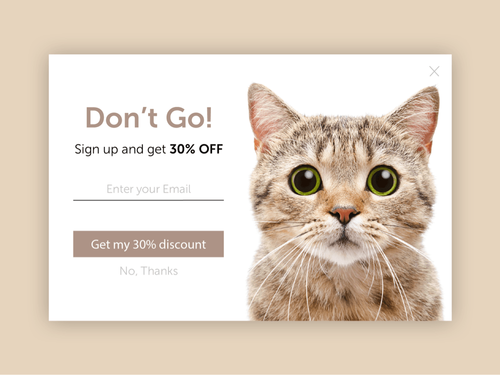
Collect emails
This is a very common way of using an exit-intent popup, with a simple premise - get emails. Usually, that means signing up to your email list, getting regular newsletters.
A good idea is to add a “hook” for signing up. You can do things like:
- Offer a discount;
- Offer some exclusive content;
- Provide social proof,
- Create a sense of urgency, etc.
People often need that extra push, so you can be the one giving it. Sounds aggressive, I know, but I'm talking about popups only here!
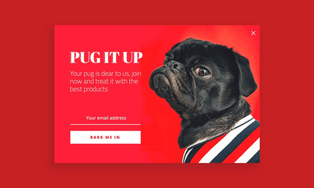
This popup, for example, works on multiple levels. It doesn't only use the attention-grabbing red color, but also plays on the viewer’s emotions with the beautiful doggy. And studies say, that relying on emotional appeal can make your content perform two times better.
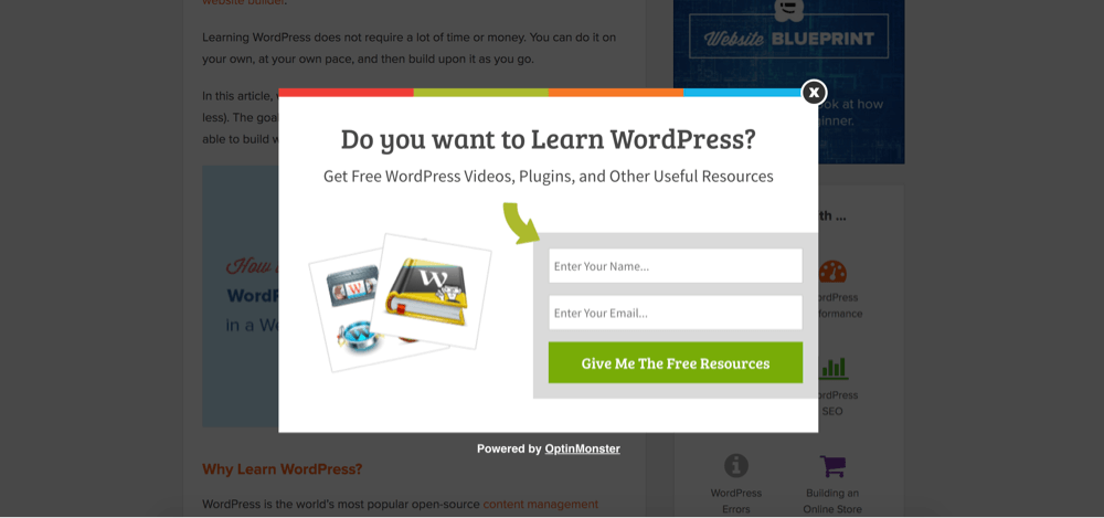
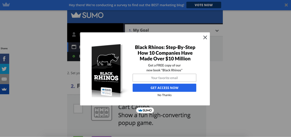
WPBeginner has found its “hook” with free resources, which is definitely a good way to go. It's not just a “dry” message but it has some value for the visitors.
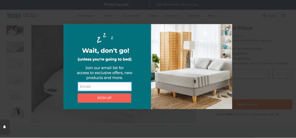
Another way to make your popups less annoying is to mix in some humor like this mattress shop. Little goes a long way in crucial moments like this. You might decide against buying a mattress, but then you see this popup, chuckle a little and give them another chance because you like the way “talk” to you.
Want To Get More Articles Like This?
Be the first to know more news, updates & web design tips from Visual Composer.
Fight against cart abandonment
Cart abandonment is something that everyone selling something on the internet will eventually fight a war with. The global average shopping cart abandonment rate for online e-commerce in 2019 was nearly 70%. 70% is a lot of lost sales and a large number of people to work with.
So what can be done, is creating an exit-intent popup right for the checkout. And there are multiple strategies to try.
Free shipping
This a good place where to offer free shipping. Great place, actually. Because you might not know this, but the number one factor that influences internet users in the US when deciding which online shop to use, is free shipping.
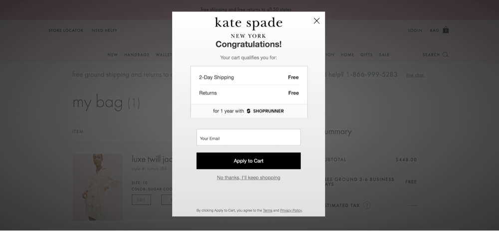
It's a good opportunity to offer free shipping right when the potential buyer has added items to the cart, but need just the right little push towards the checkout.
Discount
Discounts are a go-to, for last resort type of actions. So this is simple yet effective. It's so effective actually, that 4 out of 5 people will be more encouraged to buy something new from a brand that's new to them if they get an offer. If that's not enough, 67% of consumers have made an unplanned purchase just because they found a discount.
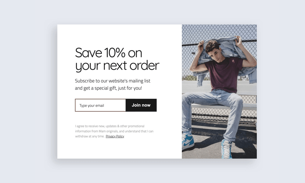
Simply offering 10% off and a gift is a strategy that might make the visitor return for more of your products in the future.
Here I also wanted to mention that apart from a discount, it's possible to offer something for free, as an ebook for example.
With strong arguments for this strategy, it's surely worth a try. You can also maximize this type of popup, with the next strategy - a sense of urgency.
Urgency
Creating a sense of urgency if yet another widely used technique in the marketing world, because it acts on our basic human traits. People are scared to miss out on something, so they act and make decisions faster.
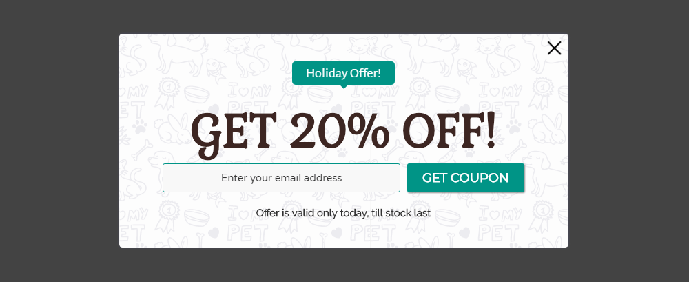
One way of achieving this is to make the offer expire after a certain amount of time, like in this popup. It's clearly stated that after today, this amazing discount will be gone.
The bright side of this, along with all the rest bright sides, is that you don't have to choose one strategy. Be smart, mix and match and in the end you could potentially save a ton of sales.
Show related content
This strategy is as straightforward as it can get, but people sometimes miss the most obvious choice. So here it is - if you want a person to look at more of your stuff, show more stuff. This goes for both - a blog and an online store.
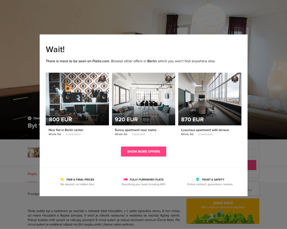
Let's say a visitor is not interested in a particular blog post and wants to leave, you can show related posts, that might spark some interest.
Conclusion
At the end of the day, it's important to remember that popups are not a fan favorite. So if you do decide to implement any on your site, make sure it's well throughout, make sure you've done your A/B tests and use whatever is the best.
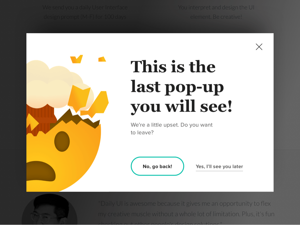
And don't forget to make it your own. There's a fine line between staying professional while doing something silly. So this is the last popup you'll see in this post.
If you're looking for a tool that allows making completely custom popups, Visual Composer's popup builder will let you do just that!
Want To Get More Articles Like This?
Be the first to know more news, updates & web design tips from Visual Composer.

Great, and how to do them with VC?
Hi Agnes, here is a blog post explaining how to create an exit-intent popup with Visual Composer https://visualcomposer.com/blog/how-to-create-an-exit-intent-popup-in-wordpress/