Padding and margin are two important elements in web design, but there tends to be some confusion as essentially they do the same thing - they create extra space. But where? Which one to choose? What are the differences? Good practices?
I'll answer all of these questions in this post and it's my guarantee that at the end, you'll be able to work with both confidently.
To start off, here's a quick look at what they are.
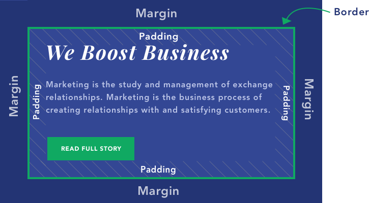
As you can see from the illustration:
- Padding is what creates a space inside the element/container;
- Margin is what creates a space around the element/container.
They both influence the layout in different ways, so let's dive in deeper.
Note: Between margin and padding is another parameter - border. It will adjust together with padding and margin. But it's what sets them apart. Also, it's the only “visible” parameter of all these. Others create a space with what's already there.
What Is Padding?
Padding, as stated before, is the increased space inside the content area. It will make the whole block bigger but from the inside.

To illustrate, here are two blocks of content containing text, a button, and a colored background. The first one has no padding and the second one has 20px padding added on all sides. So the inside gap has gotten bigger, but it's still contained within the border.
When to use padding:
- To create a gap between the edges of the container and the content in it;
- You want to increase the size of the content block, or create a bigger space within the border;
- Increase the size of the content block without making the content itself bigger;
Example: You have a button and you want to make it bigger. Add padding!

- You wish to push the border further away from the content;
- To show more/less of the background of your content block;
Example: You have a blog homepage and you've created posts, but the image should show the cat photo you've looked so long for. Add padding (to the bottom in this case)!

- Center content inside the content block (using the same value for all sides).
As you might already tell, the padding makes a big difference in the layout you want to create.
What Is Margin?
Margin is what creates the gap around the content block, by “pushing” the content away. It's always outside of the border.

And again, here are two content blocks. One without margin - other with 20px margin on all sides. The block stays the same, it the outside space that is influenced.
When to use margin:
- To create a gap/space around the content block;
- To make a space between two elements;
Example: You want to create some “breathing room” between your products. Add margins!
- Center the content block (using the same value for all sides);
- To create a space around the border.
Margin vs Padding
You might be thinking - Ok, but if I don't use different colors or images? I can just choose whichever. Unfortunately, there are cases where you can use only one or the other. Here are some key elements that set them apart.
Layout
If you are using different colors or images for content blocks, the difference between margin and padding is obvious. You're going to increase the area around the content with the margin, and the other way around with the padding.
So in terms of design, the achieved effect is different, therefore you can create different layouts. As you can see by the example below. The one on the left has margin applied and the one on the right has a bigger value of padding.

Negative Margin
You can create a negative margin to make one content block overlay another content block, like in the image below. This can be a very handy design tool.
This is not possible with padding as it doesn't affect the outside of the content area.

Color
Another important difference is that margin itself has no color, but padding, on the other hand, will take up space with the same color (or image) as the background of the content box. Border, however, is independent color-wise. You can choose whichever color you wish.
As you can tell, it mostly comes down to the aesthetic.
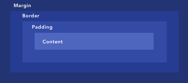
Margin and Padding in CSS
In CSS margin and padding (and border) are a part of the box model. The structure of the box model is the following - in the middle, there's the content, then padding, then the border and then margin.
Below you can see an illustration of a CSS box model.
This allows adding the spaces we've already covered previously.
How to Control Padding and Margin in Visual Composer
If you are using Visual Composer, adjusting padding and margin (and border) is extremely easy. What you can use is the so-called “Onion Controls”, where you can change the value of each of these parameters. You can do that for any element in Visual Composer.
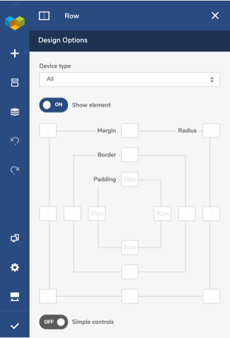
You can find the “Onion Controls” in the Design Options of every content element.
As you can see, apart from margin and padding, you can adjust the border as well as the radius for the corners. Simply write down the pixels and it will automatically be applied to your element.
You can also use the “Simple controls” toggle if you want to apply the same value on all sides. Just write down one value for each parameter and it will be applied all around.
Time to Get to Work
At the end of the day, it all depends on what you want to achieve. Remember that giving “breathing space” to your design is always a good idea and a great way to achieve that is by using margin and padding.
By knowing what these parameters are, you have all the tools to create a layout that is going to look exactly how you want it too.

Padding and margin are both used to create extra space around elements, but they are different. Padding is the space between the element and its border, while margin is the space between the element and the other elements around it. You should choose padding when you want to create space around an element, and margin when you want to create space between elements.