It’s the very beginning of spring outside which means the new season is just around the corner. And so do fresh ideas and inspiration. Each and every Visual Composer showcase is intended to make you feel that way. #madeinvc
But this one is a worth-reading knowledge-packed piece containing the best practices on how to utilize the most popular features of the plugin for a specific industry.
The Pinnacle Group
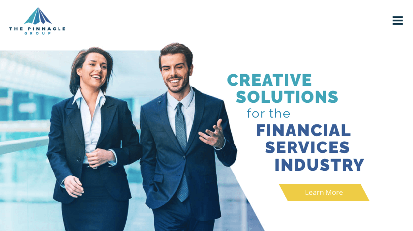
The Pinnacle Group is a “forward-thinking” company, that offers creative solutions for people in the financial services industry. They are committed to providing the most innovative ways to transform their clients’ businesses, alongside enhancing their products and elevating their brand.
They have mastered their craft so well that they have been named one of the 101 highest-scoring companies of the “Best and Brightest Companies to Work For in the Nation” by The National Association for Business Resources.
Their website is also well-crafted, by integrating a slider element by Slider Revolution on their home page. This is one of the many compatibility elements that are available in the Visual Composer Hub.
On that same page, they also use an image slider to showcase their team members, alongside a static text that represents their core values.
BlueSoft
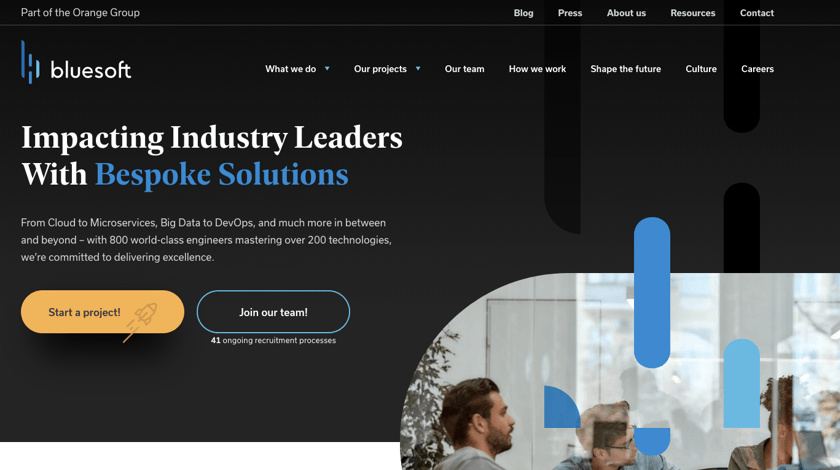
BlueSoft is a custom software development company tackling clients’ business technical challenges with the help of the latest technologies. They deliver unique products optimized for the needs of a particular industry from insurance to finance.
In addition, BlueSoft proudly highlights customers’ logos via small round-shape thumbnails (with Visual Composer you can control media’s shape, size, alignment, and more).
BlueSoft also emphasizes this individual approach throughout the site’s design. Interactive animations and fade-in effects create a sense of involvement, balance textual content, and stimulate a smooth procession of information.
While adding the fade-in effect to your site can require a bit of coding knowledge, powerful Design Options allow you to choose and add one of 40+ animation effects with a single click.
Twyst
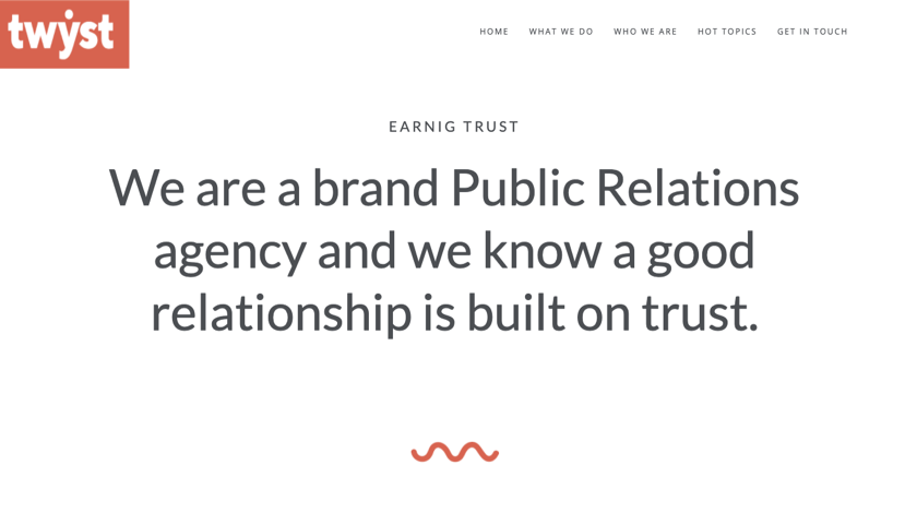
Twyst is a public relations agency delivering the vision, mission, and values of the company within a simple yet colorful website design. When a visitor launches the homepage, there are multiple components that immediately catch attention.
Like colorful symbols with a zoom effect and a large persuasive Google Fonts Heading (Visual Composer has integrated a full Google Fonts library) element.
To create a great copy as Twyst has (and make text adjustments more convenient), you can use Visual Composer Inline Editor - a feature that makes text adjustments more convenient by allowing you to change it with a double-click.
Pinnacle Consulting
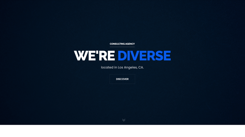
The website of Pinnacle Consulting advertising agency creates a minimalistic and creative online presence that attracts at first glance. But details like animated heading or opacity applied to texts work well to displays the agency’s authenticity.
But apart from its original appearance, Pinnacle follows another crucial requirement for a digital agency - their website is 100% mobile-friendly. Because responsive design can help potential clients to explore the work of the agency, gain trust and make decisions, it is essential to have one, especially for creative service providers.
However, to conquer this niche, agencies should think deeper while designing a website. SEO (Search Engine Optimization) is a top factor to win Google algorithms and therefore gain more traffic and opportunities to convert. A great free tool to consider using when it comes to creating SEO-friendly content is a built-in Insights content analysis tool.
Pozyx
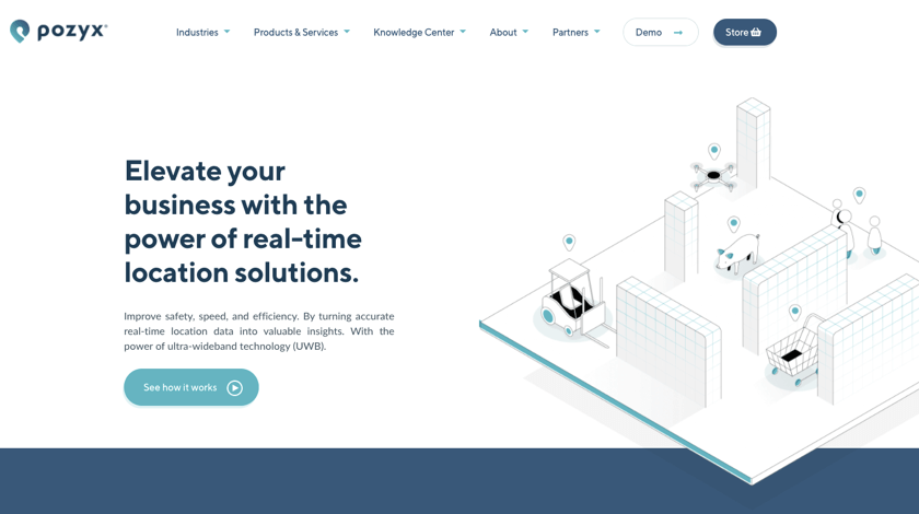
Based in Belgium, Pozyx develops both hardware and software solutions to provide accurate positioning and motion of information for various challenging environments.
Because the specific of the industry is quite difficult to figure out at first, the company supports its message by using various interactive elements. For example, a Video Popup element triggered by clicking on the button above the fold and custom graphics works well to grab attention and provide a glimpse of what the company is dealing with.
Oven Aan, Kom Eraan
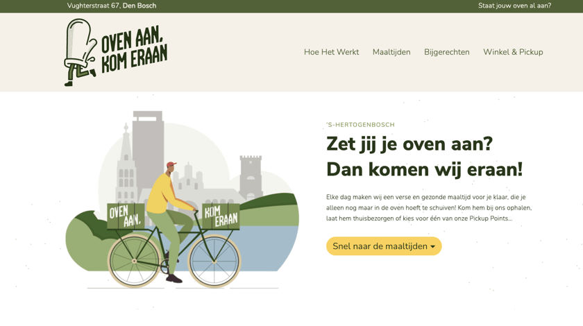
This is an online food ordering company based in a small city in the south of the Netherlands. While so many restaurants, pubs, and cafes are still closed, the food delivery industry is full of opportunities. However, to grab the share of this market, you need a feature-rich website, like Oven Aan, Kom Eraan has.
For example, you can start by considering taking advantage of Visual Composer and WooCommerce integration to create your store for online grocery or delivery. With all the basic pages (catalog, single product, shopping cart, and checkout) defined and a touch of customization, it is so easy as it sounds! 🙂
We Are Ready To Share Your Story. Are You?
Above we’ve highlighted some works from different business industries to give you a little boost of inspiration and encouragement.
But we are always thriving for new examples for upcoming showcases because our team believes your story is worth sharing. The only question is - do you?

Very thorough and informative, thank you