I've said it before and I'll say it again - website building is not an easy process. While website builders can make the task substantially easier and quicker, there's still a lot to do to make a website appealing. There are some opinions floating around the web stating that builders are not for professionals, because of their quick, easy, drag, drop, fast sort of approach and I want to prove them all wrong!
We've selected some of our favorite websites that are built with the Visual Composer Website Builder, so you can not only get inspired but see what our plugin (together with talented people, of course) is capable of.
BBDO Guatemala
BBDO is an awarded advertising agency network and the website for it's Guatemala location is built with, you guessed it, Visual Composer Website Builder.
What We Like
The website has a minimalistic design, and the color scheme is simple yet it highlights the most important aspects of the site. The layout is achieved with simple methods like background video and parallax effect making the page look dynamic and engaging.
CharlieShotMe
CharlieShotMe is a website for the accomplished fashion and portraits photographer Charles Rodulfo.
What We Like
The full width and height of the background image result in a beautiful layout that is relatively easy to make using the row settings. More about the background - the colors of the images and background are perfectly coherent.
An element that is very conveniently used in this layout is the Feature Section. It's not only a very quickly customizable block, it also takes care of responsiveness for you.
"I love using Visual Composer for my website. I'm fixing the website on my own from the ground up and it has been very helpful in making it easy for me to update my portfolio."
Charles Rodulfo
De La Garza
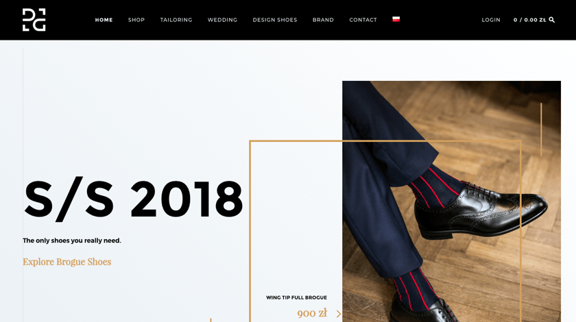
De La Garza is a Polish fashion brand and it's founded by Rodrigo De La Garza. As the website says: “The designs are aimed at men who value elegance with a hint of avant-garde.” And it is portrayed in the design of the website as well.
What We Like
The hint of avant-garde in the website seems to be the unconventional grid that makes the design very noticeable. The images are beautifully balanced to not conflict with the grid but complement it.
This site is a good example of how Visual Composer successfully works with 3rd party plugins, like sliders for example.
Eversight
Founded in 2013, Eversight is a startup based in Palo Alto that focuses on digitally transforming prices and promotions for retailers and brands with the help of AI.
What We Like
Most of this website is made with simple elements and that on its own proves that you can make a professional looking website without complex elements and anything unnecessary. That makes it easy to navigate through the site and focuses attention on the important parts.
It's also worth noting, that the branding of the site is linked with the product branding very well.
Tethr
Tethr is a Communications Intelligence platform that 'listens' to phone conversations in real time, giving you searchable insights in no time.
What We Like
This website shows a successful combination of Visual Composer structure (the row and column grid), basic Visual Composer elements and raw HTML blocks, and that is exactly what makes this site unique.
Even the small changes in default element parameters make a big difference - like the buttons in this site. The design options allow you to make the page differ from others and they have been taking advantage of that. The page also loses the feeling of it being built with a builder once you start customizing.
Norra Hamnen 5
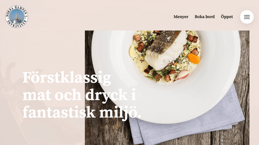
This is a website for a restaurant “Norra Hamnen 5”, a restaurant in Sweden that offers a beautiful view as well as local produce.
What We Like
This website is making a good use of the Google Headings element (it has all Google Fonts available) mixed with some more uncommon elements like Multiple Image Collage and Simple Call To Action. All these elements combined make it easy to locate the focus points of the site. Those are also amplified by using CSS animations.
Despite the site being made using a regular grid, it looks a little distorted and that's a very popular design component at the moment.
Father's Hardwood
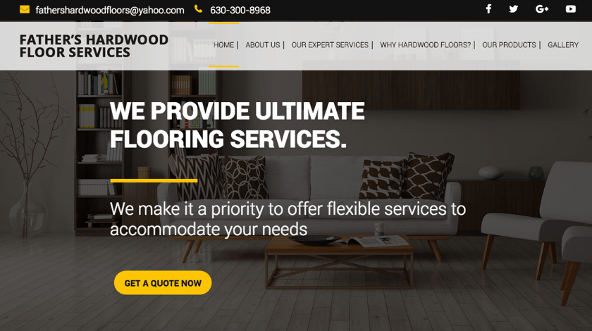
Father’s Hardwood Floor Services is a family business with over 40 years of experience in working with hardwood floors.
What We Like
This is a perfect example of a simple and understandable business website. Its unique branding is achieved with the image styling. It shows that there has been a lot of work put into using Custom CSS to style image blocks in order to achieve brand consistency throughout the page.
Nothing is impossible!
We are really proud to see the beautiful websites made with our plugin. Let this serve you as inspiration and proof that there is a lot you can do with Visual Composer Website Builder! We are adding new features all the time, so hopefully, we'll see more and more unique websites in the future.
Do you have an awesome website made with Visual Composer? Feel free to post it in the comments, so everyone can see it!


