Choosing the right colors for your website can have a big influence on the experience the visitors will have. Much like with typography and the layout you choose, the color palette also has to be a well planned out element to create beautiful and outstanding websites.
Color can increase brand recognition, influence purchase patterns, different colors can bring up different emotions and a whole lot of other factors are directly affected by color. So in this post, I'll break it all down to this:
- What is color and the psychology behind it;
- What is a color scheme;
- Popular color palette generators;
- Examples of color palettes.
Introduction to color
Before jumping into the beautiful color palettes you can use to create websites, it's important to understand color, what it consists of, and its influence on web design as well as on people and their actions. We'll look into the psychology of colors and some terminology that will help you understand the color wheel and all the little nuances of colors a little better.
Color psychology
Colors tend to stimulate certain emotions. That's why it won't be likely someone would color a baby's room black, or a doctor's cabinet bright red. The same goes for web design. Choosing the right colors can bring better results. So I'll talk more about some individual colors and their psychological effects.
- Evokes intensity, urgency, power, excitement, energy, confidence;
- Attracts a lot of attention and prompts action;
- Use red for buttons, banners, warning messages, warnings.
- Induces productivity, calmness, and stability;
- Blue is seen as trustworthy and dependable;
- Very popular for business websites and is also used for navigation bars, headers, and footers.
- Combines some feelings attributed to red and yellow. It has the attention-grabbing effect of red as well as the enthusiasm and happiness of yellow;
- It is also considered playful and warm;
- Used for hyperlinks, menu bars, CTA's, buttons.
- Yellow is considered energetic, happy and confident but it also evokes anxiety and frustration;
- When used for a website, it can cause difficulty to read;
- Yellow can be used for pop-ups, banners, footers.
- Represents nature, calmness, balance, harmony, peace, compassion;
- Because of its calming effects, green is often used for websites that are nature, psychology, health, and charity related;
- Green is not only believed to improve reading ability, but research also says that it contributes to creativity bursts.
- Purple is seen as royal, mysterious, luxurious and expresses wealth;
- Often used for premium and luxury services;
- Preferred by women, so a site for beauty products is likely to use a purple color scheme.
- Color of romance, security, and is considered feminine;
- Often used for sites with a primarily female audience;
- Makes a great background color.
- Black is seen as deep, bold and mysterious;
- Most commonly used as the main color of the body text and in the combination of white for a minimalistic look;
- It's not recommended to use black for big areas of the design.
- Represents innocence, silence, clarity, space;
- White is one of the most crucial colors in web design;
- Gives a clean slate where to add more colorful elements without overwhelming the design.
Color Terminology
Knowing the terminology and elements that colors consist of in web design, will be a big help when creating a color palette as well as working with color generators.
Color Wheel
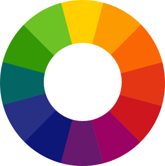 The color wheel is a visual illustration of color hues that are arranged by their chromatic relationship. It contains 12 hues.
Cool and Warm Colors
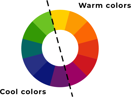 The color wheel can be divided into cool and warm colors.
Hue
 Hue is the pure color and is referred to as the dominant color family.
Value
 Value shows the lightness (tint) or darkness (shade) of a color.
Chroma (Saturation)
 Defines the intensity of a color.
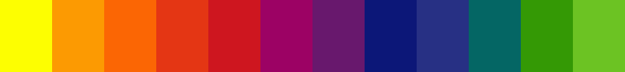
Shade, Tint, Tone
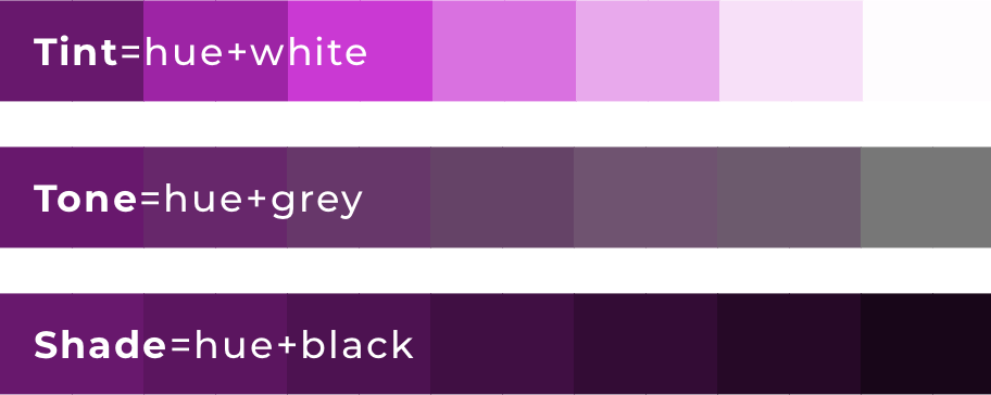 As the image illustrates, shade is darkening the hue by adding black, while tint making the hue lighter by adding white. Tone makes the hue less intense by adding grey.
What is a color scheme
A color scheme is the colors used in a certain design. It is also referred to as the color palette. In the case of creating a website, the color scheme would be all the colors you've chosen to use. Make the best of it and stand out with your site!
Want To Get More Articles Like This?
Be the first to know more news, updates & web design tips from Visual Composer.
A thing to remember is that not all colors in a palette you've chosen should be equally represented. There's always a dominant one (or a few). This way you can attract attention to specific parts of the page. There's this technique known as the isolation effect, where you would use one color just for a specific purpose. Like an add to cart button for example. You'd make all of them in one, stand-out color and won't use the color for anything else.
Types of color schemes
Color palettes can be divided into types based on what kinds of colors are used. So these are the color palette types:
Monochromatic color scheme uses variations of tints and shades of the same hue. 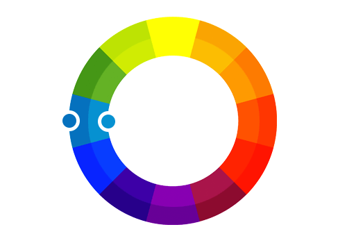 Analogous color scheme uses colors that are located next to each other on the color wheel.
 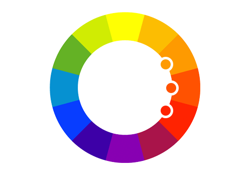 Complementary color scheme uses colors that are opposite of each other on the color wheel.
 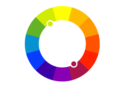 Split Complementary is a color scheme that uses one color, and the two others that are on each side of the opposite color.
  Triadic Complementary (Triad) is a color scheme that uses colors that are equally spaced around the wheel.
  Tetradic (Double Complementary) uses two sets of complementary colors.
  If you feel confident enough, you can always go for something completely out of the box, but in most cases, simple is best, so don't go out of your way to create something new, when the well known and commonly used palettes work just as well.
Color palette generators
Work smarter not harder. A great tip to live by and I think color palette generators are an excellent way to work smarter. You can, of course, create your own completely custom color palettes, but generators are a great tool to make the process fast and simple. Some of them are rich with features that allow tweaking every single detail, so it will be as custom as you wish.
But for those who just want to get a beautiful color palette and can't be bothered with all the customization - there are random palette options, a palette from an image, galleries of pre-made color palettes and everything else for you to have a palette as quick as possible. I'll tell you more about some of the most popular color palette generators, so you can choose which one fits your needs best.
Adobe Color CC
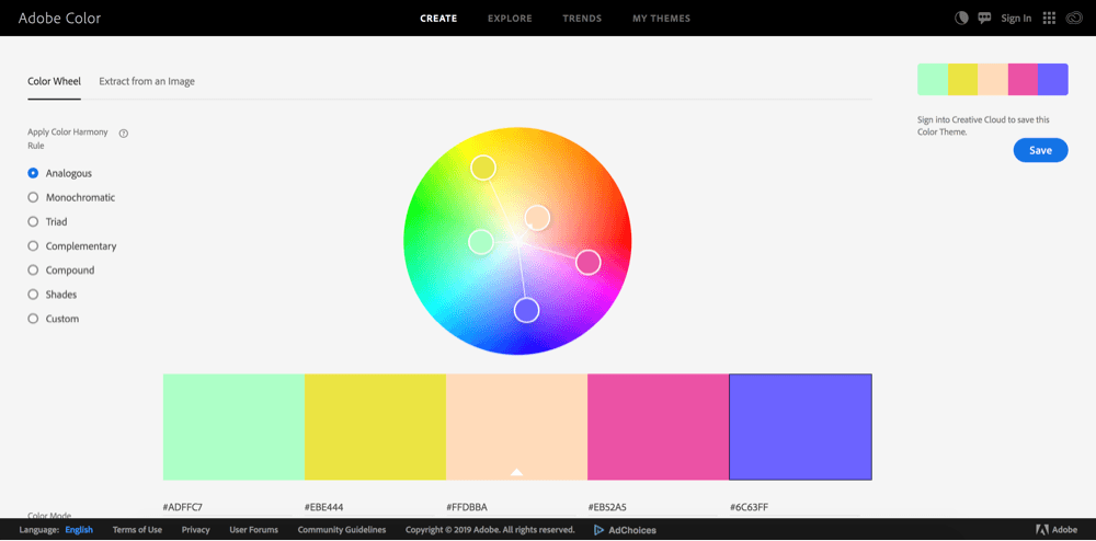
- Generator color schemes based on the color palette types (monochromatic, analogous, etc.);
- Can adjust colors in the palette separately;
- Explore section has multiple palettes as well as color palettes with the corresponding images;
- Has the option to create a palette based on an image;
- Possibility to save the palettes you've created.
Paletton
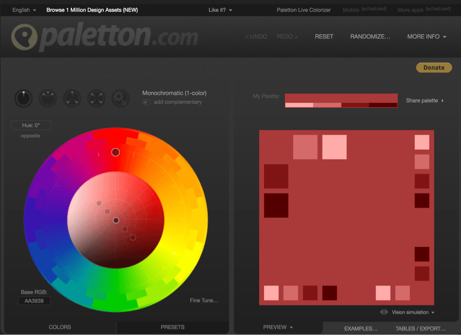
- Easy to use - dragging a circle in a color wheel;
- You can check how each color palette will look on a real page with the “Examples” option;
- Has a section with presets that you can use and adjust if needed;
- Can export the palettes in different formats.
Coolors
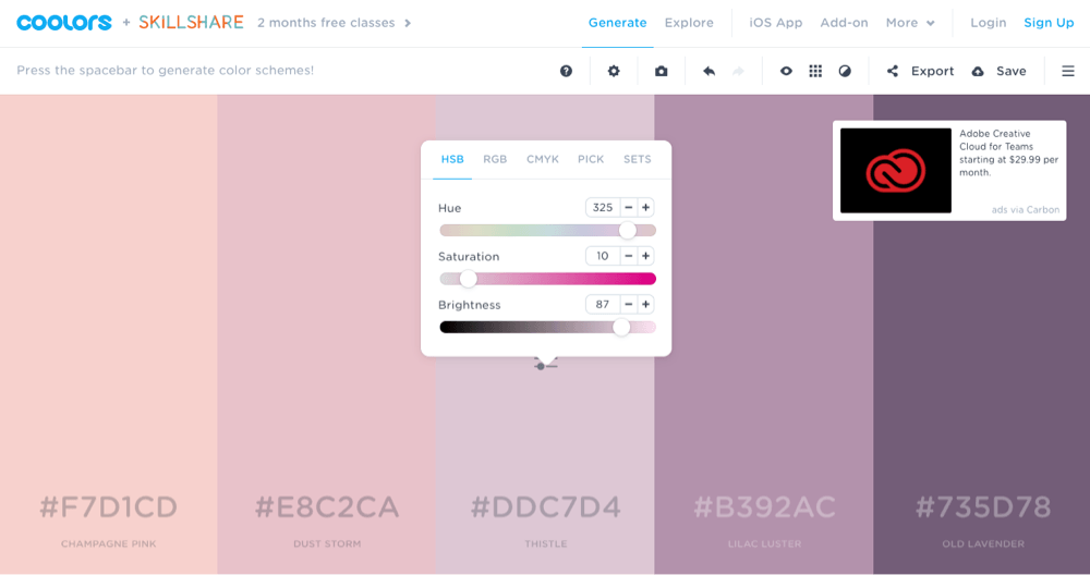
- Intuitive interface that creates a palette just by clicking the space bar;
- In the generator, you can adjust the whole palette together or each shade separately;
- Coolors also has a library of ready to use color palettes;
- You can also filter the results by choosing a parameter like a specific color or “dark”, for example;
- Extension for Photoshop and illustrator;
- Special colorblindness view.
Canva
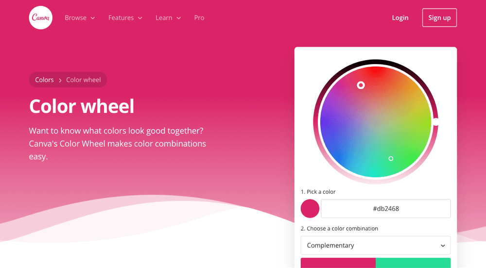
- Can generate a palette from an image;
- Simple color wheel based generator;
- Allows adjusting each color of the palette;
- Can create a Canva graphic with the palette you've created;
- Not as many options as for other generators, but very straightforward;
- Perfect for someone who doesn't want to put in a lot of energy in choosing colors.
0to225
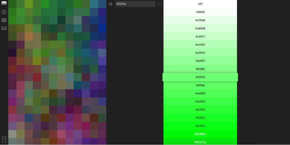
- A tool that created darker and lighter colors for a specific color you've chosen;
- Simple interface, where you can just click on a selection of colors straight away;
- There's an option to enter a specific color;
- When you click any of the generated colors, it is instantly copied to your clipboard.
ColourCode
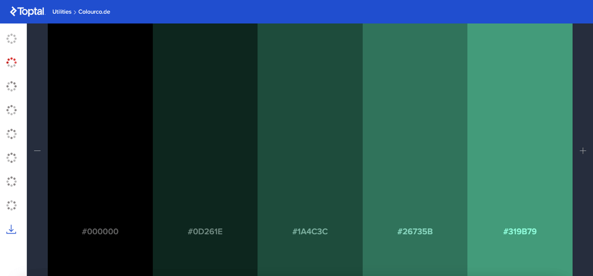
- A web-based color design tool is available for free on Toptal.
- The app is an all-in-one color design tool.
- It gives you access to various palette categories (analogic, triad, quad, etc.), and multiple conversion colors.
- Lets you create and download your own palette.
Color Palette Examples
There are some color schemes that are most commonly used for specific occasions and fields, so let me break down what those are. To give you an inspirational direction, browse over Visual Composer showcase to find outstanding websites like those below.
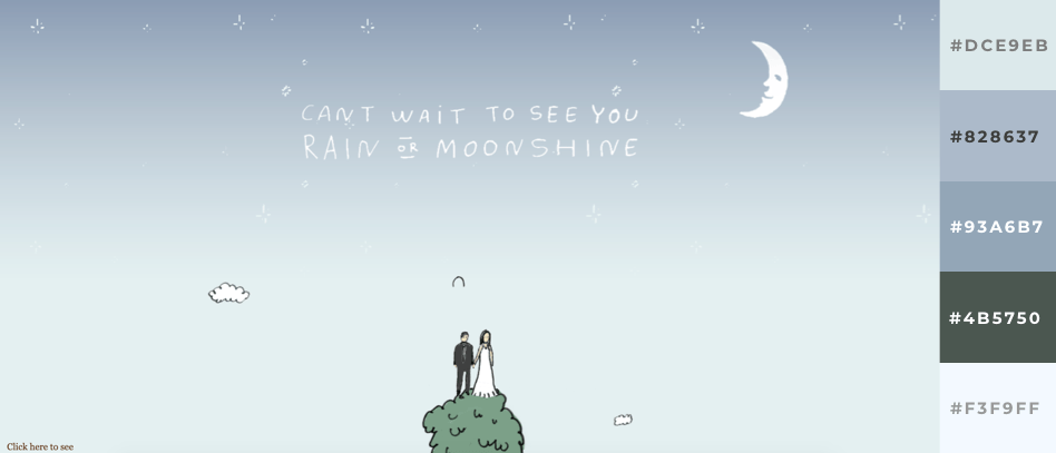
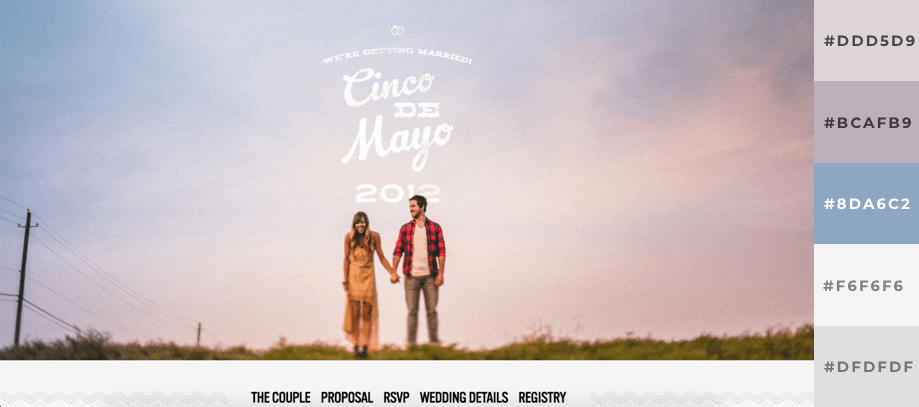
Color Palettes for a Wedding
A wedding page is usually elegant, light and simple. So the color palette should reflect that feeling. Pastels, pinks, whites, beige - these are very well represented.
Helen and Josh
The Pittmans
Color Palettes for Technology
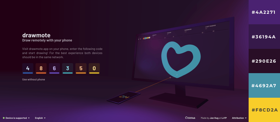
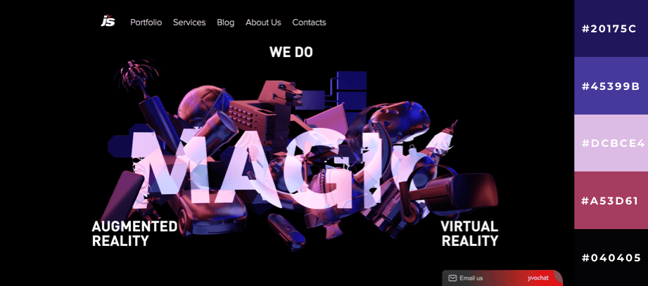
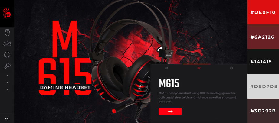
Tech is usually a field where the websites can be more dramatic and out there. That's why the color palettes can be more experimental and bold. You'll see darker colors, as they are associated with luxury.
drawmote
JetStyle
Bloody
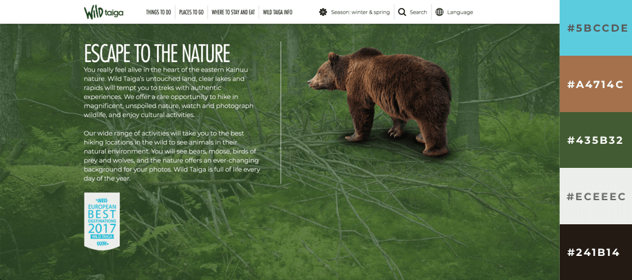
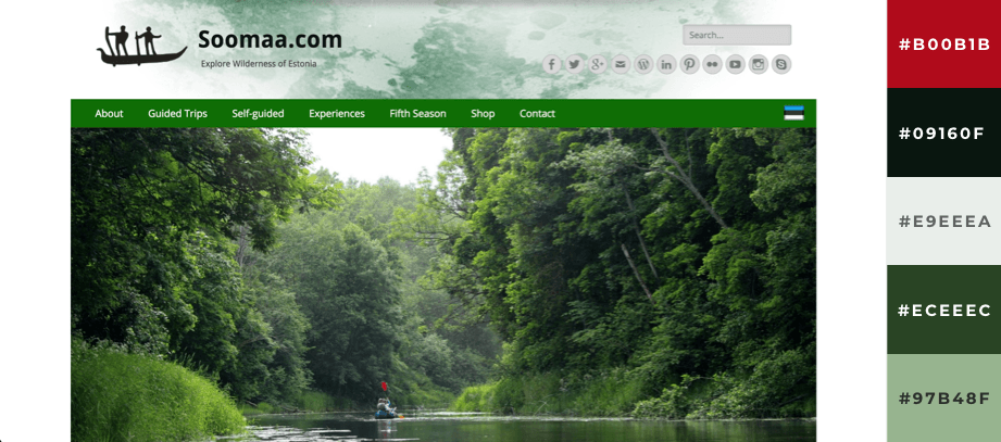
Color Palettes for Environment
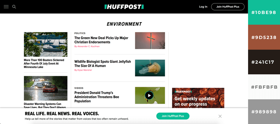
Websites related to the environment will often use 'nature' colors, like green and brown because of the associations it brings. With 'green' being a keyword that is closely connected to nature, it is a great choice here. Remember the isolation effect? It is very commonly used in these kinds of sites with green as the color that stands out.
HuffPost
Wild Taiga
Sooma
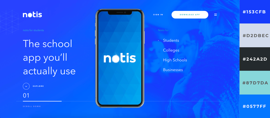
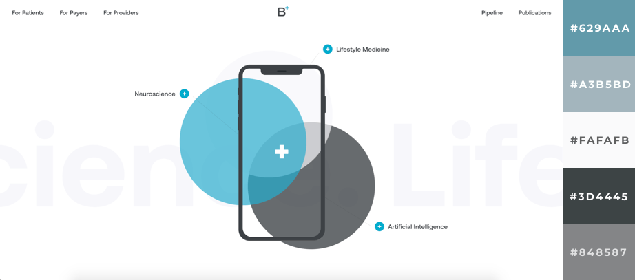
Color Palettes for Business
Corporate websites are simple and easy to read. White background and monochromatic color scheme is a common combination. From the psychology perspective, blue is very popular as it is a color that a majority of people like. It is always a safe choice.
QAccounting

notis
Zapare Technologies

Better Therapeutics
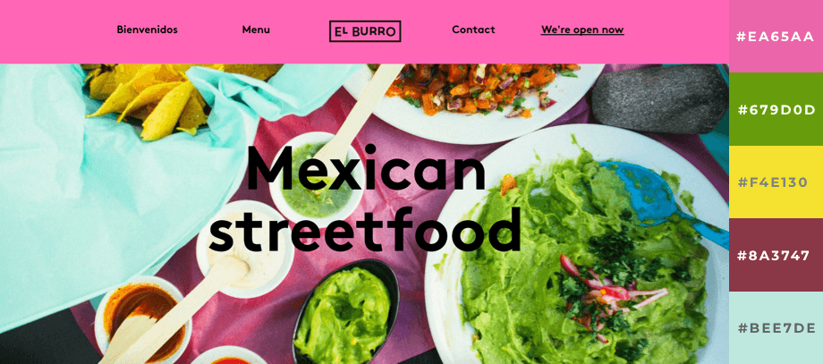
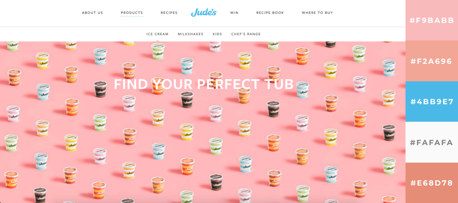
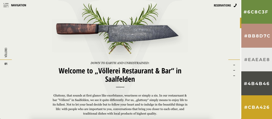
Color Palettes for Food
Food related websites (much like nature related ones) work well with association based color schemes. So taking inspiration from the food colors you want to include is a good idea.
El Burro
Jude's Ice Cream
Völlerei Restaurant & Bar
Conclusion
There's a lot to color, so it's not easy to cover all aspects in a single post (not one that you won't have to read for hours at least), but in the context of making a website, you now should have the basic knowledge to make a well thought out decision. Take into account the psychology behind color, look at some good examples, try the generators and you'll be good to go.
Want To Get More Articles Like This?
Be the first to know more news, updates & web design tips from Visual Composer.

I prefer to use the wave method of building color palette – https://wavepalette.com/about/
Hi, Igor, I haven’t looked into that method yet – thanks for sharing!
How can we import all those beautiful colours in Visual Composer? I’m loosing a lot of time by copying color codes constantly. Is there a plug-inn for this that works with VC?
Hi Hans, right now you will need to copy hex code, but things will change 🙂
When? Would love to be able to seta palette and if update it updates across the whole site.
Hey Douglas, the date for this feature is not set yet. Still, it is there in our Backlog already.
I use Adobe colors extensively & love it. Once I import a photo or graphic I’m branding into colors.Adobe.com it’s super easy to create the right color pallet. Then I save that pallet to my Adobe library accessible in all my Adobe products, particularly Photoshop.
Hi,
On 25-11-20, Raitis said that a site-wide colour palette was in the Backlog for the project. We’re now in 2023. Has there been any progress on this. It does seem to be a pretty huge missing feature of VC.
I went through your article which was on a color scheme for a website or blog. Below I have mentioned very simple steps, which you can follow.
1.Understand your brand or topic.
2.Research color psychology.
3.Start with a base color.
4.Create a complementary color palette.
5.Consider contrast and readability.
6.Use color harmonies.
7.Test your color scheme.
8.Consider accessibility.
According to my point of view, these points must be included in your article. Readers, if you want to create your website, you can visit an IT company like Alakmalak technologies. They have 17+ years of experience in this field.