Knowing that you will appreciate the tools that will help you highlight your website’s best attributes, we introduce you to a quartet of fun-to-have components. This upgrade is a real honey for those who love design, color and image interpretation in website design!
Instagram-Like Filters
Are you an Instagram fun? You have your Instagram feed reposted to all your websites? Do you like to play with its filters adding your photos various effects that shine, hush up or attracts your photography? Do you wish so you could also use this option when creating your website?
Great news! With Visual Composer, you can improve any of your content images by applying beautiful Instagram-inspired predefined filters, and ensure that all your graphics are in a single style.
You can choose from twenty most popular filters, including black and white ‘Willow’ or vignette ‘Sutro’, shady ‘Lo-Fi’ or the fading ‘1977’ filter - everything to add your images an artistic value.
Adding Instagram-like Filters
Visual Composer interface is designed so it is easy for you to add such and other elements. For this one, simply add the element that contains one or several images, then:
- Select image from your Media Library (or upload a new image)
- Switch toggle Enable Instagram-like filters to ON
- Scroll across the filters gallery and select the one you like
Instagram-like filters are available for content images that are not placed as background images. The content images are:
- Single image
- Image gallery
- Feature section
An Intriguing Bounty!
We have done the research and found out that an average price of Instagram style filter plugins on the market is around $16 - that’s another spending for you to add one of many cool features you wish your website to have.
But hey, cheer up! Visual Composer Instagram-like filter feature is totally free! All you have to do is download Visual Composer Website Builder and enjoy many great features at no extra cost. Our free version is an awesome way to get started!
PhotoSwipe Lightbox
We started with image effects, now let’s continue with its gestures!
Until now, you could choose various OnClick actions inside the Visual Composer image element, such as Lightbox, Open Image in New Tab, Link selector or leave it to none.
Now, with our new update, there is a new option added to image elements as an alternative to default lightbox - PhotoSwipe Lightbox - an extra touch gesture that has been designed to help you showcase your products in the best way thus building a good online presence.
Add PhotoSwipe Lightbox
From the Frontend editor, add an element that contains one or several images, then:
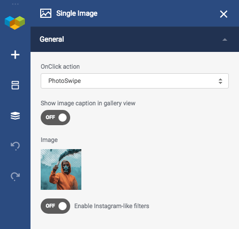
- Select image from your Media Library (or upload a new image)
- Click OnClick action drop-down menu
- Choose PhotoSwipe option
Voilà! Your image now is displayed on a black background, and in case it's a gallery, it shows right and left arrows to click for the next or previous photo. Plus, the black background highlights your image, thus paying closer attention to it.

Color Picker
Things aren't always #000000 & #FFFFFF - there are seven colors used in average website design, meaning that there are colors on your website that you use the most.
These colors can come from your brand identity, such as a logo or from the niche your business represents. Whatever the source is, to apply correct colors to each element throughout your whole website, you have to keep the HEX color codes opened somewhere near your workspace and copy/paste them every time in need. How annoying, right?
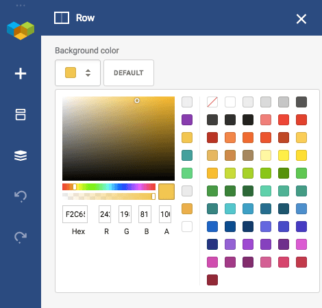
Guess what! The new feature will save this annoying process for you - Visual Composer remembers the colors you use the most on your site and store them in a recent colors palette of the Color Picker.
The very first line of the Color Picker will be empty and fill up to eight colors of your choice automatically for you to reuse them later.
And now the last but not the least essential feature...

Disable Column Stacking
Visual Composer Website Builder automatically takes care of your mobile layout and performs column stacking one below another when the width of the screen is mobile friendly. This happens because column stacking by its default is responsive.
What if you don’t want your columns to break in the mobile view but have them placed right next to each other in a horizontal row? Then you have to start using our new feature that lets you disable column stacking.
If you want your page layout to have more than one column on a mobile device, simply follow these further steps:
- Click Edit on a specific row you want to customize
- Scroll down to Row Layout
- Switch toggle Disable column stacking to ON
We all have a little Picasso in us that lets us create beautiful designs interacting with the colors, images, and layouts. Visual Composer Website Builder just makes it all easier and more vivid for you to enjoy the website building process to the fullest!
We will keep on creating new tools with an inspiration that our every next update will offer more awesome features for your website to become the greatest!
Have a great idea or a question? Comment below and let’s discuss!


