Are you still finishing your Halloween candies?
The darkest month of autumn has come…So, hello, November! We are back with a monthly showcase to give you some insights and inspiration for the fascinating websites made with Visual Composer Website Builder.
In this collection, let’s take a look into live examples of brands, businesses, and even an educational institution’s beautiful websites. #madeinvc
Do you want to know how to use our website builder and a variety of its great features to create an outstanding design of your site? Enjoy! ????
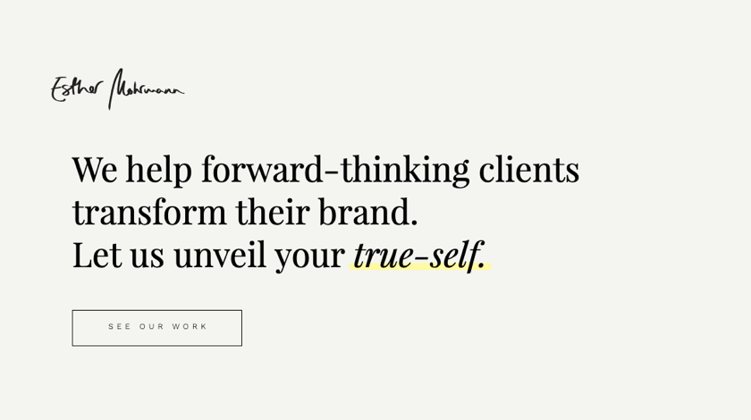
Esther Mohrmann
Esther Mohrmann’s website is all about branding and graphic design solutions for brands and organizations. On the basis of the explicit brand strategy and clear messaging, they create an authentic and appealing visual identity for your product.
The design of the website catches an eye with a parallax effect within the row. Plus, you can see the very active use of the Design Options to create blocks on images, add borders to separate the content and fix columns in the portfolio view.
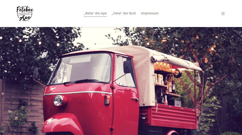
Fotobox Ape
Fotobox Ape is a service that offers you to rent one of two available charming photo boxes to make any event to be unforgettable and full of joy. Bella and Fiete can be personalized and adapted to specific wishes. Inside you can find a bar with a fridge for self-catering, integrated photo box and retro-looking Bluetooth sound system. So, if you even near Lübeck, Germany, don't miss a chance to hire it for your event!
The Fotobox Ape website is designed in retro style and uses additional font styling options of Visual Composer when formatting text. It helps to achieve unique branding and, of course, to be remembered!
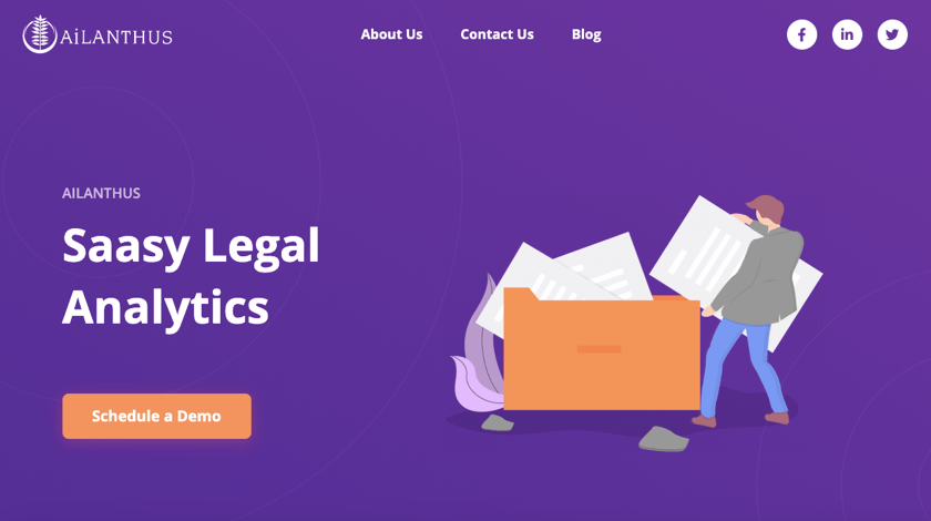
Ailanthus
What Ailanthus is all about? If you run a law firm, litigation finance company or are a general counsel, this analytic platform offers numerous analytic services and cooperation with leading insurance companies to help you with any question related to legal issues.
The Ailanthus website follows one of the web design trends we mentioned within Web Design Trends for this (2019) year - the element disorder. Applying column background and Design Options for a disordered content position is a way to raise awareness for your message.
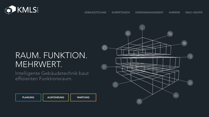
KMLS Group
The KMLS Group unites various services, competences, and products in the field of intelligent building technology, regardless of new construction, conversion or revitalization. What’s more, they care about both customers and nature. Oriented to active energy management, the KMLS group protects the environment and reduces energy costs for the users at the same time.
To achieve an exclusive design and apply unique brand icons, the KMLS group uses custom elements developed on the basis of Visual Composer. Also, a disordered look of the feature blocks (by changing a Design Options for column position) and CSS animations are used to grab users' attention.
Pegasus Board
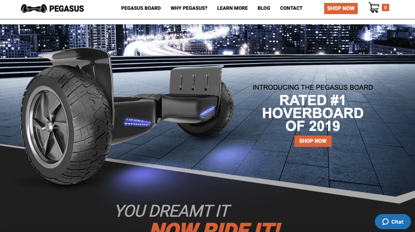
Have you ever dreamt about being a bird? Well, it’s still impossible. However, the Pegasus Hoverboard gives you the ability to arrive at your destination as faster as possible. You can easily maneuver even through the grass, but your ride will combine safe, stability and joy. The board provides you a bigger space for foot, quick recharge and stereo speaker.
Within the Design Options applied for the background image, all site looks like it has a seamless piece. But you will be surprised to discover the potential of the Design Options tool - the Pegasus Board website is combined from several backgrounds ????
KSCY
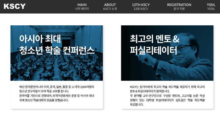
KSCY is a Korean Scholar's Conference for Youth - Asia's largest comprehensive youth conference performed by the Yonsei University Higher Education Innovation Institute, Seoul, South Korea. It is a forum for young people to present and discuss their academic researches. This year the conference took place for the 12th time. As Franklin D. Roosevelt told once: “We cannot always build the future for our youth, but we can build our youth for the future.”
The KSCY website uses simple elements to replicate a post grid style and box-shadow options to make news blocks, which allows the site to stand out.
Supplement the showcase
Above I listed the websites created with Visual Composer Website Builder to give you some inspiration boost. Do you want to be part of it?
If so, share your website in the comments and maybe you will be included in the next showcase.
Stay tuned and let’s build a great website together!

Wow, great examples! Those web professionals know their way around with Visual Composer and web design.