A modern web design means better interaction with your audience and more conversions. As you follow popular brands, you will see that they are improving their websites. If you are done with your website, you are out of business.
Last year, Visual Composer team made our first research of web design trends. As we look back on our predictions, companies like HubSpot has seen a great value in UX animations. Asana has completely rebuilt their interface with gradient overlays. Wix launched a new website with mobile-first design and extra large content elements.
As we proceed into 2019, it is time to look into what trends awaits us there.
The web design market is oversaturated with new technologies and design tools. Like never before, we are able to develop complex layouts and apply various effects. Even so, tools are no longer in charge - it all comes down to the business.
Business wants to develop websites faster and make them easy to use (UX). Everyone seeks to improve conversions. These are the main points that will define the web design trends of 2019.
Micro Animations (and Interactions)
Complex animations are in the past. They are time-consuming and hard to put in place. Small business can not afford it, large companies don't have time for it.
Please welcome micro animations and interactions. Tiny points of interaction with your visitors (all UX designers are talking about). Micro animations help to grab attention and increase conversions.
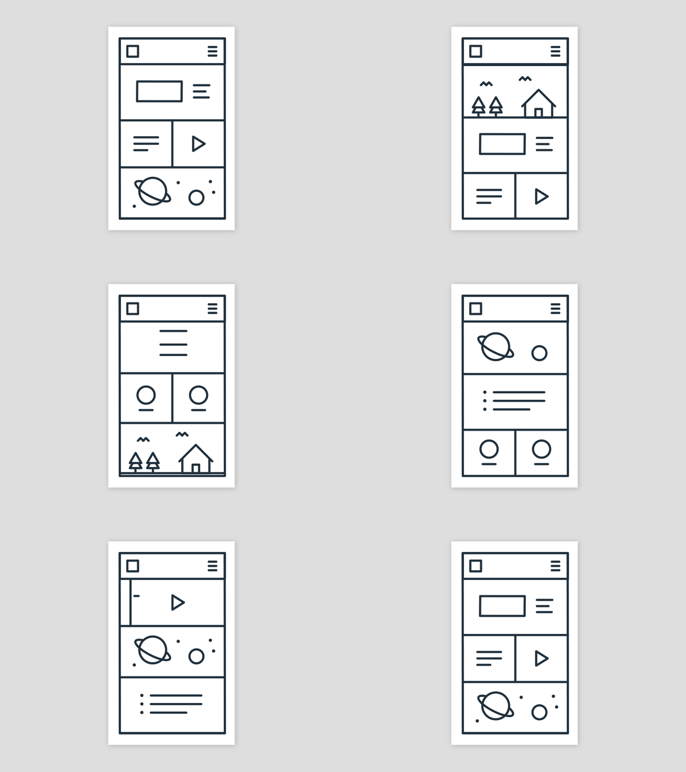
Attention to details is what differs an exception website from an ordinary one. Micro animations help to get feedback, communicate, and navigate your customers.
Micro-interactions is easy to create and they won't change the website that much. Smartly placed they will become a good trigger for conversions. And we know that even a simple CSS animation of the 'Buy Now' button can sometimes make a difference.
Learn more about micro animations and interactions.
Speed and Performance
Performance has finally become a trend. All popular websites are striking for better performance. A better performance means better SEO ranking and reduces the frustration.
Once we hear about lack of performance, it works like a blocker to choose a theme or tool. This is the reason why every good WordPress theme is optimized for performance.
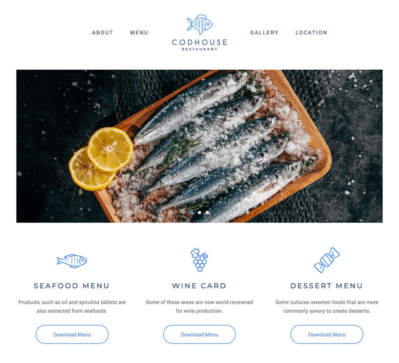
If you are looking for a tool to design a website, look into ones that create clean HTML output. A clean HTML will ensure that your website will load a lot faster.
Try to avoid overwhelming your website with the tons of content - your performance may suffer.
Content Splitting
There lot of award-winning websites that divide layout vertically. If in doubt, check out the Awwwards website on your own.
Split works like two independent parts that focus on different goals. A textual content that provides you with information about the company or services. And emotional part, consisting of images and graphics that build an emotional bond.
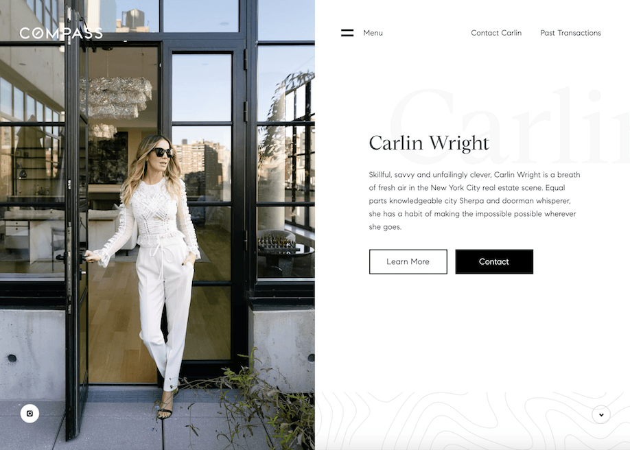
The split will help you to give both types of users what they want. Those looking for more information will find it easy to read it. While the cold audience will be able to focus on the graphical part.
Unique Elements
Every business wants their website to stand out from the crowd. We have only a few seconds to make an impression, so we want to be remembered.
Branded elements help you to differ from competitors and create an emotional bond. Imagine a button that fits perfectly with your logo. Or a slideshow that uses bullets from your brand book. With such elements, your website will look complete and professional.
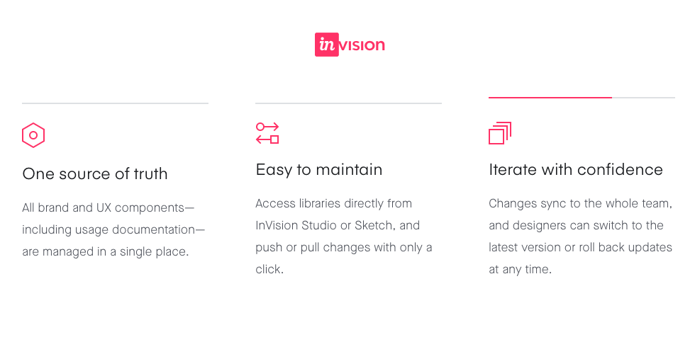
The downside of this trend is that you will have to do some custom development (and maybe even hire a web developer). Still, at the end of the day, it pays off having a unique website.
If you are working with the web design tools and builders, look for a tool that can be extended. Create your own set of elements that fit your brand.
One-Page Layouts
We are living in a dynamic environment. People don't have much time to spend on the website. Your is not an exception.
One-page layouts are popular for building landing pages with high conversion rate. In 2019, more websites will look in this direction and maybe convert their regular websites into landing pages.
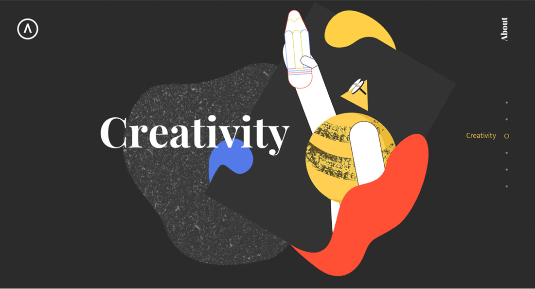
A landing page allows you to focus on one problem at the time and control the sales funnel. It is also a lot easier and faster to launch a one-page website and scale it after.
Shapes and Images
It is not enough to have beautiful images on the website anymore. People want to create an emotional bond with the brand. And every brand has their own unique shapes (at least they should).
Companies like Asana and Slack use the advantage of shapes and images. It helps them to create a bond and stress out the most important parts of their tools.
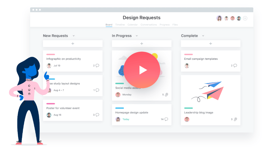
To incorporate this trend, there are two ways you may consider. The first one is to compliment your images with the shapes that associate with the brand. The second is to use shapes as boundaries for your images. Introduce masks for your image in various forms.
Both ways are very effective so it is up to you to choose which way you want to go.
Element Disorder
Forget about strict grid layouts. Disordered grids are a big thing around the web already, and it will expand in 2019.
The disorder doesn't mean chaos. In fact, it is a well-structured content with eye-catching blocks to grab attention. Usually applied to the headlines of the site it delivers a bold message your visitors can't miss.
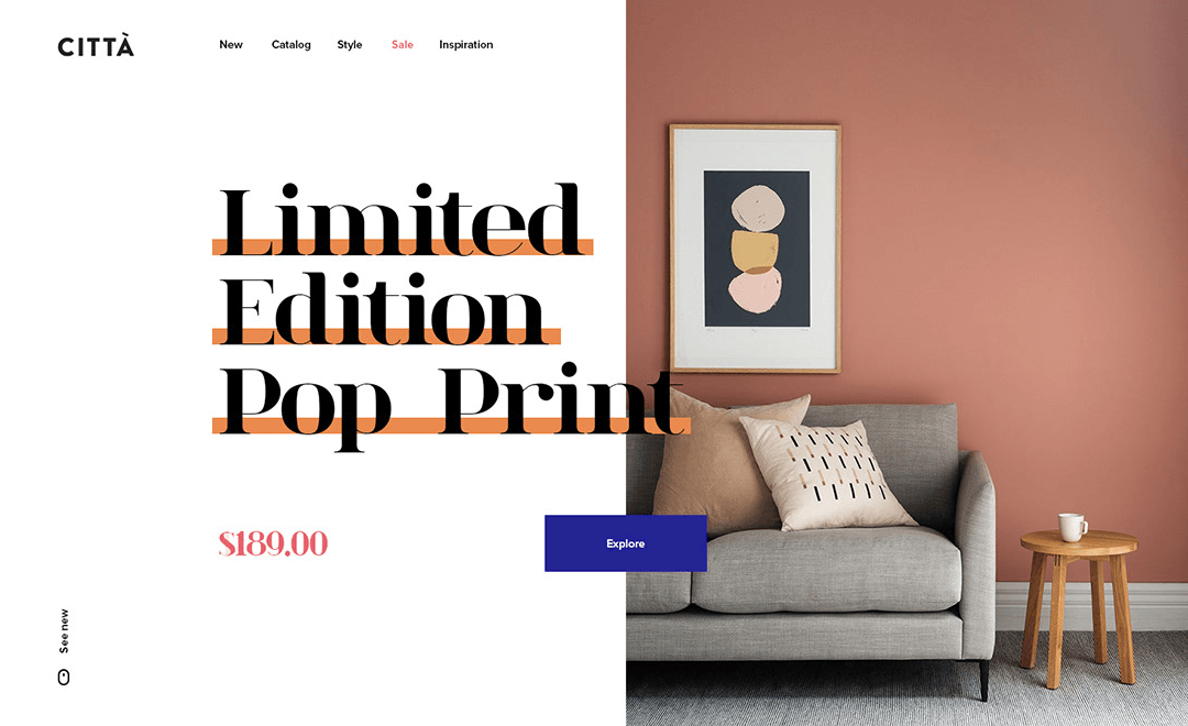
Element disorder is one of the easiest ways to upgrade your site for 2019. All you have to do is to use Design Options to adjust margins of your headlines and background images.
Such a simple technique can raise awareness for your products and services. And, it is also easy to use in A/B testing.
Sticky Notifications
Are you a fan of GDPR? 🙂 I'm a bit frustrated about all the notices and cookies policies.
The bad news is that we will see a lot more sticky notifications in 2019. Business has seen a great value in exit-intent popups and notification bars. In average, exit-intent popups can increase your conversion rate up by 20%. Ask your eCommerce expert - these are good numbers.

So, despite the fact that everyone hates them, people tend to convert more often.
While this is annoying, I would still recommend trying it out and see what value it can bring for your business.
If you use WordPress, there are plenty of plugins that you can use to set up notifications and popups. I would also recommend looking into those that create custom post types. This will allow you to build better notifications with the help of website builders.
How to Apply Web Design Trends
We have to look at web design from the business perspective. We want to launch websites faster, learn and improve.
We can start with one trend at the time and see how it affects our business. We don't have to incorporate all trends - one size won't fit all.
Think of the time and value proportion. What would make your website more successful? Build it fast and easy.

Nice post, Raits. Actually I use visual builders for my projects and see how fast they are improving. Thanks for sharing
Happy to hear that 🙂 Happy holidays!
I think the micro animations are really effective but the problem is, mostly front end developers are not very much familiar to give these little SVG elements a life of animation and that’s too bad 🙁
Yes, this one is tricky, but some things can be done even with a simple CSS and it is better than nothing.
Very good post. It’s good to see performance and speed as a web design trend!
People are fighting over SEO ranking so speed is one of the key factors. And we don’t want to spend much time on development – this is where performance comes into play.
In 2019 the website have to be SEO Friendly, so the speed performance is an important thing!
Exactly! Everyone wants to be on top of the SEO ranking.
I couldn’t agree more Raitis. Without proper “user optimization” all your search engine optimization could go to waste. One should remember always that a human would be visiting this site and not only search bots its basically why we create a website for ‘People’
Micro animation has always been a very high impressive impact when it comes to making your portal stand out of crowd, Web designers need to be up to date with Interaction and Execution part. Worth reading your article. Thanks for sharing. Keep up the good work.
If you are looking for an opportunity as Web designer freelance then Register yourself at our portal at https://www.womenfreelancer.com/
Web design, while surely important from a visual point of view, includes much more. From SEO and traffic to branding and conversion rates. Your site’s web design marks your whole internet presence.
True. How the end user is interacting with your website is very important and it is clearly reflected in your conversion rates.
The design of your website can also make or interruption the business you are trying to deliver. It essentially makes a difference on how your target audience views your business or firm and possibly turn them into your customers.
This is good
It good to know about what is trending right now. It is really a great way to provide visitors new trending look and it will also help the website owner in one way or another. Thanks for sharing such a great post with us
Thanks, Donald, did you have any of these suggestions implemented on your site?
Good in depth article! Web design trends are always a hot topic for designers worldwide. The above web design trends for 2019, designers can capitalize on their strengths to create more bold, unique, and unforgettable designs. Creative web design is not a matter of chance. It can be analyzed, understood, and executed. Keep an eye on new web design trends, and you’ll be sure to build excellent websites.
Thanks for sharing Raitis.
Thanks, Sarah, couldn’t agree more.
I really appreciate your work. Thank you so much for posting this.
Thanks for the heads-up!
Thanks for sharing.keep up the good work.
Thank you so much for this blog. It was extremely informative. Will definitely help me get further ahead.
Thanks for the nice words! Which trend do you like most?
thanks for this article . good work
Hi! I Hope you are good. I have to say this is an awesome post! Please help me I have some questions regarding web designing what should I do to increase the conversion rate on my landing page? Which software language is best for developing a website that can scale to over 100 million users? What is the best Word Press plugin for my newly launched website in 2019? How do I increase the page speed of my website?
Hi Jerry, thanks! Ok, some pretty tough questions there, but let me try to help you out 🙂
1) Performance – I would say that the first thing is to have a proper host. We recently migrated to Kinsta and I have to say – they are good in terms of performance. Apart from that, keep your images optimized and avoid plugin hell (don’t install all the possible plugins)
2) Conversion rate – well, a lot of topics out there. But, make the site easy to navigate, think about intent popups (they do tend to work pretty good). I will also think about setting some article about it.
3) If you stick with WordPress, you will most probably use PHP. Other than that, if you decide to give Visual Composer a try you can also take look at React. It is fast, and it will help you develop some custom elements for Visual Composer via our API.
Hope this will help a bit. But you gave me some nice ideas for the upcoming articles. Keep rocking!
Web design trends are making things possible. It makes the impossible possible. I got design trends from various YouTube channels but here we are as beginners need professionals teachers who will assist us.
Fantastic article! It is very informative for everyone when it’s come to web development. We all know that this industry is very competitive so it helps us a lot to keep our knowledge up to date with the latest changes.
Thanks for providing this awesome information .I hope it will be fruitfull for me. Thank you so much and keep posting.
Very interesting post. It’ is very good that speed is a web design trend in 2019! Speed is very important for SEO and when we use more and more javascript code on website we should care about speed for users! It ‘s a good sign that it is an important factor for web designers!
Exactly! People always think about trends as something visual but tend to forget that speed is visual as well (at least slow speed :P)
Hi Raitis Sevelis, what about 2020 trends? any changes? btw your article very nice, thanks for sharing.
Hey, thanks and yes – we do have web design trends for 2020 already published. Go check them out here and let me know your thoughts: https://visualcomposer.com/blog/web-design-trends-of-2020/
I read you’re blog such a good article and knowledge base thank you so much, dear.
I really appreciate your work. Thank you so much for posting this.