Every month we prepare a list with inspirational examples of websites made with Visual Composer. #madeinvc
But inspiration is not a single emotion we hope to evoke in you. Each showcase intends to reveal tips & tricks on how to use Visual Composer (and WordPress) to rock with your website design 🤘
Stay tuned for a portion of helpful hints coming! ⬇️
Dune & Sky
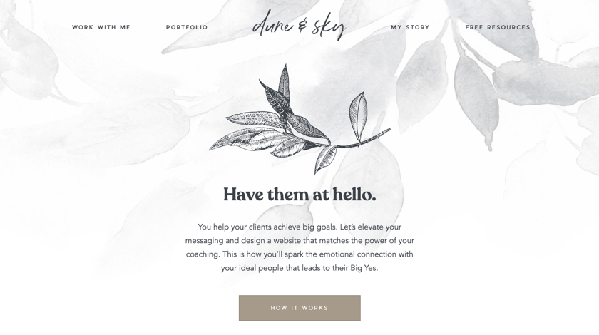
Dune & Sky is an authentic portfolio of a web designer taking care of everything. Like picking up the color schema and crafting copy to helping you build an email marketing funnel. Each element of the page reflects the uniqueness of this personal brand and the value it provides. This portfolio is also a great example of how a persuasive message can be delivered via website design.
From basic elements like separators and buttons to an attention-grabbing background and clean minimalistic sections. The balance between customization and fundamental key components is what connects the audience with the artist from the very beginning.
Did you know: You can also create a transparent header (just as Dune & Sky did) with a Visual Composer Header Builder that comes within a Theme Builder addon.
Finch
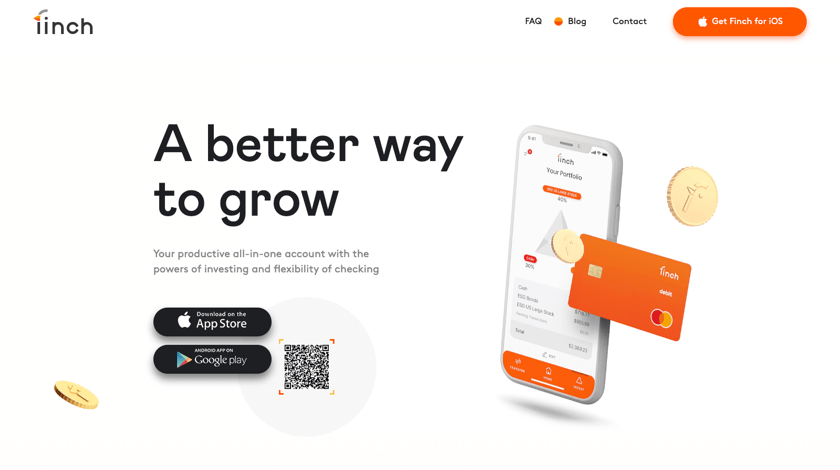
It seems that each element of the company’s website is living its own life. Take these loop animation videos, one-of-a-kind mouse cursor, and custom scroll. Just spend a little time playing around with the design of the homepage to see them in action. You can literary click anywhere to trigger some kind of animation.
Yes, animations are great for improving conversion rates and increasing average time on page.
But if you are using animations, be careful while making any changes: sometimes this can lead to slow page load times and responsiveness issues. Plus, it’s important to keep a code clean (if you are using one to animate content).
Did you know: Among all benefits when creating your site with Premium, you can also access the Global Template addon. This feature allows you to make global changes to your layout without having to manually edit particular sections.
Haus Kärntnerland
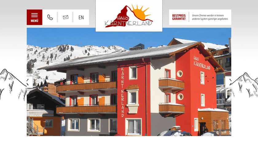
Haus Kärntnerland is a small, family-owned bed and breakfast place located in a cozy Alpic village. They have a simple site highlighting the most important information for clients first. Namely, they are using a powerful combo of Visual Composer and Slider Revolution integration to liven up the layout from the very top of the page.
But the slideshow created is not the only thing that gathers attention here. Haus Kärntnerland uses the Basic Button content element to personalize the design by simply customizing borders. It’s a great little twist to add a personal touch to a static page.
Did you know: A GDPR compliant cookie popup, like the one at the very bottom of the Haus Kärntnerland page, can be also created with Visual Composer Popup Builder.
Future Productions
The company is yet another example of a design that speaks louder than words and conveys the message in a better way. Future Productions believe in visualization because this is what they do on a daily basis as a video production company.
To illustrate the purpose of the company, Future Productions are using the YouTube Video Player element embed in their page. Also, they are taking advantage of the column Design Options. They set a video as a background and complement it with different custom hover effects.
Did you know: The best approach for adding a depth illusion to your video background is to combine it with a parallax effect (for Premium users, there are more than 8 parallax effects available).
Tavolo Apolidia
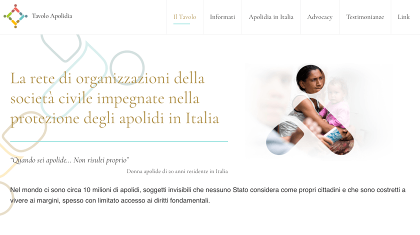
Tavolo Apodidia is a network of civil society organizations engaged in the protection of stateless persons in Italy. They fight for equal fundamental rights for people who are not considered national. They also provide protection, coordinate advocacy activities, and more.
This network wants to be heard - and nothing can help here better than their chosen content elements. Like testimonial block to a large Google Fonts Heading to grab visitors’ attention. Or Post Grid container to display news and embedded Twitter posts to represent the importance of the problem. Every aspect of this design clearly states the following: this is an issue that needs to be solved.
Did you know: Starting from scratch sometimes can take a lot of time, money, and energy, but using pre-made WordPress templates can be a solution. Especially, if they are already designed for a specific industry’s needs in mind.
Cloud Five
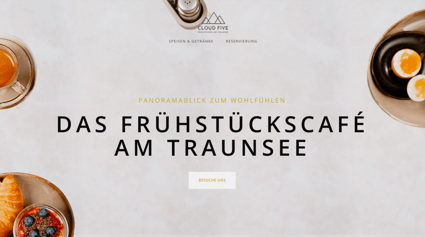
We are always passionate about including some food industry sites in our monthly showcase. In April, this is a Cloud Five breakfast cafe website.
This is a classic illustration of a minimalistic (and yummy) layout consisting of high-quality images, a lot of white space, and logically divided sections. But apart from appealing visuals and powerful custom solutions, Cloud Five is also using must-have attributes for every restaurant, cafe, or bar. For example, a sticky header (which is also one of the custom header best practices) to make content more accessible or a Pricing Table content element to display prices in a transparent way.
Did you know: Visual Composer Hub consists of more than 500 content elements, predesigned templates, addons, and integrations for every industry (from beauty to retail business and more).
It's Not a Goodbye, It's a See You Later
We hope some of the websites included in this showcase have created a “wow” effect for you while scrolling. And, what’s most important, have ensured you building your professional website starting from now.
As always, see you in the next showcase - it's not a goodbye, it's a see you later 😉
