The time has come for the new Visual Composer showcase. This means that the collection of beautiful websites made with the best WordPress drag and drop editor is finally here. #madeinvc
This monthly selection of websites we (the Visual Composer team) love is an example of branding consistency, and a combination of plugin’s most powerful features with custom elements. Plus, this is a great chance for you to get inspiration from those who have already made it.
So, sit back, make yourself a cup of hot tea or coffee (it’s autumn, by the way), and enjoy! ☕
Axxo
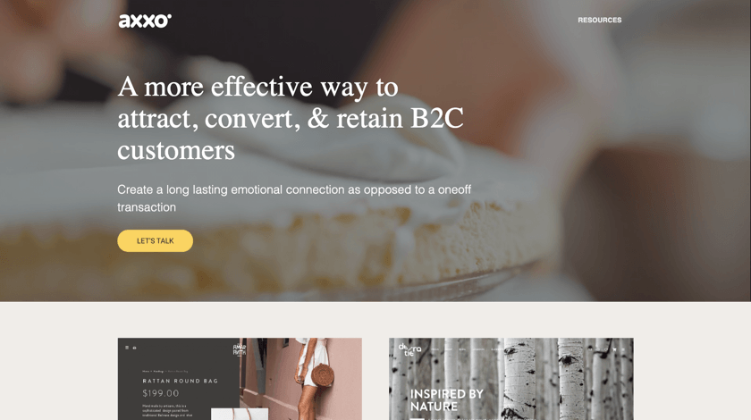
Axxo Studio offers a package of wide branding, web design, and eCommerce services from WordPress theme setup to marketing strategy development. The company states that a long-lasting emotional connection is the cornerstone of a B2C business.
As likewise as the persuasive content, the design of the website also highlights this corporate value. A light color palette, well-organized sections, and a balance between textual information and visuals create a positive user experience and build trust.
Moreover, a video in the background reduces overstimulation. Yet, at the same time, it engages and creates an uninterrupted flow.
You can replicate this approach by setting a video as a background type in the Visual Composer Design options. To reduce performance issues, follow the guide on responsive web design to make your background look good across all devices.
Tilde Johansson
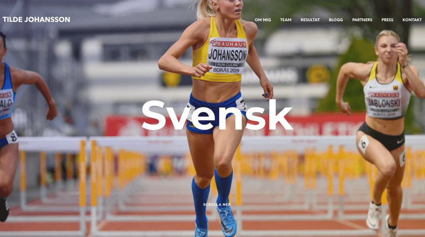
We are so proud to support various types of brands from individual to organization and personal brands. For example, Tilde Johansson, a famous Swedish athlete, chooses Visual Composer to build her engaging and unique portfolio website.
To give her website a personal touch, Tilde is using multiple plugin’s features to counteract the technical look of the website. In other words, she makes the website less technical by using high-quality images. This clearly represents that there is a real person behind.
Also, this layout is an example of how well two outstanding web design trends like disordered grid and micro animations can blend together with a simple slider block.
TADA Ventures
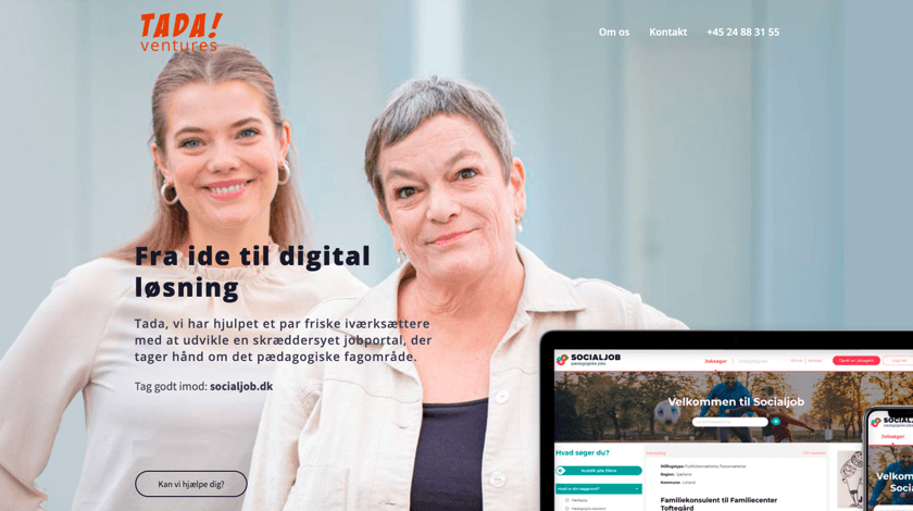
TADA Ventures is a danish-based digital marketing agency that specializes in content marketing, SEO optimization, and social media strategy development.
This is the true example of an image (visual representation of the company) that speaks louder than words. Because you may not speak danish in order to evaluate the credibility of the company - the website design speaks on its own.
But full-height authentic sections represent the basic information about the company, therefore, grabbing the attention from the first sight.
Back In Form
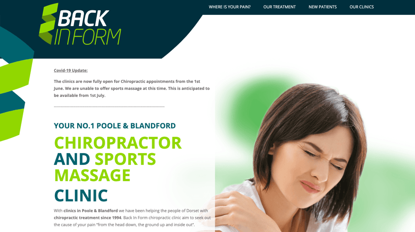
Back In Form is a sports and massage clinic helping people to get rid of muscular pain. They concentrate on the chiropractic alternative medicine approach for treating mechanical disorders.
The website of the company is fully aligned with the branding consistency pattern - from authentic shapes on the sides to independently designed sections, like a sticky menu. This is a great way to highlight the most important information.
To create a sticky section just like that, enable stickiness toggle available within an element Edit window.
Also, the chosen color scheme influences users in the best possible way. According to color psychology, green is a great choice for health-related websites because of its calming effects.
Deaf Minds Education
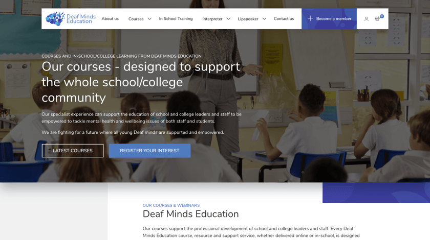
Deaf Minds Education is a platform offering courses to support the school and college deaf community of both staff and students. They empower youngsters and adults to solve mental health and wellbeing issues to ensure the future of equal rights for everyone.
The site of the company illustrates brand guidelines for both corporate style and values. But one of the most popular design trends, the disordered grid, helps to highlight the most important information for those who are looking for it.
Birdsong
In 1996 Microsoft CEO Bill Gates wrote that content is king. And nothing has changed nearly two decades later.
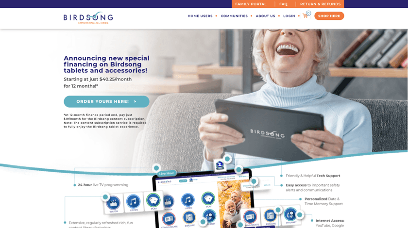
The website of the Birdsonglife company is all about the content. At first glance, it looks like there is much more textual content that needs to be for preventing users from frustration. However, once you start creating your website from scratch or go for a pre-defined WordPress template, the acknowledgment of your target audience is crucial.
For this website, lots of text is one of the niche-specific requirements, because the primary users of the website are seniors. Because a detailed explanation is what makes effective communication with elderly people possible.
To Be Continued
Long story short, this is all we have for the Visual Composer October showcase. Make sure to leave the comment below if you have one. ????
Want to be featured in the next season? Use #madeinvc under your posts, so you can inspire others with your website powered by the Visual Composer.
