Either you are stuck at home or in commuting to work, you definitely use some mobile devices more or less. Mobiles (excluding tablets) generate 52.6% of worldwide website traffic. This clearly represents the following: every business should focus on responsive web design.
In this complete responsive website guide, I will cover the essentials of designing and creating an effective mobile-friendly site:
- What is responsive design and its extreme importance;
- Key components of responsive web design;
- The difference between mobile, responsive and adaptive site;
- Best responsive design techniques;
- How to make your WordPress website mobile-friendly.
Without further ado, let’s get straight to the topic.????
What Is Mobile Responsive Design?
You probably came across words like responsive web-design, mobile-friendly website, adaptive layout, etc. These are methods for dealing with websites' appearance change on different devices - based on the browser width they are being viewed on.
As simple as that, it’s worth knowing what all previously mentioned terms mean and why nowadays they are of extreme importance.
But first, I will cover what the mobile responsive design is.
Responsive design, first introduced back in 2010, is a web design approach to craft website content to work (and look) well on every device and screen size.
Responsive web design (RWD) is focused around providing a similar experience for every user regardless chosen device to view the site.
In a nutshell, it makes your website content look good at any device size - from a large desktop monitor to the smaller screens, like your smartphone.
Responsive design is a critical part of your website, as it adapts and optimizes your page in an efficient and easy-to-read format. By adjusting the display to various screen sizes, your page URL and code stay the same.
Also known as a key principle of website development philosophy, the responsiveness of your website ensures an optimal view to users across a variety of devices, browsers, and connection speeds.
Why Should You Make Your WordPress Site Responsive?
You may ask me: “Why should I care about making my WordPress website design responsive?”.
A quick disclaimer - building your websites for multi-screen consumers is important for any business. Nowadays responsive web design is more a necessity than just an “additional touch”.
Mobile responsive websites are important because that’s where your audience is. In order to succeed and to help your visitors to complete their objectives, you should care and invest in building a responsive website.
By investing in, I'm talking here about your time, money, and energy. But I’ll get you covered. At the end of this article, you will know the most common approaches and all-in-one solutions to make your website responsive quick, easy, and cost-effectively.
But why is a responsive website important? First and foremost, 7 years ago the world’s biggest search engine, Google, announced that mobile-friendly pages would rank higher in its algorithms.
In other words, you may experience a decrease in mobile traffic from Google Search if you are not using responsive web design (Google's recommended configuration). Pretty strong point, isn’t it?
Benefits Of Responsive Website Design
Now you can slowly begin to create a mindset that responsive web design is a requirement, not just a web trend. Plus, this is an essential way of thinking behind building any business websites.
Apart from the above mentioned, there are a few more benefits of using a responsive website, such as:
- Lower website development and maintenance costs;
- Better and consistent user experience;
- Easier website management;
- SEO (Search Engine Optimization) boost.
Let’s take an in-depth look at each of them.
Lower Development & Maintenance Costs
In good old days, before the responsive design was introduced, the practice of maintaining two sites - one for mobile users and the other for desktop users - was highly popular. But nowadays having those consumes a lot of time and costs.
With responsive web design, you only need one version of your site for any device users. It allows you to run and maintain your page using the same domain, which will simplify your efforts and reduce the website development and maintenance costs.
So, investing in a single responsive site design eliminates a lot of hassle and expenses with a page that will appeal to all visitors across all devices.
Improved User Experience
For your audience, responsive website design means no more unnecessary clicks, unreadable fonts, and endless scrolling.
Because unresponsive websites with an awkward layout view can make you appear unprofessional. And it’s very unlikely that your users would come back to visit your site again.
Responsive web design reduces the pain not only for you but also for your users. It provides a seamless and consistent user experience - one of the main factors that affect lead generation, sales, and conversions.
Improved user experience is one of the greatest benefits of having a responsive website, both for your audience and your company. Through an overall positive impression, you can convince visitors that your business is trustworthy.
Flexible Website Management
I’ve already mentioned that responsive website design allows you to maintain a single site for all device users.
So, if you want to apply any design changes to your content, you can do so in one place. The same refers to your website content analytics and tracking.
This flexibility is a huge advantage when it comes to website management or even small typo improvement.
Responsive design makes you free from handling every aspect of your website - you don’t need to waste a lot of time updating the way your website looks.
Flexible website management allows you to dedicate your working hours to other important components of your business, like marketing.
As a result, responsive website design drops out a huge amount of stress (and time) while managing a business website.
Better SEO Results
Because responsiveness is a Google-recommended design pattern, a site with a responsive design will rank higher in search results than the one without.
The higher your rank, the better the chance for potential clients to find you.
As the number of mobile users is growing exponentially these days, it’s essential to reach customers on smaller devices.
How? Responsiveness is a proven and efficient practice that can give you a big boost and achieve better SEO results in the long run.
Key Elements Of Responsive Web Design
While convincing you that responsive website design is a must, it’s worth to mention what lies behind this design technique. A technique that dynamically adapts to different browsers and device types by changing layout view and content along the way.
So, let me break down 3 main components of the responsive design. As Steve Jobs said: “Design is not just what it looks and feels like. Design is how it works.”
How does responsiveness work? Here are 3 elements of responsive web design:
- Fluid grid layout - a practice of building a layout with a flexible grid that automatically resizes to screen size;
- Flexible text and image sizes - scalable texts and media that change the size as the viewport (user's visible area of a web page) changes;
- CSS media queries - a functionality that allows changing and specifying website design depending on the size of the browser window.
To conclude, responsive web design works through multiple specific CSS (Cascading Style Sheets) styles applied at different viewport widths depending on the user’s device type and browser.
Responsive vs. Adaptive Web Design (And Mobile Website, Explained)
There is a great amount of confusion as it comes to the difference between responsive and adaptive website design. Sometimes you might be even more acquainted with the mobile site term.
At first, it can be quite challenging to understand the difference.
However, while responsive and adaptive website design has something in common by scaling your page content on any device, a mobile site uses a completely different approach.
Let’s take a look at each individually.
Mobile Site
The mobile site generally means that it is a separate website version specifically designed for mobile users.
This type of site is built on a new domain to work on small screens and provide equal experience to those who prefer tablets or smartphones.
However, because mobile sites are made for mobiles, they won’t always look that good on other devices. Plus, it may be hard and time-consuming to maintain two sites with different domains at once, which means that the probability to compete for similar keywords is much higher.
Responsive Design
In its simplest definition, responsive design works on any size screen and device type and automatically adjusts to better fit the user's screen.
In other words, by applying responsive design to your site, a single layout will fit different browsers and resolutions.
Responsive websites use media queries that adjust images, text, and layout so the site can appear well on different screens.
Adaptive Design
Contrarily to responsive design, adaptive one uses multiple fixed layout sizes that are most appropriate for the particular screen.
In short, you maintain a single site that has multiple versions to fit someone’s device.
However, adaptive design is much more difficult to implement because of the technical aspects. Plus, it is harder to maintain - you need to design your page for the most common screen widths.
So, back to responsive website design.
What Is Good Responsive Design?
As well as in the traditional approach of designing web pages, there are a few key elements for designing an effective responsive website. These techniques will take your website building process to the next level and will help you to extend your responsive practice.
As web design trends change every year at a speed of space, it’s important to keep abreast to achieve great results.
Yet some of the best responsive design techniques remain the same from the very beginning, more advanced ones require coding knowledge and skills.
These are only a few tips for a good responsive design.
Plan Ahead
A good plan is half of your success. This is why planning ahead every little part of your responsive website design is crucial.
A few things to consider in planning:
- Think of your audience while focusing on UI design;
- Prioritize content by estimating your product features;
- Remember what works and what doesn’t (be aware while applying hover effects);
- Use icons where appropriate;
- Make your button sizes large;
- Don't underestimate A/B testing.
Pay Attention To Typography
Typography matters for your brand, user experience, and overall look. This goes both for traditional design as well for responsive website design.
And when it comes to typography and mobile devices, there are many factors to be aware of:
- Font type and size;
- Color contrast;
- The amount of text;
- Line lengths, hierarchy levels, etc.
In our ultimate guide to fonts and typography, you can find some useful practices to take into consideration while working with typography on your responsive website.
Reduce Page Load Time
I'm sure you've seen quite a lot of statistics on why users bounce from your page within seconds. Yes, they want it to load instantly.
Otherwise, there is a chance you’ll lose your existing audience and your potential clients.
Page load speed is far more important for smartphone and tablet users - they all are less patient and easiest to frustrate. To avoid this and reduce your page load time, you can cut down the number of plugins, use optimized media files, or do away with tons of redirects.
Choose Media Carefully
High-resolution images, as mentioned above, take up a lot of space and slow loading time.
By compressing your media file sizes, your site will load faster and overall page performance will improve.
However, as visuals are a rich part of any website and they affect user experience in a crucial way, there is a need to find a balance between implementing high-quality visuals and page load time.
For instance, you can use the Unsplash library of free stock images to complement your responsive WordPress site without any performance issues.
Make It Accessible
The consistent browsing experience is fundamental if you want to look professional and build trust. Your content should be easily accessible across all device types as part of the design process.
So, the content of your site, including price table, navigation menu, and contact information should all be easy to find and accessible for everyone, including mobile users.
Create Whitespace
Let your content breathe. By this, I mean adding some spacing between the elements and sections of your page. Set different padding and margin settings and adjust your fonts sizes and line spacing to the relative amount of so-called whitespace.
Don’t clutter your screen when designing a website for mobile. Put the space to split up your content and provide your reader with a comfortable experience on smaller screens.
Make Navigation Easy
Easy navigation is one of the most challenging aspects of a responsive website because it has a huge impact on the quality of user experience.
While designing a responsive website, you need to create a clear navigation experience for your audience.
Do you know that menus are essential in defining if your navigation is user-friendly? Besides this, make sure to check that your visitors won’t experience alignment issues or reverse column ordering. This makes the difference between an effective responsive website and not-so-one.
Perform Regular Testing
Any site requires regular testing to ensure that there is no need to make improvements.
You need to be sure that your website’s responsive experience works on any device.
Spend some time browsing there, interact with your design, or perform A/B test to make it even better.
How To Make Your WordPress Website Mobile-Friendly?
A lot of techniques can be utilized to create a responsive website from scratch or make an existing one to fit mobile devices.
Typical responsive website design is based on CSS media queries. This allows specific CSS styles to be applied at different browser widths. All of this may seem fairly intimidating if you are new in a coding world. It requires some skills, major change in design, and your web strategy.
But there is an easy way to make a responsive site, I promise.
How to Create a Responsive WordPress Website With Visual Composer?
Solving responsive web design challenges can be tough, especially if you have none or minimal coding skills. With Visual Composer all-in-one solution for responsive websites and extensive mobile editing tools, you can build a site that will look perfect on any device.
Visual Composer is an easy way to create a responsive website from scratch in a code-free way. It requires minimal additional changes to your design afterward as your site will be a mobile-friendly from the very beginning.
By offering the most powerful responsive controls on the market, Visual Composer comes with various options to create a fully responsive website design.
Built-in Auto & Custom Responsiveness
Visual Composer ensures that all your website design will be automatically adapted for mobile devices.
With built-in auto responsiveness, all the changes you make in the editor will appear well on all screens and devices.
But the custom responsiveness allows you to control how your layout behaves on different devices. The rich custom responsive settings let you adjust and change column stacking, hide certain content elements, and more.
Stacking Controls
Customize your column layout by changing default left-to-right stacking to right-to-left. Change default column order or disable stacking for a specific part of your website.
Powerful stacking controls adapt your layout for the mobile and enable the content to be displayed in the desired order.
Responsive Design Options
Mobile device users, as well as those who mostly use a desktop to preview your site, are expecting to have the best possible experience. Perfect your layout by applying out-of-the-box Design Options that automatically supports responsive design.
Adjust backgrounds, paddings, and margins. Or add various background effects like CSS animations, gradient overlay, and parallax. This will enrich your design and fine-tune the overall look of your website.
To go even further, Visual Composer design controls can be applied to fit a specific device.
Hide and Show Elements
To make your site more responsive and reduce any possible performance issues, you can use a hide and show practice. This can be useful if you decide to go for a video background or multiple buttons next to each other.
Hide any element for all devices or pick a specific one (mobile, tablet, etc) with a one-click action - control your layout display across different devices.
Mobile Edit & Preview
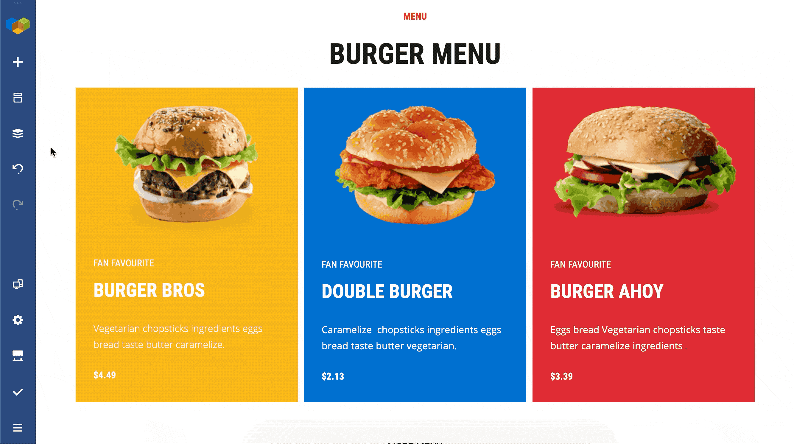
Visual Composer allows you to edit the content of your WordPress website on the go. Use your mobile phone or tablet to change your design via mobile-friendly controls.
The interface is tailored for mobile devices - access all features available to desktop users. Imagine the same powerful functionality but crafted to fit in your pocket.
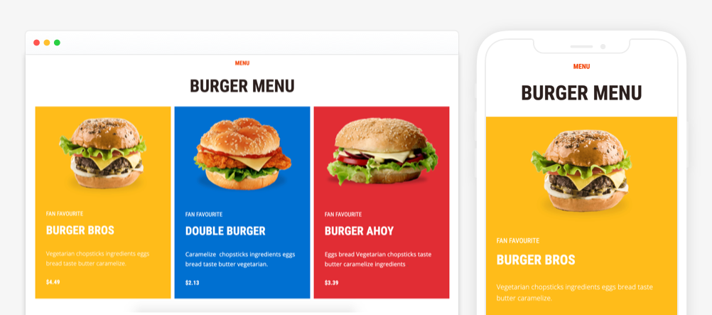
You can also instantly preview your layout look on different devices by switching between different options anytime. Check your layout on the most popular device types to make sure the design perfectly fits any screen.
Conclusion
This ultimate guide on responsive web design covers all you should know about building a mobile-friendly WordPress site from the very beginning. Keep in mind some tips that may be useful while designing one and you’ll be okay.
It can be quite difficult to absorb some code-related responsive website design basics, but I’m here to assure you that there is an option to make your website automatically responsive.
Using a plugin, like Visual Composer Website Builder, can reduce time spent on learning code or building the second version of our site specifically for mobile devices.
With Visual Composer, your design will be automatically adapted to look good on all screens. No more hassle.

great article!
Great post. thanks for sharing
Awesome article. The way to explain is simply amazing. Thank you for sharing this content.
Many thanks for sharing your knowledgeable thoughts on the challenges in developing a new website. I noticed a few crucial elements were missing from your list, Responsive web design requires the following key elements to provide a seamless user experience across all devices:
1. Flexible Grid-Based Layout
2. Media Queries
3. Scalable Images and Videos
4. CSS and HTML Techniques
5. Viewport meta tag
6. Testing and debugging
I was looking for redesigning my website Alakmalak Technologies helped me out & they can do it for you as well.