Job growth for UX designers is projected to increase by 22% in the next ten years. Which means you’re in demand.
Companies are looking to hire people like you. Of course, you don’t want them to hire people like you. You want them to hire you.
And how do you do this?
With a killer portfolio. One that acts as a highlight reel of your best bits so that hiring managers are left in no doubt who they need.
In this post, we’ll show you how to make a UX portfolio website from scratch, including:
- What to include in your UX portfolio
- How to present your portfolio
- What type of site to go for
- What you need to do before putting your portfolio live
But before we get into all of that. Let’s get the big question out of the way...
What makes a good UX portfolio website?
The ultimate aim of a portfolio website is to land you work. So what makes a good UX design portfolio is what impresses the people looking to hire you.
According to a panel of UX recruiters and hiring managers attended by Usable Interface’s Kyle Soucy, a UX portfolio website should...
- “Demonstrate your passion.”
- “Be CLEAN and really highlight your work.”
- “[Be] a demonstration of your UX chops not just a place to put artifacts. Tell the story of how you got to the solution your sharing, but don’t be long-winded.”
- “Keep it brief.”
- “[Be] a way to get in the door. Once you’re at the interview, have 3–4 projects to walk through.”
Hiring managers want to see that you know what you’re doing and that you’re passionate about UX design. Keep these quotes in mind as you build your portfolio.
What to put in your UX portfolio
Your UX portfolio is a showcase of your skills. But it’s also there to give recruiters an insight into the person behind the work.
What interests you? Are you a team player? Do you attend industry events? Do you volunteer at industry events?
What you put in your portfolio needs to give a complete picture of you.
Show your best work only
How many projects you include on your UX portfolio website depends on where you’re at in your career. But that should always, ALWAYS be your best work.
And not just the projects you’re most proud of, but the ones that relate best to the industry you’re looking to work in.
- If you’re an experienced UX designer, stick to 3-5 projects that appeal to whoever it is you’re trying to impress.
- If you’re a junior or are lacking experience, 1-2 projects will suffice. If you’re worried about your portfolio being thin on the ground, beef it up by picking a website to redesign as a personal project. Do you think you could make improvements to the Airbnb or Nike website? Go ahead and make a concept site.
If you’re dealing with NDAs, focus on process images and black and white wireframes rather than the finished project. If images are important to the process, blur out any identifying information.
Tell stories of the project
According to UX recruiter, Tom Cotterill, each project in your portfolio should include:
- The problem
- Who you worked with
- What tools you used
- Discovery phases (how did you go about solving the problem)
- The process you used to overcome the problem: lo-hi wireframes, prototypes, sketches, personas, user journeys, and research
- The final outcome
It’s the classic case study format. And it works perfectly to give your work context.
Product Designer Simon Pan’s portfolio is a great example of telling the story of a project, taking the reader from the challenge to the results with the help of personal insight and images.
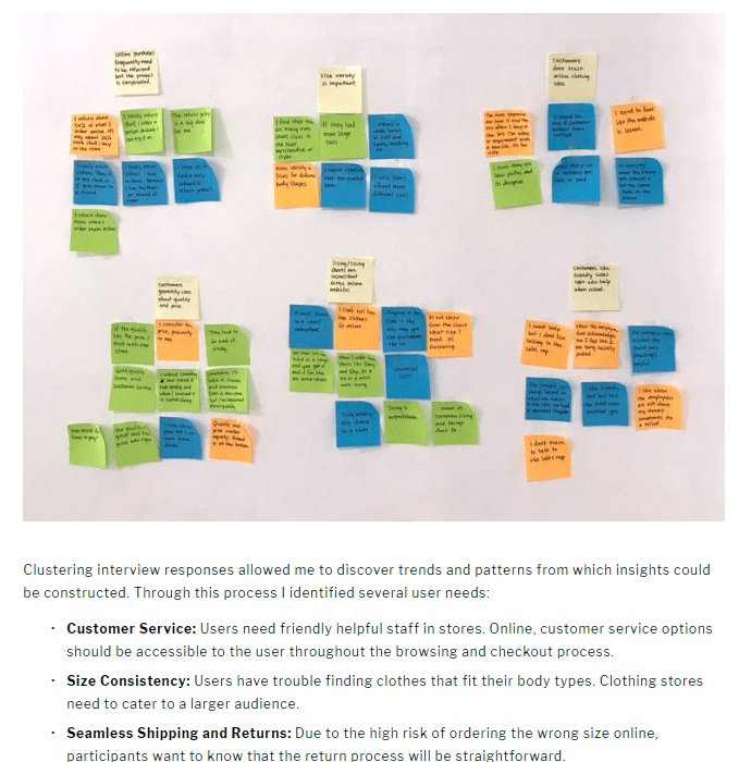
Niya Watkins’s portfolio is another good example, providing an overview of each project, before breaking it down into sections showing sticky notes and wireframes.
While it’s important to give your perspective on things, don’t get too wordy with it. We’ll talk about how to present your work soon, but it’s important to keep it concise. You work in a visual industry, let images do some of the talking.
Try to include one or two images with every stage of the project.
And you shouldn’t forget another important element of projects...
Credit the team
In all but concept design projects, you’re part of a bigger picture. Make sure you talk about the team and how you worked with them to overcome problems.
Employers need UX designers to be team players. Crediting those you worked with lets them know you have those skills.
A part about you
While recruiters aren’t particularly interested in whether you’re married with kids, they do want to know about you as a UX designer.
Your about page should talk about…
- Your passion for UX design
- How you got started
- Your education
- A line about your interests and where you live
- Your contact details
You can also use this page to your mention work experience and any awards and recognition you’ve gained.
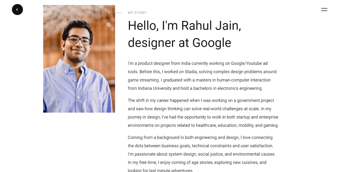
Google’s Rahul Jain does this well with his about page.
Should you include a picture on your about page?
Most UX designers do.
Our recommendation: think about the industry you’re looking to work in.
For example, federal government hiring managers won’t want to see a photo on your portfolio to avoid any kind of discrimination. In more creative industries, though, a photo won't harm.
Add a blog
Including a blog on your UX portfolio website is a chance to show your knowledge of UX design and demonstrate your authority.
It also tells employers that you’re an active part of the UX community – sharing, collaborating, and networking with others.
Another thing adding a blog to your portfolio site does is get you noticed. Take a look at these statistics from HubSpot’s research:
- Websites with blogs have 434% more indexed pages (that means more pages ranked in Google)
- Websites with blogs get 97% more links
- Websites with blogs get 67% more leads
Bottom line: blogging is great for SEO. If a recruiter is using Google to search for UX designers, a blog will get you found.
Your contact details
Make it easy for people to get in touch. A contact page needs to be nothing more than:
- Your email address
- Phone number
- Links to your social media profiles
- A contact form for visitors to contact you via the site
How should you present your UX portfolio website?
Okay, so we’ve established what’s going into your website. Now you have to present everything in a way that appeals to visiting recruiters and hiring managers.
There’s one simple rule to doing this…
Keep it clean.
Of course, we’re preaching to the choir here. Clean design is what you do for a living.
Expect a hiring manager to stay on your website for around 30-60 seconds.
There’s a chance they may stick around longer than that, but only if they get a clear idea about you and the projects you’ve worked on in those 30-60 seconds.
So every second count.
Keep navigation clear and simple
Your UX portfolio website is as much as a demonstration of your skills as your projects. You make it easy for visitors to get around shows that you know how to create enjoyable experiences.
Keep navigation to the top right of the page and visible on every page. This is the easiest way for visitors to find what they’re looking for in a hurry.
If you decide not to include a link to ‘Home’ in the navigation, make sure that your logo links back through to your home page.
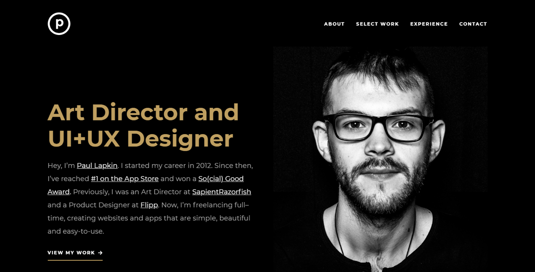
Paul Lapkin’s single-page WordPress template portfolio is a good example of navigation done well, taking the user to the relevant section when they click on a link.
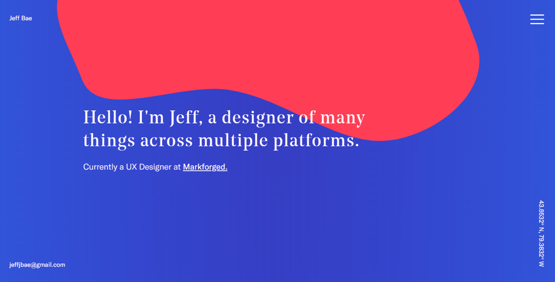
Jeff Bae uses a “hamburger” menu for his portfolio. This promotes a clean look whilst being familiar enough for desktop and mobile users to use without fuss.
Be consistent
Pick a format and color scheme for your project pages and stick with it.
Across all of his work, Simon Pan keeps everything formatted in the same way. Images are the same place down the page, text and quotes are in the same colors and fonts, and the story follows the same path.
Consistent formatting breeds familiarity. It means that, once a recruiter has read one page, they can check out another and know exactly where to find the information they’re looking for.
When it comes to the color scheme, follow the 60-30-10 rule.
- 60% of your site should be a dominant color (usually white)
- 30% should be a secondary color
- 10% should be an accent color
To use Paul Lapkin’s UX portfolio website as an example, black is the dominant color, white is the secondary color, and gold is the accent color. And that’s consistent across the site.
Make content skimmable
Time for a somewhat depressing statistic: a user will only 20% of the content on your page.
All that hard work and only four-fifths of what you write will be read. But that’s the way of the modern reader.
And there are a couple of reasons for it.
- Blue light from screens makes it harder to read for long periods. Eyes get fatigued quicker reading words on a phone or laptop than they do reading on paper.
- People are looking for a specific piece of information and they don’t want to read through an entire page to find it.
Your job when presenting your portfolio is to write for the skimmers. This means pleasing the eyes before you engage the mind.
Here’s how to do it:
- Use bullet points like this for lists
- Use lots of white space
- Break up content with headings and subheadings
- Write in short, 2-3 sentence paragraphs
- Use bold text to highlight key points
- Use simple language
- Stick to 2-3 fonts across your portfolio
If you’re looking for an example of skimmable content, look no further than the post you’re reading now.
Which platform should you use for your UX website?
There are dozens of choices out there, but we’d recommend one of:
- WordPress
- Wix
- Squarespace
These platforms offer the best templates and the most complete features.
If we were to recommend just one, it would be WordPress.
WordPress is open source and free to download. It also powers a third of the internet which tells you everything you need to know about its credibility.
With WordPress, you’re not tied to any hosting provider and you’re not restricted in the size or complexity of your website. Although, you can get started easily and launch the free version of Visual Composer and the Starter theme on verified WordPress managed cloud hosting by Cloudways in just 1-click.
Some templates limit what you can do on Wix or Squarespace. Some limit what you can do on WordPress too. But with a tool like Visual Composer, your portfolio becomes a blank canvas for you to create exactly how you want it.
WordPress is free forever and both Wix and Squarespace let you create a site for free before signing up. So have a play around to see which platform you’re most comfortable.
Single page portfolio or multi-page portfolio?
Single page UX portfolio websites have grown in popularity in recent years and for good reason.
A one-pager splits content into small chunks and makes everything easy to digest. There’s very little clutter and the linear navigation is perfect for scrolling with thumbs.
But it’s not great for SEO. A multi-page site gives you more URLs (including a blog), which makes it easier to get found in search results.
Multiple page portfolios also give you more room for scaling. Crucial if you’re looking to add to your list of projects.
There’s no right or wrong option here. But think about how you plan to present your content and make information accessible to users.
If blogging and SEO are important to you, go with a multi-page UX portfolio. If your site is targeting a specific industry and is likely to remain static, a single-page UX portfolio will serve you well.
Before your UX portfolio goes live
If you’re satisfied with how your UX portfolio website looks and you’ve got all of the information you want on there, you’re ready to launch.
But before you do, check (and double-check) the following things:
- Spacing: Is it consistent across the site?
- Images: Do any look blurred, stretched, or pixelated? Have they been compressed (uncompressed images slow page loading speed)?
- Logo: Does it look blurred, stretched, or pixelated?
- Typography: Is it consistent across the site?
- Links: Do they all work?
- Spelling and grammar: Are there any mistakes?
- Cross-browser and device appearance: How does your portfolio look on other browsers and devices? Does it resize as well on a smartphone as it does on a large monitor?
- Headings: Does your content follow the correct heading structure: H1 to H6?
- Meta titles and descriptions: Does every page have a title and description? Do they include keywords (words related to your work, e.g. ‘UX designer’, ‘digital designer’)? Are they the correct length (under 70 characters for titles, under 160 characters for descriptions)?
Have a couple of friends or family members look over your portfolio. Ask them to check for errors and test the usability or your site.
If they’re happy and you’re happy, you’re good to go.
Summary
Creating a UX design portfolio that shows off your skills and personality is the best way to attract the attention of potential employers and land your dream clients. Investing in a website over a PDF gives you the chance to build your personal brand on your own platform.
- Pick out your best projects and give them narrative
- Use a blog and about page to add personality to your portfolio
- Keep the layout and content simple and clean
- Perform checks, get feedback, and make tweaks before publishing
Do these things and the 30-60 seconds a recruiter does spend on your site will tell them everything they need to know: you’re the right UX designer for the job.
