Minimalism is more than just a style or a trend – it is a way of living. Minimalism can be adopted in all areas of life, from designing your house to designing your website to creating your shopping list.
It is about focusing on purpose above all else, leaving embellishments and unnecessary extras out of the picture.
This article created by our team at Visual Composer will guide you through the essential philosophy of minimalist graphic design by covering a list of some of the most amazing minimalism-inspired sites on the Web.
Read on to discover the power of simplicity in graphic design.
What’s Up with Minimalism?
Minimalist graphic design on the Web refers to creating very clear, sharp websites with no extraneous or otherwise distracting elements.
That said, some of you may still not have a clear image of what minimalism means. To get rid of any confusion, here are the common characteristics of minimalism in graphic design:
- Generous use of white space
- Making the design content-driven from the get-go
- Getting rid of design elements that clutter the overall view
- Each included element serves a well-defined purpose
These principles apply to all projects of minimalism graphic design. You can personalize the website the way you want, as long as you don’t make it cluttered. Minimalism principles can be applied to all sorts of visuals: websites, photos, business cards, even Power Point presentations.
The Rules of Minimalist Graphic Design
Let’s take the rules a bit further:
Simplicity
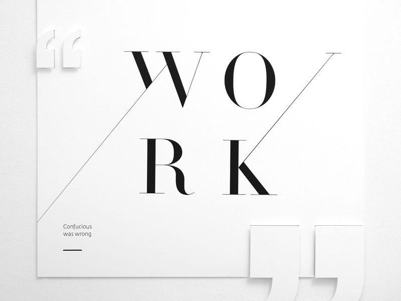
The key to all minimalist designs is to keep it simple. The enemy of minimalist graphic design is bringing too many elements together. Streamline your design by only using one (max. 2) fonts, a relaxed color palette, and only as much content as is strictly necessary per page.
Typefaces
Be very selective with your fonts. Even though it may seem like this detail doesn’t matter as much, it can make a huge difference when your design is put together.
A minimalist design project should include unpretentious typefaces from the same family and use hierarchies for scaling these fonts.
Color Palette
Moving on to colors, you’ll have to reduce the number of nuances you use for one single design. Minimal design is a friend of black and white or other color palettes that are based on a neutral color scheme.
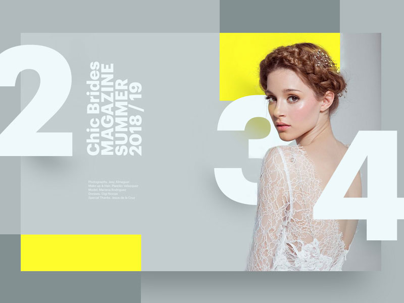
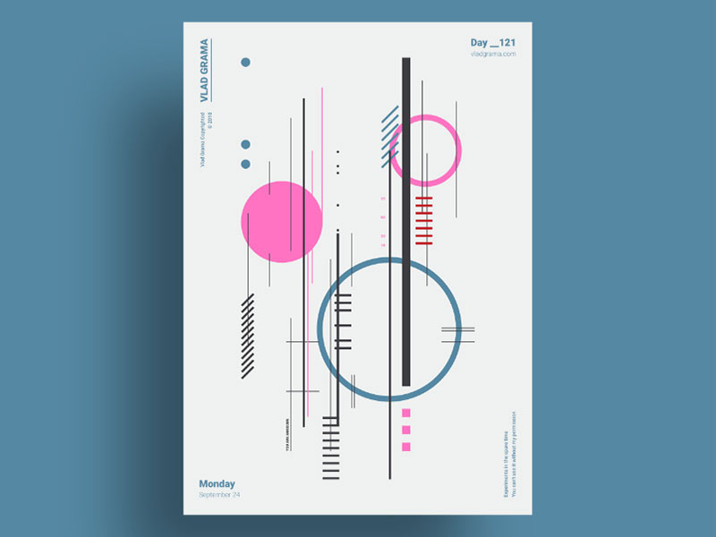
Simplicity at its best, using a two-color palette and pairing it with one accent color (preferred over texture) is the perfect choice for a minimalist graphic design.
While this is what you’ll see in most minimalist graphic design examples, it shouldn’t be a strict rule.
You can use various color palettes: vivid, neutral, monochrome. All this, as long as the design doesn’t feel too heavy on the eyes.
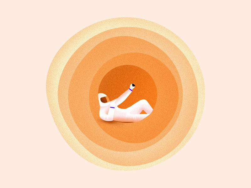
Flat design didn’t appear on websites and apps a while ago out of nowhere. It was something that minimalist graphic designers have been using for years in their work.
So go for flat or almost flat color schemes, even some more colorful than you’re usually seeing. They can produce magnificent results.
Note: You can read more about choosing the right color palette in our Ultimate Color Palette Guide.
No Design Tricks
By design tricks, we mean all the stuff you’d normally do to pump up a website’s look – drop shadows, texture, image frames, crazy typefaces. In minimalist, it’s best if you stay away from all these and focus on color, plain fonts, and content instead.
Strip those cluttering details away.
Details
Finally, in minimalist graphic design, you need to pay great attention to detail. Element alignment must be perfect, while the design itself needs to be organized and balanced so that the whole composition comes across as harmonious.
Throwing some elements on a blank page without following any rule whatsoever can’t be called minimal.
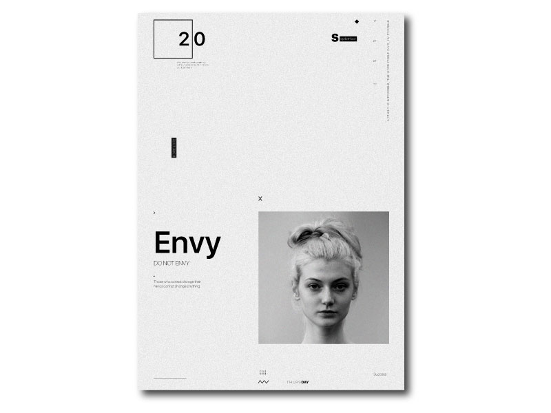
Use plenty of white space
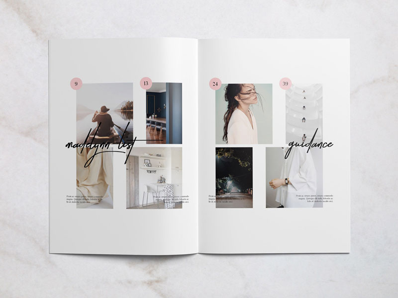
What you’ll see in most minimalist graphic design examples is white space. Crowded elements? No. Everything is distinctly placed within the layout.
When you are working on a graphic design project, you must be sure that the work has meaning. For that to happen, the elements should have a lot of space around them and be easy to distinguish.
Use a grid when designing
You’re probably thinking that a grid is useful only in web design, UI design, or in photography, but guess what: it’s ideal in graphic design as well.
How is that?
Well, a grid will help you create a simple design without having the risk of making it cluttered. When using a grid, you will keep all your elements organized in the layout and it will be easier for you to group them logically.
In this way, it will be easy for the viewers to follow your designs’ patterns so that they will understand and appreciate it better.
Be consistent
Whether you are working on a single piece or on several pieces from the same project, be consistent in your style. The minimalist features that you will use should be present throughout the whole project.
This is easier said than done. You probably experienced this situation if you have been in the design medium for a while.
While you will start with a certain theme in mind, it is easy to wander off and to complicate things, especially in minimalist graphic design.
Every element needs to have a purpose
You have started a minimalist design project with the thought of using as little design elements as possible. This means that you should be very careful about what elements you are including and what you are not.
Whenever you are thinking of adding something to the layout, look at it this way: will that design element contribute to the overall goal of the project? Will it make it better?
If the answer is no, then it is better to focus on what designers have been saying for ages: less is more.
Creating a minimalist brand
When thinking of minimalist logos, you might be tempted to consider that it is easy to design one, right?
Not quite.
If you rush unto things, you might end up with a basic logo.
So, how do you create a minimalist logo?
First, make a plan. Good design usually requires planning. Great minimalist graphic design does not happen by accident.
The first thing you need to do is to walk in your audience’s shoes. Think of who will see this design. Will it attract them? Will they related to this design?
Moreover, please do not forget that what you like doesn’t mean necessarily that it’s something the audience will like.
Then, consider where the logo will be seen. Will it look good in that medium? If not, go back to sketching.
Then, think of what logotype it will be: symbol, wordmark, lettermark, a combination, or an emblem.
Depending on the business you are designing for, you can pick one of these categories.
These are just a few quick steps that you should not forget about.
Ending thoughts on minimalist graphic design
To come up with a minimalist graphic design project, your primary goal is to avoid cramming too many elements on any given page to enhance readability and maintain attention.
The themes presented above should help you stick to this most basic minimalist principle while giving you a solid launchpad for creating your very own minimalist website. Remember that minimalism doesn’t mean boring, so get those creative juices flowing and enjoy the process!
If you enjoyed reading this article about minimalist graphic design, you should read these as well:



Thank you so much for sharing this article with us. Very useful and valuable information about graphic design. It extends beyond establishing identity and brand recognition. Designing a website image or product image editing is very effective at attracting attention and encouraging your audience. Very appreciated.