Are you still looking for reasons to love summer? Friends and families gather together to enjoy open-air festivals, delicious picnic foods, and local trips around country regions. In this Visual Composer showcase, you’ll find beautifully designed websites that offer it all to make the most of your summer. #madeinvc
Moto Macellaio
From clear personalized call to action buttons to crisp headings—lots of factors matter when it comes to building a winning website design. Moreover, it’s also a necessity to stay authentic and up to date with the latest web design trends.
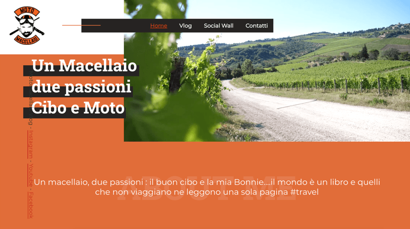
Moto Macellaio blends beautiful graphics with written content to create a unique layout look and an inspirational story behind the product. By following grid design principles highly popular this year, Moto Macellaio website stands out of many similar offers in the travel niche.
Because at the end of the day you are most likely to remember but not the product itself but the way it was presented. Moto Macellaio won Visual Composite team’s hearts with its chosen slogan by Saint Augustine “The world is a book and those who do not travel read only a page.”
Lyst Festival
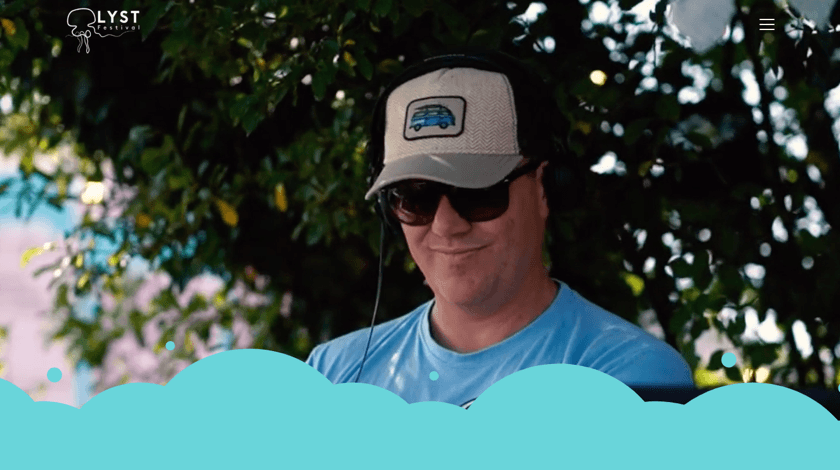
Nothing could bring you into the atmosphere of the event more than a great high-quality video in the background. This makes you feel involved—like in real-time.
Applying a video background is a great way to help your visitors catch the momentum. Still, there is a trick you need to know there if you wish to reach a wider audience and build a website that looks good on any device type.
According to the best responsive web design practices, it’s better to avoid video background for mobile device users. Instead, you can put a static background image, for example, the one from the Unsplash media library. In that case, those who interact with your website using mobile devices and tablets won't face any performance issues.
Lyst Festival uses this technique to grab attention from the first sight. Also, it is a well-designed website that guides visitors to take action. Combined with shapes and beautiful color gradient, this website encourages you to become a part of the community right away.
Urban Spaceman Storage
Using storytelling in the website design is yet another powerful technique for a successful website. A well-structured story keeps visitors focus on the product and creates logical connections between the feature you offer and the benefits your audience will get.
Humans love stories either spoken, written or visual. This is why telling a story using web design elements are extremely popular these days. With captivating visuals, even the most complex information becomes easier to comprehend rather than via plain text.
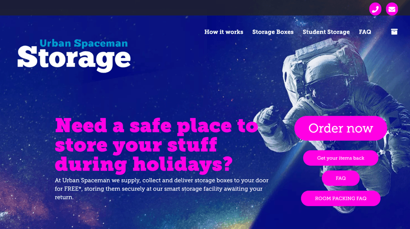
The site of the Urban Spaceman Storage is a great example of storytelling through design—it looks like a story you scroll from beginning to end. Complemented by a large background image and strong message, this website made with Visual Composer is a top-notch inspiration source.
Georgie Dallas
Everyone wants the navigation of the website to be as easy as possible. Good navigation can make (or break, in case it’s not so good) the experience while interacting with a website. It also helps to find the desired information and drastically impacts conversions.
There are many navigation practices to apply. It is good to start with understanding the purpose of your navigation flow and planning ahead. Then you can start to create a menu in WordPress ensuring easy access throughout the whole website. Be clear, concise, and consistent.
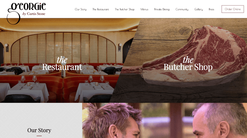
Georgie Dallas’s website has a simple yet straightforward structure. This provides a positive experience to anyone who interacts with the site, and, what’s more important, encourages them to return.
Paradise Kitchens
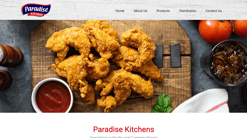
A simple structure of the Paradise’s Kitchens website is clear proof that minimalism is not about the emptiness (okay, these delicious chicken wings really don’t require a lot to be craved).
The main principles of minimalism in web design are a user-friendly interface and lots of empty space. In other words, this is the art of less by doing more. Minimalism requires careful message catering and smart (and simple) website design structure.
In addition to the clean overall look, this website represents how small design elements, like tiny CSS animations, can affect the end result. In Visual Composer, there is an option to choose from multiple animation styles and even set a delay for it.
Online Regisseurs
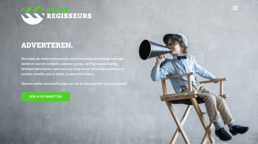
Like a journey of a thousand miles begins with a single step, often an award-winning website begins with a hero image.
Hero area is the first one visitors see when they land on the website. An image in this particular section has a huge impact on user experience and conversion rates. This is why it needs to be carefully selected and accompanied by no more than two persuasive CTA buttons.
As to Online Regisseur’s large and beautiful hero image, it kills two birds with one stone: catch visitors’ attention and visually influence them. Basically, it serves as a second call to action.
Conclusion
Sometimes the number of things you need to consider before (and while) creating a website brings you the fear of taking that first step.
With the Visual Composer showcase, we want to encourage and inspire you to start building your project fast and easy like many before you did. Good luck! ❤️
