We're excited to share our latest collection of beautiful e-commerce, portfolio, and agency websites made with Visual Composer. It never ceases to amaze us how completely unique creations come out of using the same features, just in different ways.
We hope these showcases reveal new ways how web creators utilize Visual Composer and serve as an inspiration for your next project.
Polygraphic
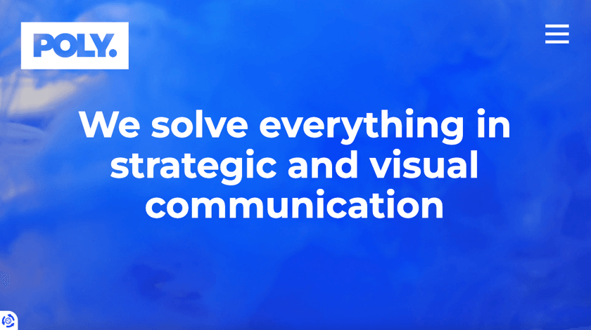
Polygraphic is a Danish agency, that offers a combination of creative, strategic, and political communication and design. In their own words, they create purposeful and meaningful communication that makes a difference.
What we love about this example, aside from the bold colors and minimalistic design, is the layout. Check out their beautiful cases and customers pages, and learn how beautiful media and simple row and column arrangements can make all the difference.
This reminds us, did you check out our latest Visual Composer design hacks? Now, you can easily resize rows and add columns without batting an eye.
Nora Shcott
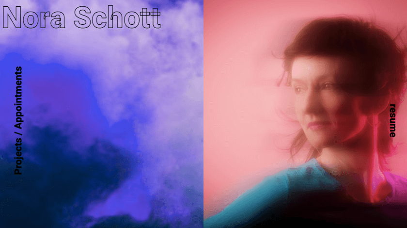
Next up, we have Nora Shcott. A German choreographer and dancer with her mesmerizing portfolio website.
Upon arrival, you are greeted with a color-changing hero section. You too can use the advanced Visual Composer design options to add background images, slideshows, gradient colors, and videos to liven up any section of your website.
Another thing that we absolutely head over heels about is the side buttons and the menu bar, that follow you along as you scroll down to the bottom of the page. To make sure your website navigation is always within a hand's reach (or a drag of a mouse), enable row stickiness.
Senior By Design
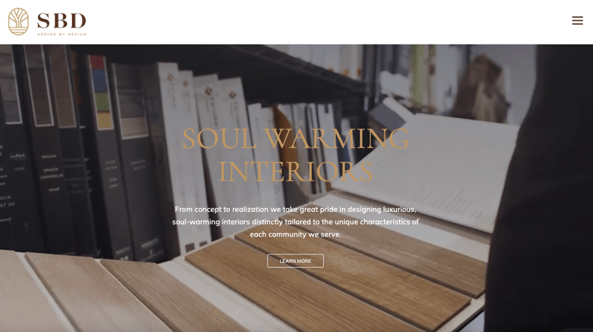
Senior By Design is a company that takes pride in creating luxurious, soul-warming interiors, clearly tailored to the unique characteristics of each community they serve.
As they should (pride themselves) because the words from their satisfied customers speak for themselves. If you have an online business of any kind, it's essential to add testimonials to your site. Fortunately, the Visual Composer Hub offers multiple elements of that sort, to help you advertise your endorsements as well (hey, no shame in that).
Alongside other effects, their video background is what makes their content even more engaging and fun for the visitors. This, actually, is one of the current web design trends of 2022. Don't hesitate to jump on this bandwagon, because it is surely one that won't go out of style any time soon.
iDESIGN
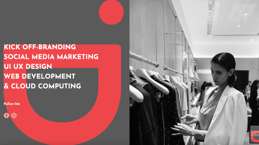
iDESIGN or Issue Design Corporation Co. provides web design, graphic design, and all kinds of publishing services. The way they communicate their business values is beautiful — in a world and time of evidently approaching climate crisis and news full of strained situations and bad incidents, they intend that their website can be a way to attain all the relaxation you need.
One of the most important parts of this example is that it has applied some of the best responsive web design practices. A key factor in the modern online world, considering more than half of the worldwide website traffic is generated by mobile devices.
A nice touch, and an easy way to make the user experience even more enjoyable, is by adding simple parallax effects to your background images (here used in 'fixed' style).
MinimalBiżu
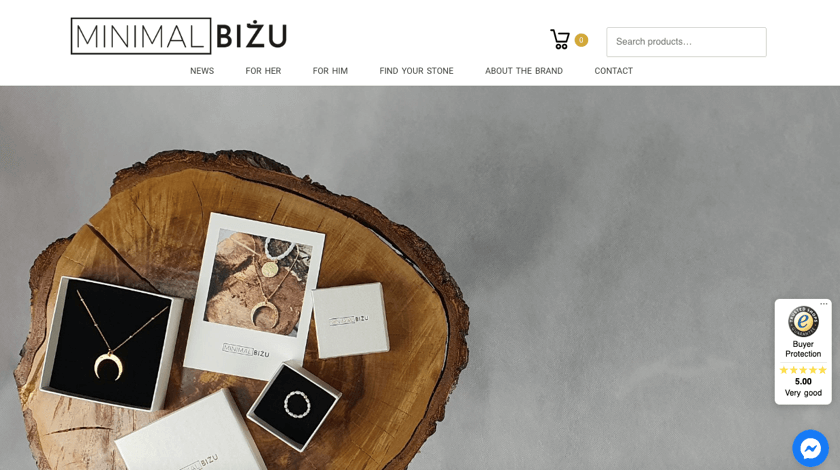
MinimalBiżu is a Polish business, that creates original, hand-made jewellery, made out of semi-precious stones plated in 24-carat gold. This is one of the many good-looking e-commerce websites #MadeInVC.
A crucial part of any online store is the integration of WooCommerce — the number one e-commerce plugin for WordPress. Which in fact, works seamlessly with Visual Composer, as you can perfectly see in this example.
This website specimen creates a seamless shopping experience, by helping users move from page to page effortlessly. Creating a menu with product categories and filters helps users to easily sort and navigate through the website. This also increases the likelihood of sales, and your shoppers NOT leaving your store empty-handed.
PANOS
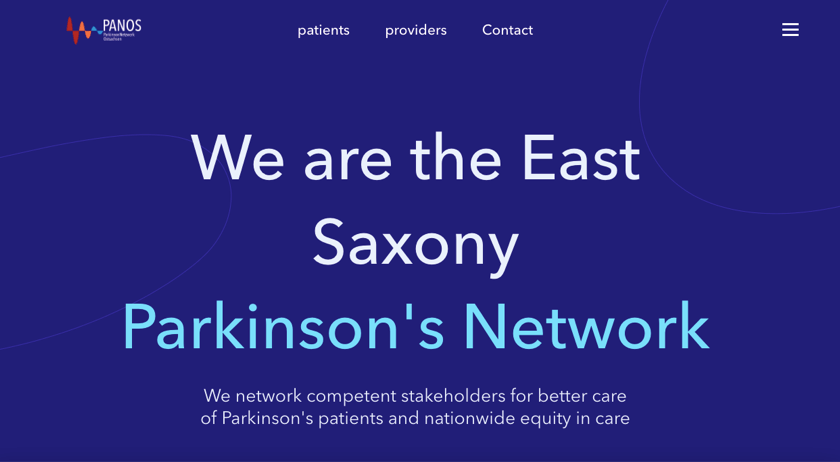
PANOS is a growing network of doctors, clinics, scientists, and organizations such as the German Parkinson's Association with special Parkinson's expertise. Their mission is to provide better care for Parkinson's patients and create nationwide equity in care.
One thing that's striking about this website's design, is the title in the hero section, which highlights parts of the text once when you drag your pointer across it. While Visual Composer is powerful on its own and doesn't require coding, it also allows you to add custom CSS and JavaScript for additional styling options.
This is yet another example of how simplicity works best. They have created a matching design putting thought into the smallest detail and each element throughout the page. By using the popular theme Twenty Twenty One as the base, and creating a WordPress child theme, they have changed the look of the parent's themes styling and added extra functionality to their website.
Conclusion
Whether you're just getting started with your first website or are already an experienced web creator, there's no need to worry when using Visual Composer. As long as you know what kind of site you want and have some basic ideas in mind you can start building.
The best part? According to Michael Bellina, our self-proclaimed biggest fan, Visual Composer allows him to work at least 30% faster and deliver a website to a client until lunchtime. All thanks to the highly-customizable elements, templates, and features it offers.
Stay tuned for more amazing showcases we have in store for you, and even more — yours could be in the next one!
