Today we will take a look at one of the most important content parts of the website, namely, your header. By the end of this article, you'll be fully equipped with knowledge on how to create a perfect custom header using a powerful Header Editor.
Apart from best practices on how to create a perfect header In WordPress, I’ll also provide you with actions you can do to apply them. For example, you’ll learn how to add a logo to your header and how to make it sticky so you can reduce bounce rates.
In order to illustrate it all, we’ll go with a powerful Premium feature of the Visual Composer Website Builder - Header Builder for WordPress.
What Is Header In WordPress?
A header in WordPress is what your visitors see at the very top of the page when they land on your website. It’s a crucial area for every page and post (with a few exceptions). Your header plays a role in the navigation process and in the formation of your brand identification.
If you are a tech-savvy person, you can find the header functions contained within the header.php file to adjust your header. Or you can go with a website builder for WordPress that helps you to create custom headers in no time without coding.
Custom Header Best Practises - A Complete Checklist
As mentioned above, to show you how to apply these best practices to your WordPress header, I will use the Visual Composer plugin. It comes with a Theme Builder addon that includes a Header Editor (also known as a Header Builder).
Ensure readability
As a general rule, a header should make your visitors’ journey easier, not more complicated. And that’s when readability comes to play. While typography is a complete science we won’t dig deeper into here, choosing a font-family suitable for a digital environment is a must. Make sure to think twice before applying a font that it’s too off-beat or difficult to read.
Pro Tip: You can choose a font great for on-screen reading from the Google Fonts library that is fully integrated with Visual Composer Website Builder (900+ fonts).
How to change fonts in WordPress: There are 5 ways to change fonts in WordPress in total, so you can plenty of options to choose from.
Consider background type and size
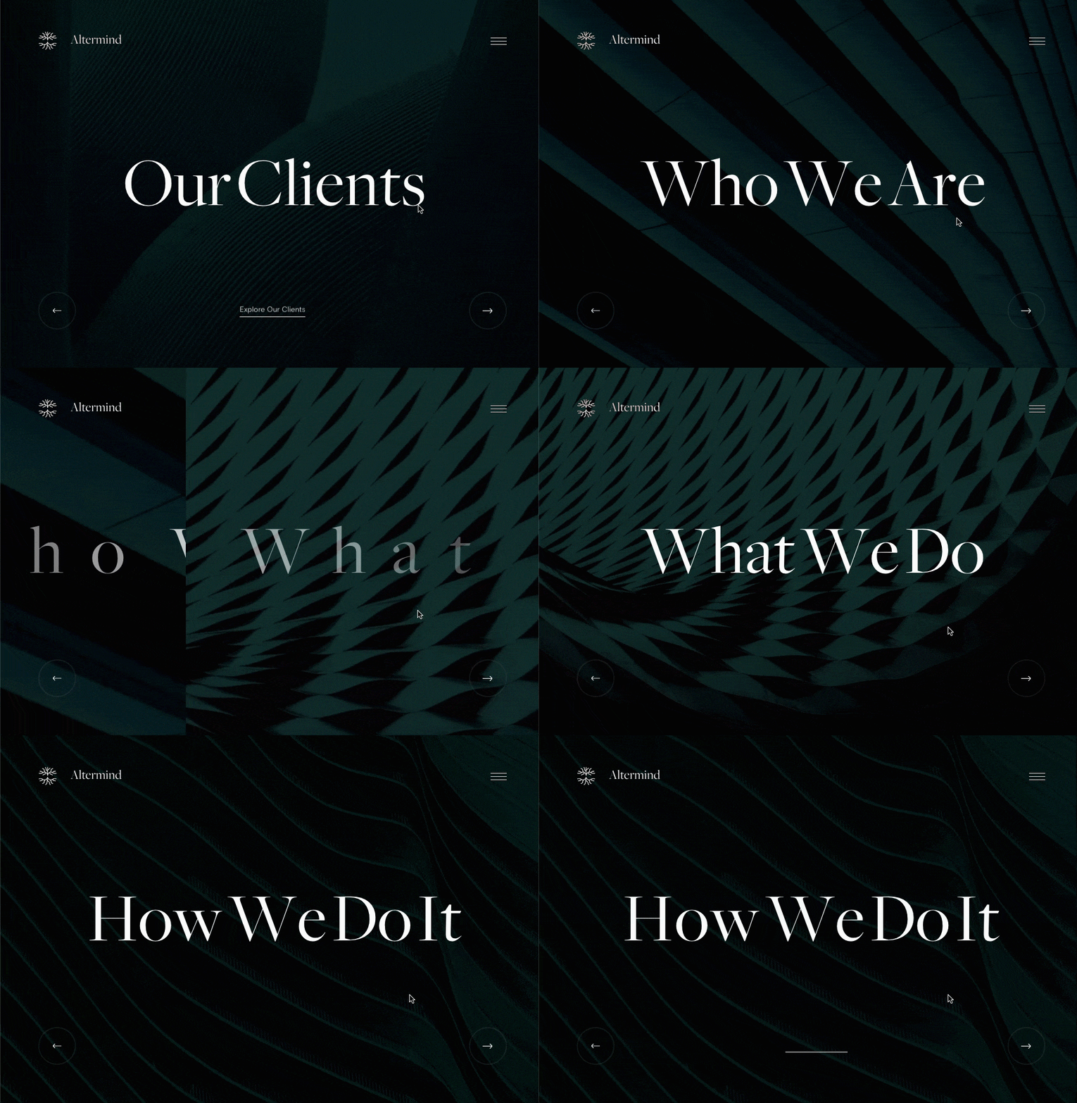
To make your header more eye-catching, you may consider incorporating a background image or video. It is essential to think about image quality (for example, you can use Unsplash integration to get free high-quality stock images) and video size.
Pro tip: As a heavy video can slow down your page loading time (especially on mobiles), adjust the background for a specific device using custom responsiveness settings.
How to set a video background in WordPress: In Design Options of a row or column select a video as a Background type drop-down and specify a link.
Add a personal touch
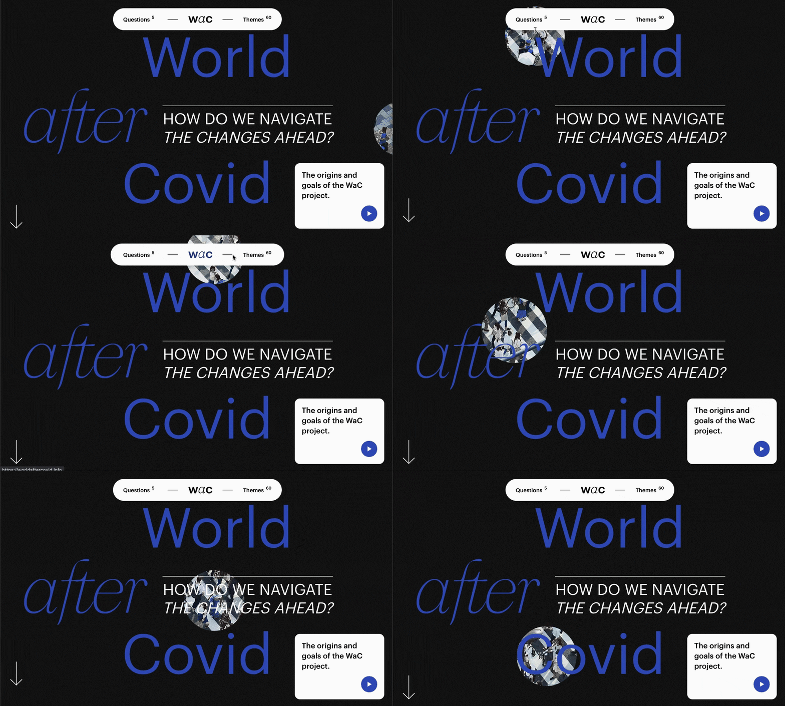
To attract attention, don’t hesitate to be authentic.
Yes, a large call-to-action will be visible enough for catching visitors’ glimpse. But that’s not what can make them stay (and browse your site further). In order to accomplish it, you should think about every detail of your header. Think about adding a high-quality (and proper-sized) logo or including social media icons in your WordPress header.
Pro tip: A personal touch to the design of your header should go together with the specifics of your business niche and business goals.
How to add a logo to your WordPress header:
- Navigate to Header, Footer, or Sidebar editor in Visual Composer menu;
- Add a new template and give it a name;
- Open Visual Composer Hub and search for the header template you want to use;
- Download the template of your choice;
- Add your template to your page or post and change the logo.
How to add social media icons to a header: You can also use one of the predefined header templates and add social media icons to it. In order to complement your header with social media icons, open Visual Composer Hub and search for mono-styled social icons or a Social Profile Icons content element.

Use white space
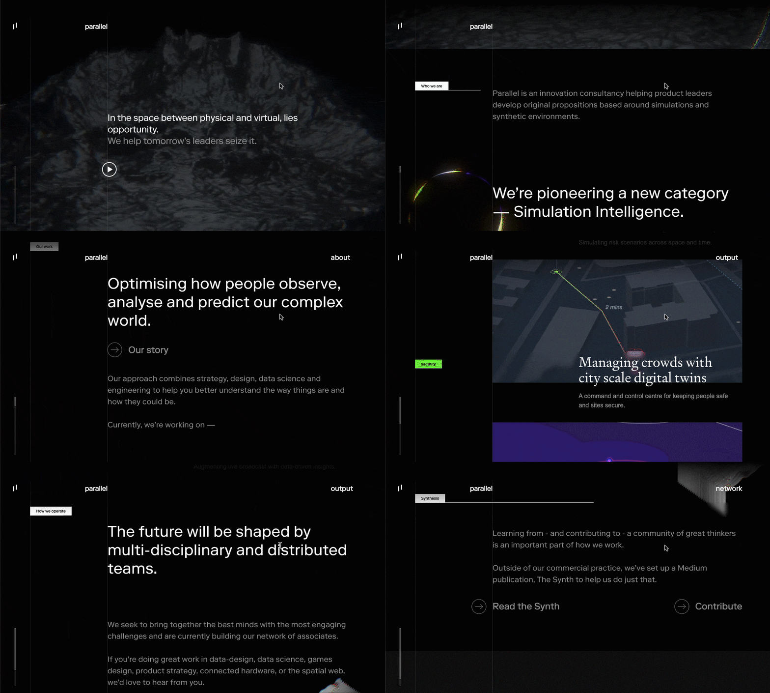
White space or so-called negative space is an empty area inside and surrounding elements of your page. It declutters the whole layout, improves readability, and emphasizes the focus of your page enabling different content parts to stand out.
Pro tip: Adjusting paddings and margins can help you to create a white space.
How to change the spacing of elements:
- Open any content element of the plugin;
- Access Design Options and find the “Onion Controls”.
Create SEO-optimized header
While the header of a website serves more than a single purpose, the main one directly ties in with your website’s position in search engine results pages.
Because the header is used to navigate visitors, it contains multiple internal links (that are often also site-wide). These links help make the process more natural and smooth. If links you include don’t compliment this goal, Google will understand that while crawling those links.
So, don’t overdo here in order to avoid hurting your website’s ranking.
Pro tip: The most convenient way to analyze your links, media, and textual content is to use a checklist-organized view following best SEO practices.
How to optimize your WordPress website for SEO (headers included):
- Create a page or post with Visual Composer;
- Click on the light bulb icon in the Navigation Bar;
- Follow suggestions to improve your SEO ranking.

Make your header sticky
A sticky (on-scroll fixed) header not only provides a seamless user experience. It also reduces your bounce rate by up to 33% and increases the average time people spend on your page.
Because it always remains visible when a visitor scrolls down a page, a sticky header makes your content more accessible and easier to be found.
Pro tip: If you don’t feel comfortable working from the technical side to make your header sticky, there is an option to do so without any coding knowledge required.
How to create a sticky website header:
- Open Visual Composer Header Editor;
- Select the row or section that you want to be sticky;
- Enable stickiness toggle.
Design interactive navigation menu
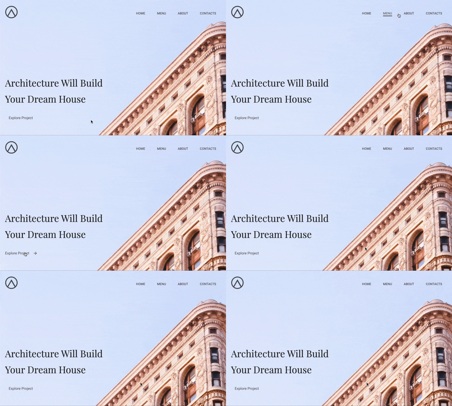
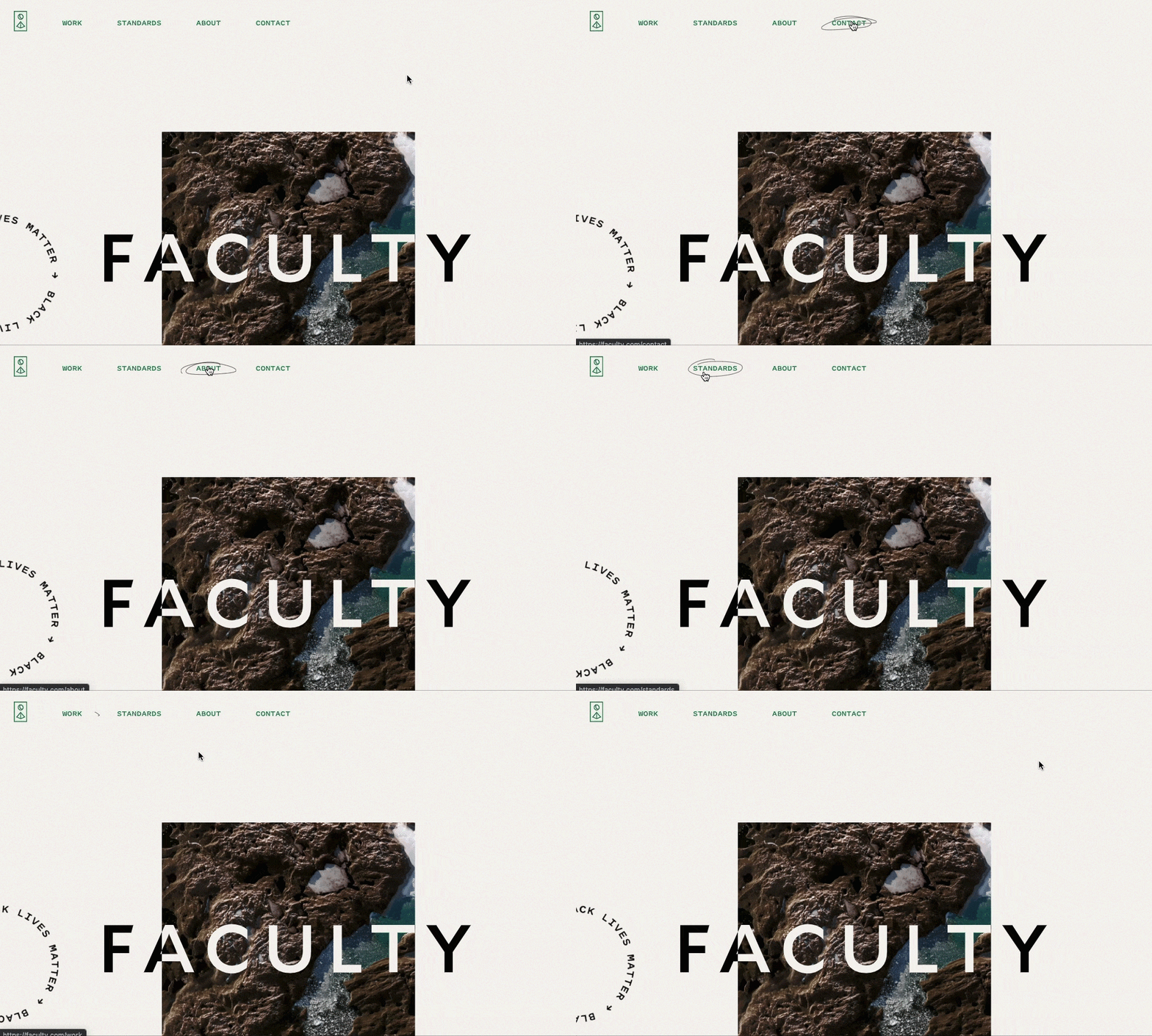
A menu is one of the most important parts of the header of your website. Keep it clean and concise yet interactive.
For example, you can go for a sandwich (drop-down) menu so you don't overload your visitors too much. Or choose a menu with an underlining hover effect to create a “wow” effect.
Pro tip: In Visual Composer Hub you can find a variety of menu content elements, from the sandwich to the sidebar menu.
How to add a menu to your WordPress site:
- Go to Appearance – Menu in WordPress Admin Dashboard to create a new menu;
- Download the menu element you want to add from the Visual Composer Hub;
- Add an element to your page and in the menu source select the one you've created (see step 1).
Keep responsiveness in mind
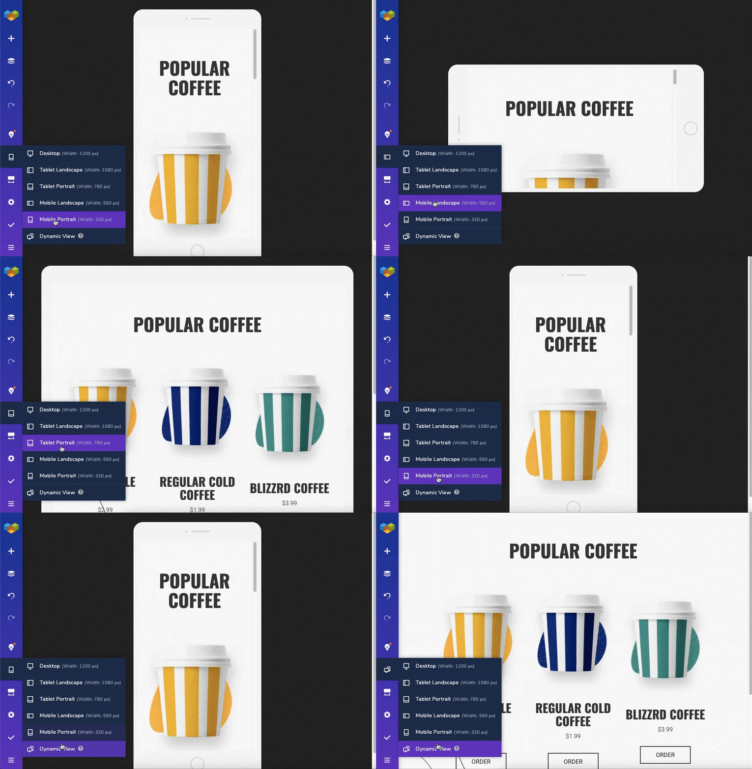
Whatever tool you pick to start creating your WordPress website, you probably are aware of the strict requirements Google has put on responsive design within the last few years. And the header is no exception, meaning, it also needs to be fully responsible.
Pro tip: A feature like built-in auto responsiveness ensures that every design you create will look good on any device (you can also instantly check your header on the most popular device types).
How to make your header mobile-friendly:
- Click on responsive control in the Visual Composer Navigation bar;
- To preview the layout design on different screens, select the device type to be activated.
You can also choose whether the default “working” view will be the desktop or the Dynamic View (the layout will adjust automatically depending on chosen screen size).
Prevent Banner blindness effect
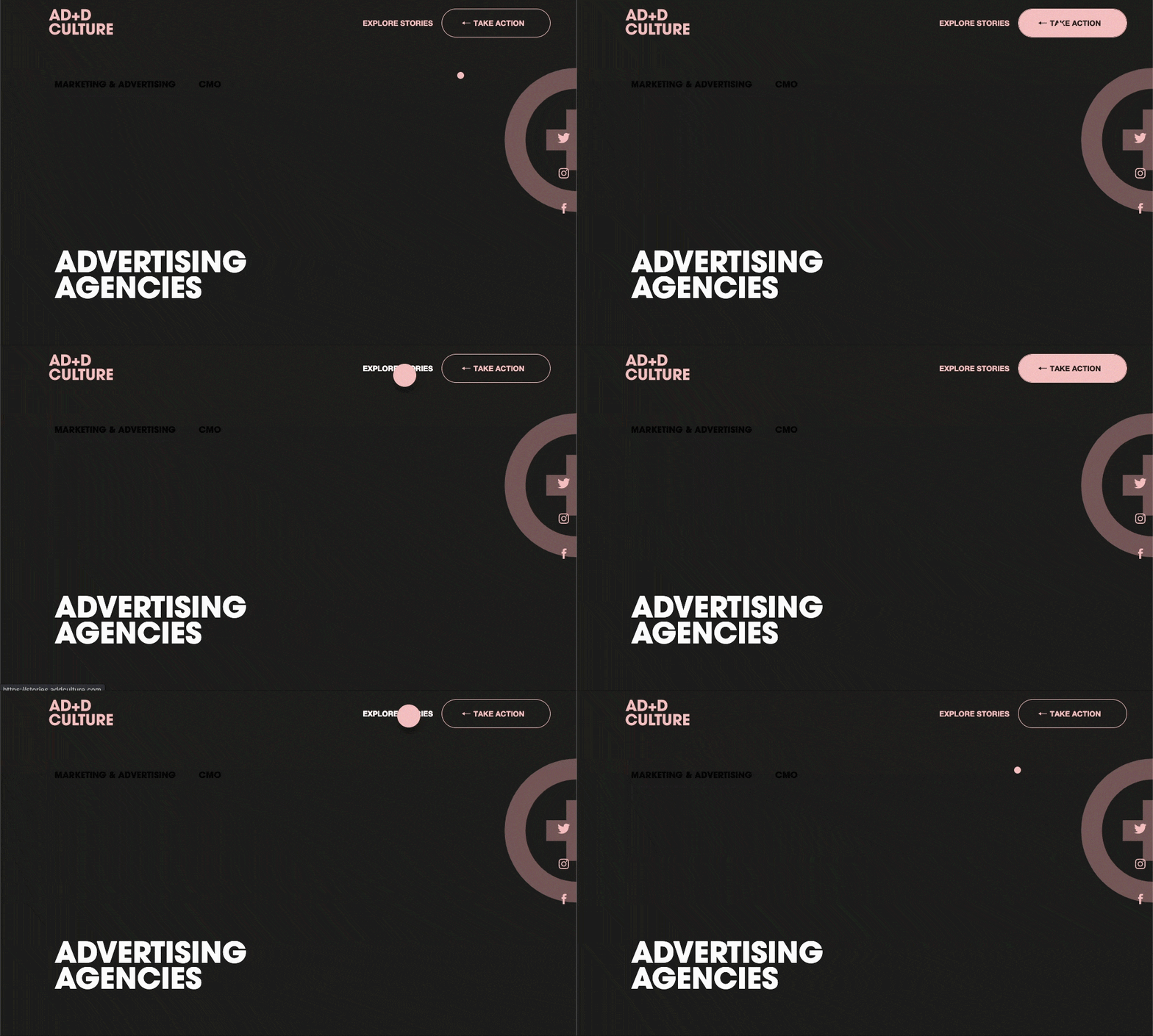
This effect describes how people tend to read and perceive website content. If the design of your header looks like a typical banner ad, most likely it will be ignored by the majority of visitors.
Pro tip: An effective way to understand what visitors of your page look at or ignore, is to set a website heatmap - a visualization of user behavior.
How to conquer banner blindness tendency: In order to make visitors really pay attention to your header, take advantage of minimalist design and color psychology.
Remove header space for landing pages
There might be cases when you don't need a header at all. I'm talking about landing pages here in particular. Why it's better to remove header space when creating landing pages?
Quite simple: often landing pages have a specific purpose (like our page dedicated to Christmas charity campaign #wpgivesahand 2020). With that being said, a header on a landing page can distract visitors from completing the desired action.
Pro tip: The advantage of using Visual Composer is that you can adjust the layout for every single page.
How to delete your header on WordPress:
- Create a page or post with Visual Composer;
- Go to an On-Page Settings and disable a header for a particular page via On-Page Settings.

Maintain consistency
The widely-known “consistency is key” saying probably originated back to times when the first header was applied. In case you are not creating a dedicated landing page or specific post type (like WooCommerce product page), consider applying a single header to all your site.
Pro tip: Visual Composer global header controls allow you to use the custom header all across your site.
How to apply the custom header to all site:
- Find Visual Composer Dashboard in your WordPress Admin panel;
- Open the Header and Footer section;
- Select ‘Apply custom header and footer (all site);
- Choose the header you want to apply from the drop-down.
WordPress Header Builder That Does It All
As you can probably conclude at this point, Visual Composer Header Editor coupled with the functionality of the plugin is a great companion when it comes to building custom headers. Using this powerful feature, you have all the tools to implement the above-mentioned practices to your header.
The main benefit of this feature is that doesn’t need a coding experience at all. It’s very easy to get started - you can either do it from scratch or choose one of the ready-made templates for your WordPress header.
Create Your Custom Header Today
Header Builder is a Premium feature that comes within a Visual Composer Theme Builder addon. If you still doubt whether it’s the best time to upgrade, we provide world-class support to premium users. Our help is an email away if you need one when creating your beautiful header.

Dear Paula,
Is there a way to recreate the designs that were used in this blog post? The custom mouse hover action (WaC) or the pen-like circle on hover in the example for interactive menu design, for example.
Thanks in advance,
Karl Schmidt
Really it’s fantastic article post, thank you!
Your Article writing Guide is really helpful for research and analysis to start blogging in the year 2021
I have read your blog on How do I customize the header and footer of my WordPress website.It was very interesting and helpful but I can add some extra points in your article. Here some extra points:
1.Go to WordPress Dashboard
2.Templates
3.ThemeBuilder
4.Click Add New Template and choose Header (or Footer) Name your header template and click Create Header (or Footer)
These are some extra points to add to your article. Readers if you are confused about your web and App development , you can get a free consultation at Alakmalak technologies.Visit our site for more information.